
Hey! 👋
Welcome to Kawan—our vibrant community of data heads and storytellers. We’re all about improving data literacy and sharing nuanced stories about Asia. Come hang!


Who would we be if we had a different name?— issue #76
Names weave a story of places, beliefs, and people. In our latest story, we explore the diversity of Asian naming practices. When we look beyond the typical first and last name conventions, we are exposed to a world rich with meaning.
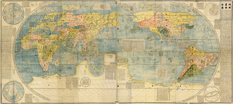
Musings of a history major in the field of data visualisation
“Oh, study history. Next time you’ll be a teacher, right?”

The answers don’t lie in biodegradable bullets — issue #49
Did you know that military-related emissions aren’t subject to international climate goals? I didn’t, until recently. Countries have been rushing to meet their climate goals. Most of their efforts centre on energy transition, economic re-prioritisation, and sustainable development. But the quest for reduced emissions and clean
Dataviz in Asia (Nov 23')
This month in Dataviz in Asia, we're diving into stories that show us how data visualisations are powerful mediums used to tell important environmental stories in Asia. Our first highlight is an infographic by Ganesh B Varakale for India In Pixels, spotlighting the alarming levels of untreated sewage
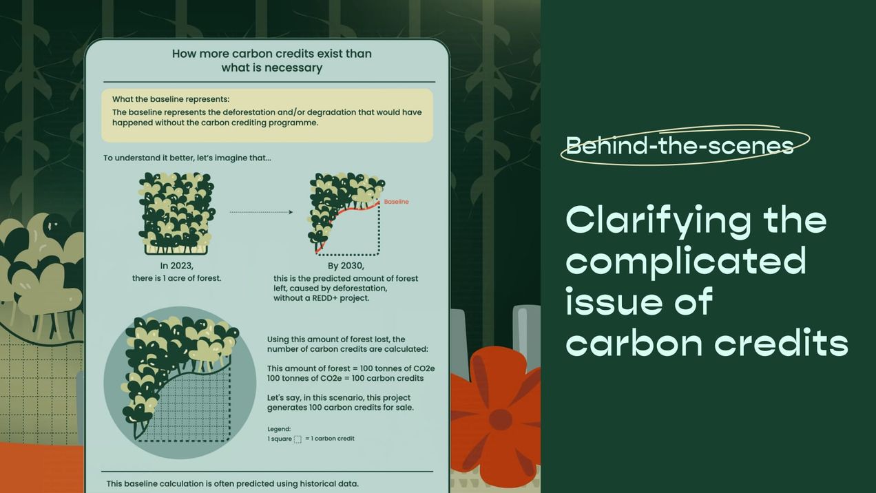
Clarifying the complicated issue of carbon credits
In this article, we share our process of creating our data-driven explainer about the voluntary carbon market and Singapore’s role in it. We break down how we turned a large and complex concept into a more digestible piece. This story was written in collaboration with the Earth Journalism
Girlmossing 101: A Beginner’s Guide
The term “girlmossing” may have surfaced on the internet just a couple of years ago, but I’ve been embracing this lifestyle long before it had a name. Girlmossing, which is a play on the word “girlbossing”, refers to women making intentional time and space for rest, joy, and self

Whose voices are we listening to? — issue #48
The past few weeks have felt incredibly heavy. In Gaza, a genocide against Palestinians is happening in front of our eyes. Heinous war crimes are committed daily without impunity, emboldened by the support of colonial powers past and present. Across the world, many of us scroll through horrors that surpass
What role does data play in death?
Over the past few weeks, I’ve seen my social media feeds and television screens flooded with rapidly rising death tolls as a result of the heavy bombardment in Palestine, notably being one of deadliest years since 2005 for those living in the West Bank. As of today, over 8,
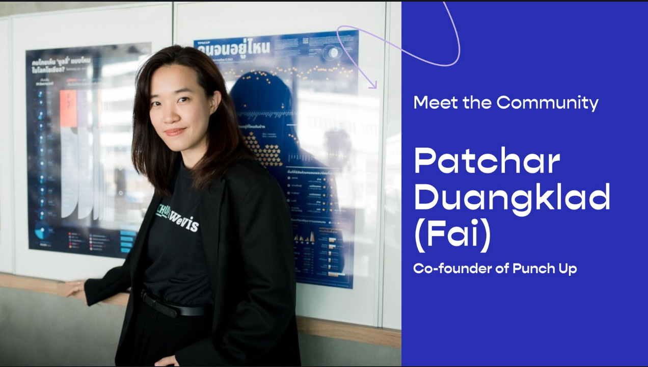
Meet the Community: Patchar Duangklad (Fai)
Patchar Duangklad (Fai) is the co-founder and business developer at Punch Up, a Bangkok-based data storytelling studio that creates meaningful conversations with data, design, and stories. Coming from a background in public policy and media, Fai shares her journey in setting up Punch Up, as well as WeVis,
Dataviz in Asia (Oct '23)
Amidst a landscape of misinformation and conflicting reports, making sense of the current humanitarian crisis in Palestine and Israel can be quite challenging. Data has become especially critical in this context. This month we want to highlight some visualisations that are helping us to contextualise the recent happenings, and sieve
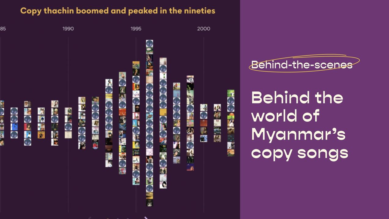
Behind the world of Myanmar's copy songs
The team from Thibi shares their process of creating their groundbreaking data-driven explainer on Myanmar’s “copy thachin” or copy songs movement. This is the first time that Kontinentalist is collaborating with Thibi, a data and design consultancy, on a story. In this article, Thibi breaks down how they

Why local stories matter — issue #47
A few years back, I had the privilege of meeting other environmental journalists from across Asia at a climate journalism fellowship. Hailing from Indonesia, Kashmir, Bangladesh and the Philippines—places extremely vulnerable to the impacts of climate change—they had spent their career reporting tirelessly from the frontlines of our
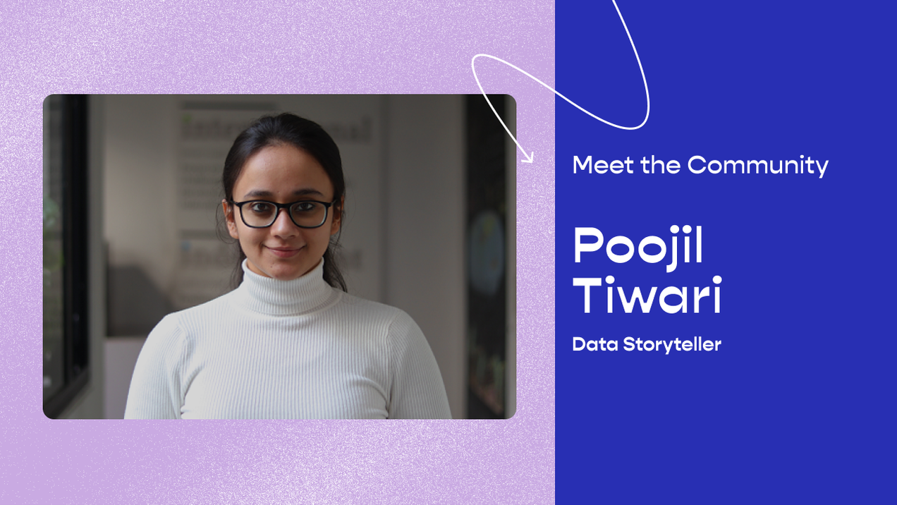
Meet the Community: Poojil Tiwari
Poojil Tiwari is currently a Communications Associate at the Council of Energy, Environment and Water (CEEW) where she creates data stories and visualisations on India’s environmental challenges. She was previously a Data Journalist Fellow at Newslaundry and India Data Portal at Bharti School of Public Policy. A classically-trained
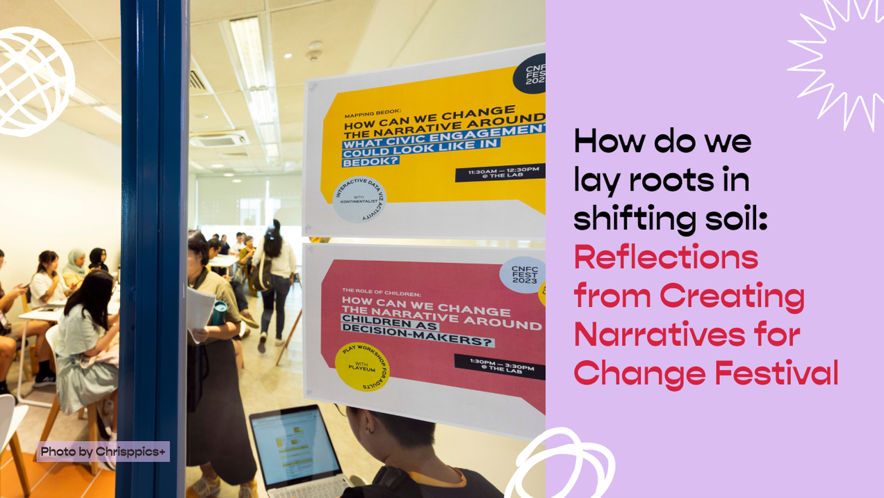
How do we lay roots in shifting soil: Reflections from Creating Narratives for Change Festival
I’ve been watching a lot of TV shows lately, my recent favourites being Insecure and Abbott Elementary. Both shows take place in predominantly Black neighbourhoods in the United States, forming the backdrops for these characters as they explore their own relationships to their work, friendships, and homes. Their neighbourhoods