
Meet the Community: Poojil Tiwari
Poojil Tiwari is currently a Communications Associate at the Council of Energy, Environment and Water (CEEW) where she creates data stories and visualisations on India’s environmental challenges. She was previously a Data Journalist Fellow at Newslaundry and India Data Portal at Bharti School of Public Policy. A classically-trained Bharatanatyam dancer, she reflects on how her literature and arts background has shaped her unique outlook and practice in data storytelling. Check out her work here!
You studied literature and dancing, and did a lot of coding during your undergrad days and in your career. How did you make the leap into the world of data storytelling and journalism?
Data aside, I am a storyteller. That's what reading literature and being a dancer is all about, right? It's about conveying a certain kind of emotion and a story, and being able to capture something in a defined time frame or pattern. Also, I was always very interested in coding. I just felt a very instinctive connection to it. I do have a very vivid memory of sitting in a literature classroom [in university] realising that, while I loved the storytelling part of it, a lot of it is just not in tune with who I am and what I want to read. And I really wanted to do something a bit more technical and explore that bit of my personality. I was sitting at lunch with one of my college seniors, and I asked her, “What [should] I do for my future?” She told me to check out data journalism. So I started reading and I [thought it seemed] like something that I [could] do.
I also believe that data journalism, data visualisation, or information design are very easy to fall in love with, because we create such beautiful things. It's hard not to see all the cool stuff that people all around the world are creating and say, “Hey, I want to do this too!” So, when I was trying to make a portfolio, I wanted to come up with something that could communicate my skillset effectively, and I came up with this analogy of a public transport system. This is perhaps the best analogy for being a data journalist or information designer—like Delhi's Metro, there are so many intersecting lines in my life and about who I am. I studied commerce and economics, and did a BA in English Literature. Then I did an MSc in computation and data journalism, and now I'm working in information design. So I [thought], let me explain what being a data journalist is like with another area I'm very passionate about, which is public transportation.
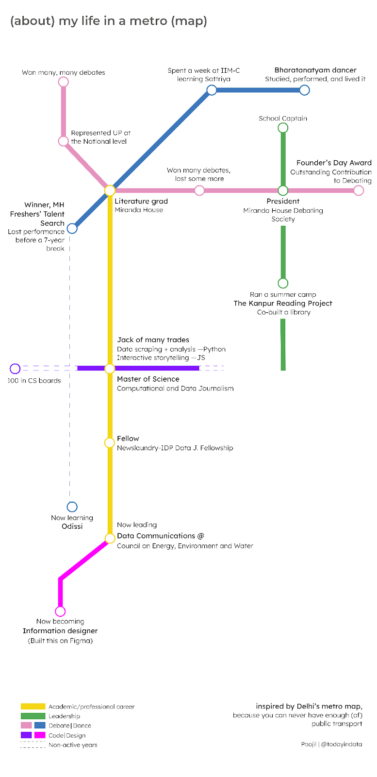
The central, yellow line represents my academic and professional career, which is also where my college, Delhi University was [located along]. In school, I studied Bharatanatyam for six years. The blue line connects bits of my [dancing] with my life. I love learning different classical art forms because I grew up in a very homogenous setting. My parents were from the same state. I [always joke that] everyone in my family married within 100 kilometres of each other, max. So these art forms [add] these different dimensions to my life. I'm a jack of many trades, and eventually, all of that led to my MSc degree in data journalism.
I resonate with that so much, as someone who's very into literature. I love poetry. Data storytelling has surprised me in that sense. When you think data, you think just numbers, but you also realise it's an incredibly creative and expansive field. Speaking of your career, how did you land your current role as a Communications Associate at CEEW?
One of my seniors referred me to the job. What I really appreciated was that they saw the need for effective data communication, [and saw] it as a field of its own with its own challenges, constraints, and [theories]. I was really impressed by the kind of vision that recognised its growing importance. [They wanted to] invest in it right [then].
At my job, [I do wonder] how to get people to start thinking more about data visualisations. I started a new newsletter, where I take charts from top organisations and deconstruct what’s good about [them]. What’s one tiny change that we can make in the way we visualise our data? And also what doesn't work? I wanted to break this myth of perfectionism. I wanted to show that even the biggest organisations have something missing, or face some constraints.
I also wanted to set standards. Looking at how charts work internationally and then seeing what can be done in our context. [If] you look at some of the work from India in Pixels, it’s [created in] a very Indian way. It’s a unique design language the medium has chosen, so [it brings a] kind of individuality into your work.
I realised that you explore a lot about environmental issues, specifically in India, with your pieces on soil degradation and air pollution. What is it about environmental issues that draw you in?
This could be a very individual perspective but in India, I do think that, to a large extent, we care about the environment a lot—both from a personal and an institutional perspective. A lot of our spiritual practices are very driven towards protecting and nurturing the environment. I grew up praying to trees alongside my mom and my grandmother.
The education system has also played a huge role in grounding the problems of global warming and air pollution, which we take very seriously. It builds a kind of consciousness at a very young age, a value that we only realise when we're older, [which is good] because you have to spend less time convincing [our] people that climate change is a problem.
I wanted to talk about a problem that unites all of us, to speak about something that was a lot more technical like carbon capture and critical minerals. All of this is completely out of left field given my educational background. That technical challenge was also something that really attracted me to environmental issues. But I think, at the heart of it, it’s the issue of our times, [as well as] the battle of our generation and for our successive generations. I like the fact that I'm constantly evolving in this space. I'm learning so much from all these experts around me.
This is also one of my favourite parts about the field of data storytelling—it's an incredibly collaborative endeavour, which creates magic.
It takes a village! You have to be five people at once in your job: a writer, researcher, data analyst, and information designer. I work across so many dimensions, I have to keep switching my brain. One meeting could be with somebody discussing critical minerals. [At the] very next meeting, I could be talking about industrial sustainability and carbon capture. I wouldn't be able to do that if I didn't have people who were constantly explaining and cueing me into the issues. You really need that kind of team to ensure that you get a complete understanding of that context.
I love that aspect of my work. I'm a very people-driven person. So I love the ability to collaborate.
I've talked to so many people in the field who’ve said the same thing. At the end of the day, people are at the heart of data and the stories we're trying to put out there. For you, how do you manage to inject that sense of humanity into your data stories?
I think that has a lot to do with who I am as a person as well. I don't think I can ever speak about something without ever thinking of the people that it affects the most. For data, at the end of the day, we make these blanket statements about large numbers of people. We need to bring out the nuances. That's why I enjoy Mona Chalabi’s work so much, because she brings out that individual perspective. Her piece 100 New Yorkers is brilliant data work.
I also talk to people about the particular issues we are making the visualisation around. I ask people around me, “Hey, do you think these numbers are actually representative of your experiences?” Mapping it back to my training as a dancer, you operate at a very one-on-one level when you're on stage. You want to connect with each and every person in the audience very individually, and you want to get their emotions out and build a public conscience at that point.
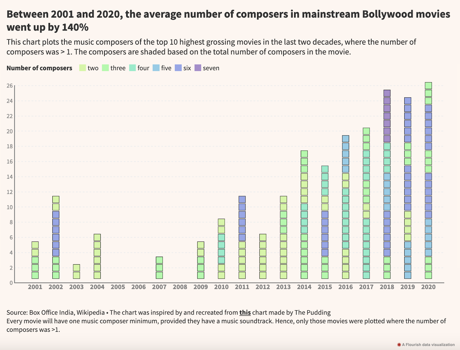
One of my other projects was inspired by the fact that people felt like Bollywood was remaking a lot of old music. I wanted to see how true that is. I also like exploring these projects because I want to make data a bit more fun for us as well. As post-colonial countries, we feel so much pressure to prove ourselves on developmental indicators and we [sometimes] forget to have fun with data.
There are different ways of bringing out humanity. We don't [always] have to bring humanity within our data visualisations. It can also be brought out in people’s responses. In this attention-deficit economy, if you've managed to hold somebody's attention for two or three minutes, I consider that a big win. It can also be an experience that you design for the person, invoking an emotion that was not there prior to seeing the visual.
I love how you said that because at the end of the day, with data visualisation, you're essentially creating a world for them and being like, “Hey, here's what's happening. Come into my world and understand what I'm trying to tell you”.
Precisely. That's why I always feel like my life keeps intersecting. I got such a good response from people on my story about Bollywood remakes. It [spoke] to a larger group of people, as a society. When I spoke to a music researcher, she pointed out the way the physical investment we used to make in listening to songs has reduced. Instead of buying a cassette or CD, you can just tap [into] your Spotify. India has some of the cheapest mobile internet data rates in the world. So we have instant access on Spotify to this world of music, and we get bored of them quickly as well. And it speaks to the attention-deficit economy.
The charts in the story here are fairly standard. But it’s also about the emotion that they invoke in people, where they [think], “I have also felt that and you've quantified it in these terms.” When we speak about bringing in the human aspects, it’s also about doing these stories that can resonate with what people see and feel around them, making data less mechanical.
You’ve done such a wide range of data stories. How do you think your style or approach towards data storytelling has changed over the years?
I studied data visualisation and data journalism in the UK. Therefore, I think I had a very Western [point of view when I looked] at these really complex experiences that are driven by code.
Then I came back to India and I [wanted to] do all of this over here. But our medium of interaction differs a lot. Our internet penetration is primarily driven by mobile, and you cannot [easily] translate all these experiences [onto] mobile. I have actually asked people about this at the Outlier conferences. “How do you think that this can be done for mobile?”
And they [replied], “Can we just forget that mobile exists for a second?”
That's when I realised that we needed to come up with indigenous solutions. Data visualisation in Asian contexts cannot look the same as that in the West. It cannot always be those really beautiful experiences [on the computer screen], [which don’t work as well] on your phone. I think that makes for a very clunky user experience. This has been a major shift for me, [and] I’ve come to appreciate static data visualisations a lot more. That’s something I love about Ashris’s [India in Pixels] work, because it captures that story in one chart. I don't come from a design background, so I'm always pro-simplicity.
One last question for you—you’ve talked about your love for dance and music a lot. Do you have any exciting new projects that blend data storytelling and all these interests?
Not at this time, but I know that it will happen at some point, because I can definitely see the intersections between dance and data. Indian classical dance is based on patterns that are arranged within a particular time frame or a particular beat, with X number of steps which I can map to a data visualisation. Another major point of intersection is through data sonification, because we make [rhythmic] noise as we dance. So in my head, I [can] definitely [see] those connections [forming].