
Data Diaries
First-hand data tips, tools, and a peek into our thoughts on the craft of data storytelling and visualisation.
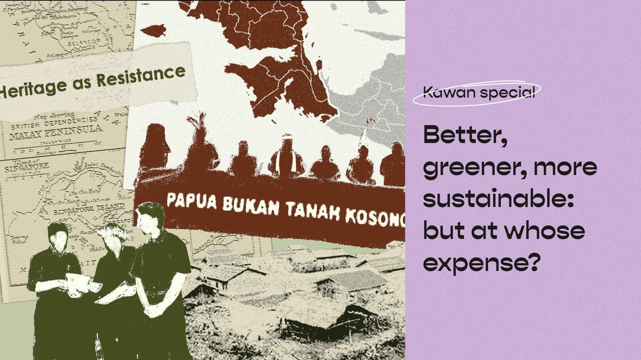
Better, greener, more sustainable: But at whose expense?
We all want a better, greener, and more sustainable future, we also want abundance in agriculture, food production, and natural conservation. But adding the decolonial lens forces us to ask: At whose expense is this better, greener, more sustainable development made possible?
Dataviz in Asia (May 23')
I always joke that working in the field of data storytelling is like attending an eternal university—the learning (and unlearning) never really stops. At Kontinentalist, we're constantly rethinking our approaches to data storytelling, grounding them in lived experiences and contextual understandings. We strive to learn from different
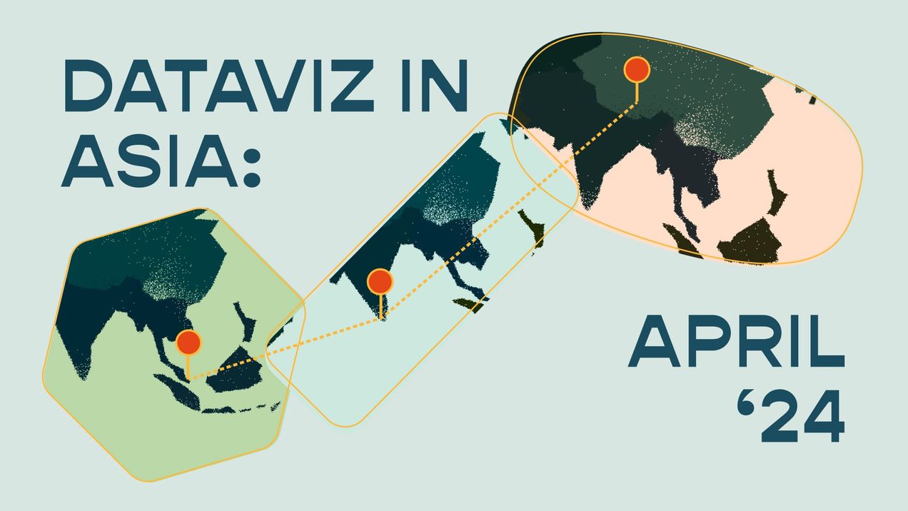
Dataviz in Asia (April 24')
Spring is finally here! As my colleagues Zafirah, Munirah, Michael, and I brainstormed the theme for this issue, we found ourselves drawn to the transient essence of the season in April. It's a time marked by various new beginnings, with festivals such as Ponggal and Songkran happening, and
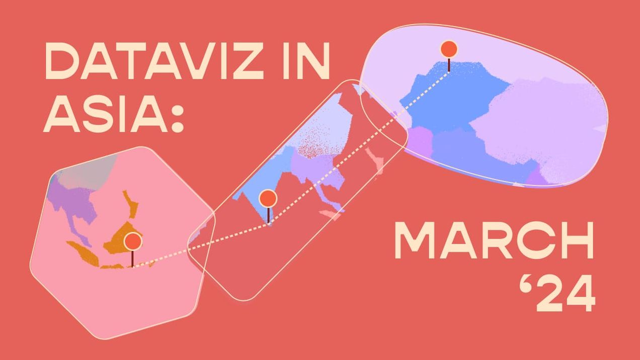
Dataviz in Asia (March 24')
For this month’s Dataviz in Asia, we’re highlighting works by two of our favourite female data viz practitioners. Shirley Wu and Gurman Bhatia both use data to amplify the contributions of women in the arts and entertainment industries. We’re self-professed patrons of the arts here at
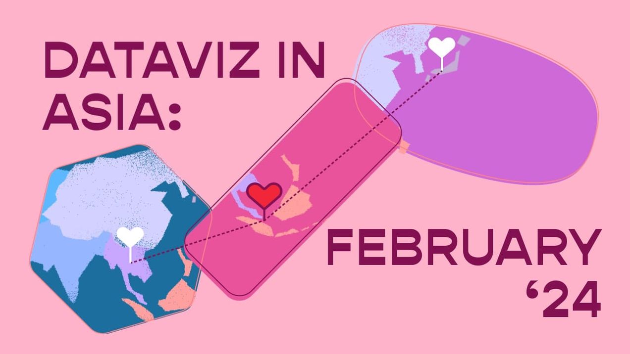
Dataviz in Asia (Feb 24')
Love is in the air this month, and data’s capturing every moment of it. For this issue of Dataviz in Asia, let’s look at all the creative ways that people are telling their stories of love through data visualisations. First, let's explore the epic love triangle
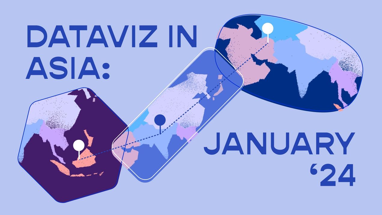
Dataviz in Asia (Jan 24')
Asia has a long history of impactful political and protest movements, a legacy that continues to unfold today. As we navigate through 2024, the biggest election year yet with at least 64 countries set to cast their votes, this month’s Dataviz in Asia spotlights data stories that are helping
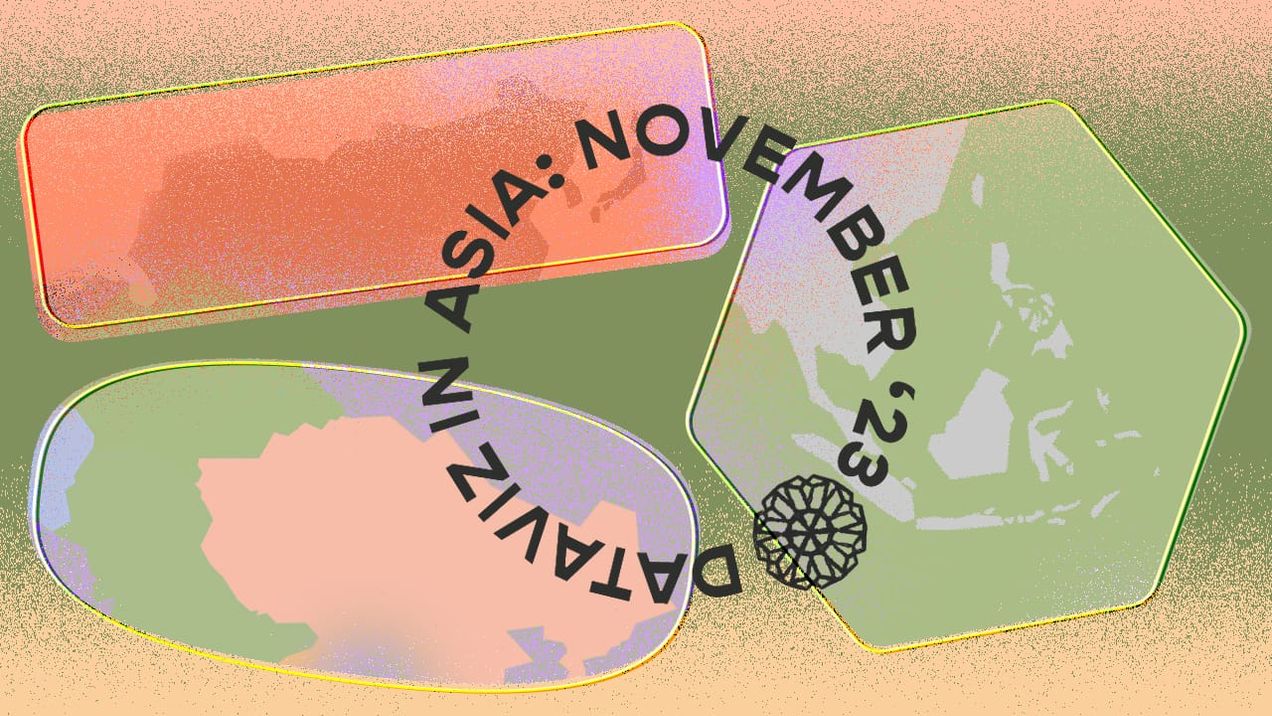
Dataviz in Asia (Nov 23')
This month in Dataviz in Asia, we're diving into stories that show us how data visualisations are powerful mediums used to tell important environmental stories in Asia. Our first highlight is an infographic by Ganesh B Varakale for India In Pixels, spotlighting the alarming levels of untreated sewage
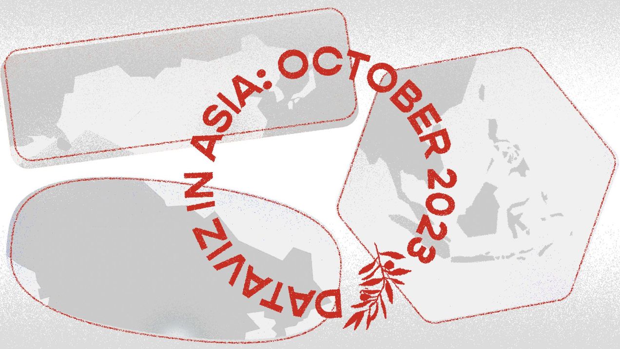
Dataviz in Asia (Oct '23)
Amidst a landscape of misinformation and conflicting reports, making sense of the current humanitarian crisis in Palestine and Israel can be quite challenging. Data has become especially critical in this context. This month we want to highlight some visualisations that are helping us to contextualise the recent happenings, and sieve
Dataviz in Asia (September 23')
In a world inundated with data, making sense of it can feel overwhelming. In this month’s Dataviz in Asia, we look at projects that cut through the noise using striking and immersive data vizzes to reveal important social and cultural undercurrents in the region. South Korean daily newspaper Kyunghyang
🌏 Dataviz in Asia (August’ 23)
Who said data can't be a blast for teens? In this month’s Dataviz in Asia, we’re exploring how people are making data exciting for young people and breaking language barriers to boot! We’re always on the lookout for folks who are putting their own spin
🌏 Dataviz in Asia (July’ 23)
Who’s who in politics, and what are their relationships? In this month’s Dataviz in Asia, we look at how different publications are visualising the often intricate political networks in Asia. Last October, Bloomberg did an amazing interactive on how Xi Jinping rewrote China’s rulebook to build the
🌏 Dataviz in Asia: June' 23
The Society of News Design’s Best of Digital Design 2022 results are out! The largely US-centric awards tend to be dominated by the likes of New York Times and Washington Post, but here are some of our favorites from Asia-based publications that bagged big prizes: * Asahi Shimbun