
Hey! 👋
Welcome to Kawan—our vibrant community of data heads and storytellers. We’re all about improving data literacy and sharing nuanced stories about Asia. Come hang!

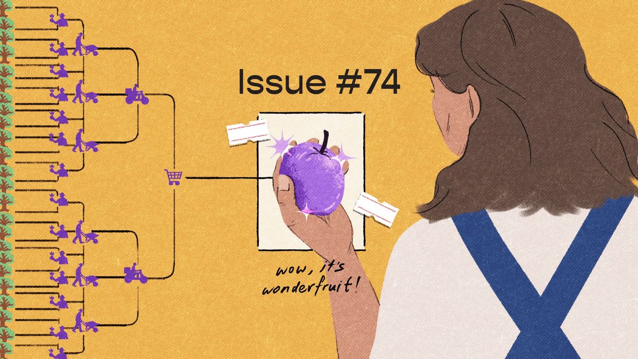
Pluck, pluck, pluck — issue #74
What would you do if you discovered a new resource growing in abundance on your land? What if it comes with a cost? Human behaviour is age-old, and we seem bound to repeat the choices that have echoed throughout history. We ponder access, utility, and the secret calculations we make every day.
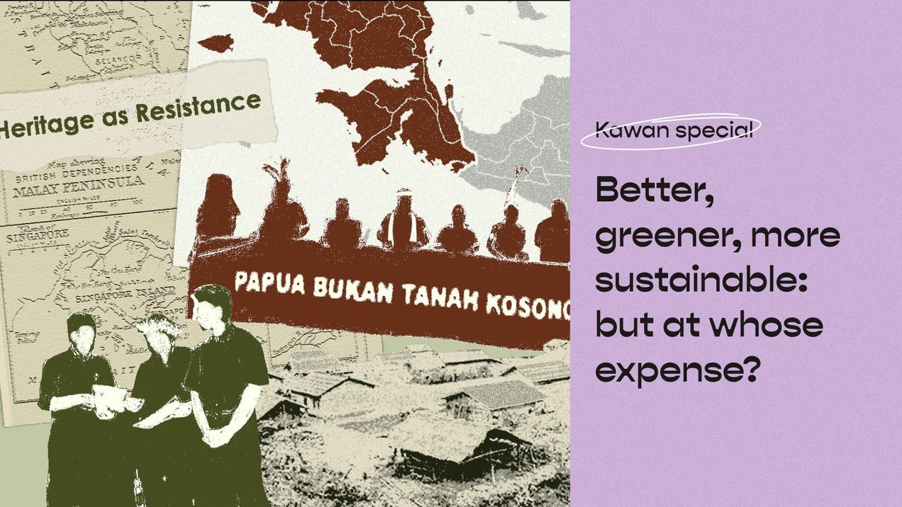
Better, greener, more sustainable: But at whose expense?
We all want a better, greener, and more sustainable future, we also want abundance in agriculture, food production, and natural conservation. But adding the decolonial lens forces us to ask: At whose expense is this better, greener, more sustainable development made possible?
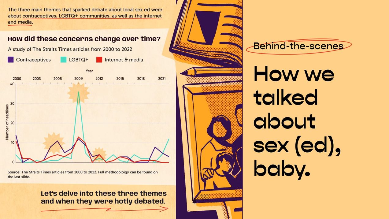
How we talked about sex (ed), baby
We share our process of creating a microstory about the evolution of sex education policy in Singapore over the past two decades, shedding light on its pivotal role in shaping the nation's attitude towards sexuality—and vice versa. We delve into how we collated and analysed over 200

Dataviz in Asia (Feb 24')
Love is in the air this month, and data’s capturing every moment of it. For this issue of Dataviz in Asia, let’s look at all the creative ways that people are telling their stories of love through data visualisations. First, let's explore the epic love triangle

Love in Singapore: When the third-party is the state
There is a longstanding quirk associated with getting married in Singapore. Instead of proposing to their partner, a Singaporean might ask, “Wanna get BTO?” This entails applying for a public Built-To-Order (BTO) flat under the government’s Fiancè/Fiancèe scheme. It’s a balloting process, as BTOs are
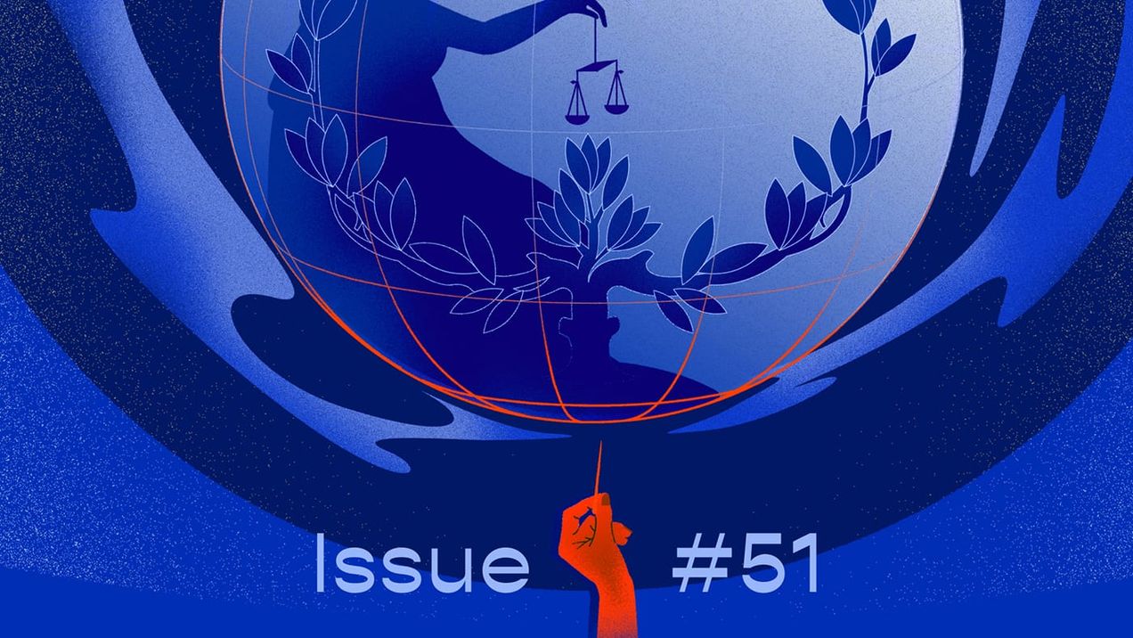
Popping our bubble of convenience — issue #51
Last April, I met a Ukrainian journalist at the International Journalism Festival in Perugia, Italy. I thought my near-20 hours of commute to Rome was long, but she had travelled 24 hours to be there despite hailing from the same continent. What struck me was her steadfastness. Despite how

Meet the Community: JP Campos
JP Campos is the founder of Media Commoner, otherwise known as Commoner, a social media-first independent media organisation based in the Philippines. He is also a Multimedia Executive Producer at Provill Studios, a Manila-based film production agency. Amidst a transformative year, JP contemplates the evolving responsibilities of storytellers
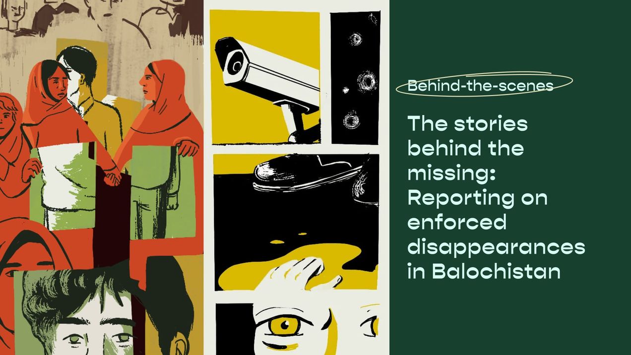
The stories behind the missing: Reporting on enforced disappearances in Balochistan
Our latest piece, written by freelance journalist Somaiyah Hafeez, highlights the silent epidemic of enforced disappearances in Balochistan. A stealthy, routine occurrence across Pakistan, disappearances are particularly rife in the country’s marginalised province. In this inside look at the story, Somaiyah shares her experiences covering this issue as a

Dataviz in Asia (Jan 24')
Asia has a long history of impactful political and protest movements, a legacy that continues to unfold today. As we navigate through 2024, the biggest election year yet with at least 64 countries set to cast their votes, this month’s Dataviz in Asia spotlights data stories that are helping

Boycotts: A call for connection — issue #50
Recent calls to boycott have got me thinking about how intricately connected we are to each other. Each day, I depend on my iPhone to get updates on what goes on in the world, and communicate with family and friends miles away. With digital media, I have easy access to

The answers don’t lie in biodegradable bullets — issue #49
Did you know that military-related emissions aren’t subject to international climate goals? I didn’t, until recently. Countries have been rushing to meet their climate goals. Most of their efforts centre on energy transition, economic re-prioritisation, and sustainable development. But the quest for reduced emissions and clean

Dataviz in Asia (Nov 23')
This month in Dataviz in Asia, we're diving into stories that show us how data visualisations are powerful mediums used to tell important environmental stories in Asia. Our first highlight is an infographic by Ganesh B Varakale for India In Pixels, spotlighting the alarming levels of untreated sewage
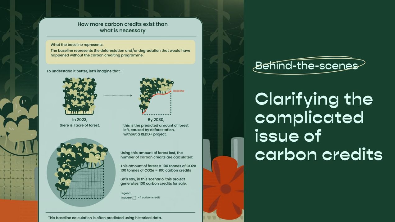
Clarifying the complicated issue of carbon credits
In this article, we share our process of creating our data-driven explainer about the voluntary carbon market and Singapore’s role in it. We break down how we turned a large and complex concept into a more digestible piece. This story was written in collaboration with the Earth Journalism

Girlmossing 101: A Beginner’s Guide
The term “girlmossing” may have surfaced on the internet just a couple of years ago, but I’ve been embracing this lifestyle long before it had a name. Girlmossing, which is a play on the word “girlbossing”, refers to women making intentional time and space for rest, joy, and self