
Hey! 👋
Welcome to Kawan—our vibrant community of data heads and storytellers. We’re all about improving data literacy and sharing nuanced stories about Asia. Come hang!

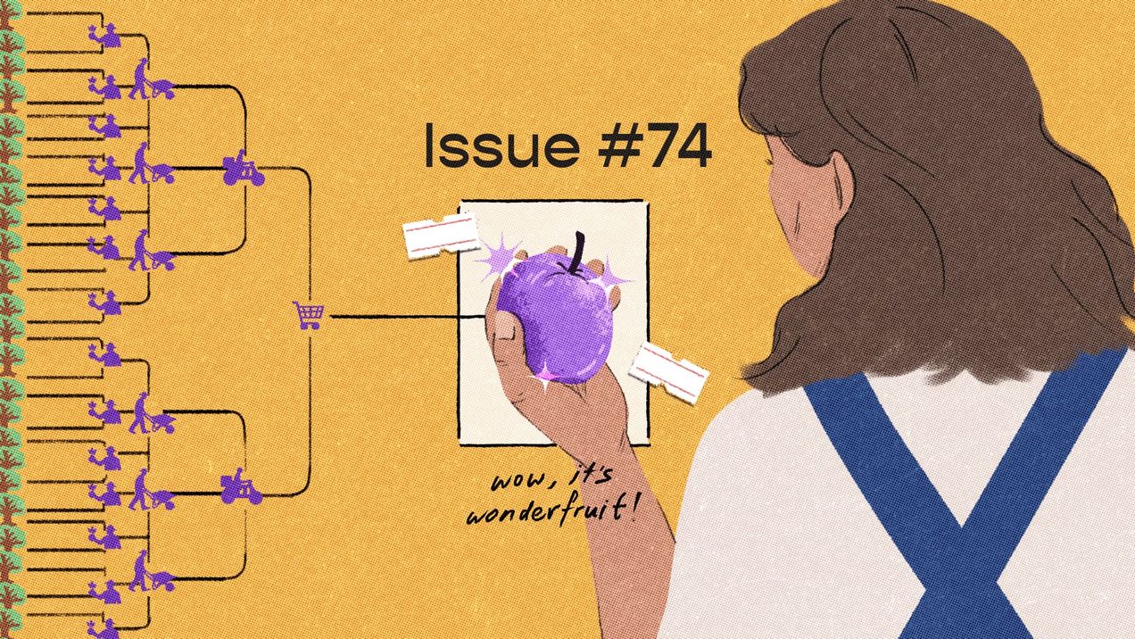
Pluck, pluck, pluck — issue #74
What would you do if you discovered a new resource growing in abundance on your land? What if it comes with a cost? Human behaviour is age-old, and we seem bound to repeat the choices that have echoed throughout history. We ponder access, utility, and the secret calculations we make every day.
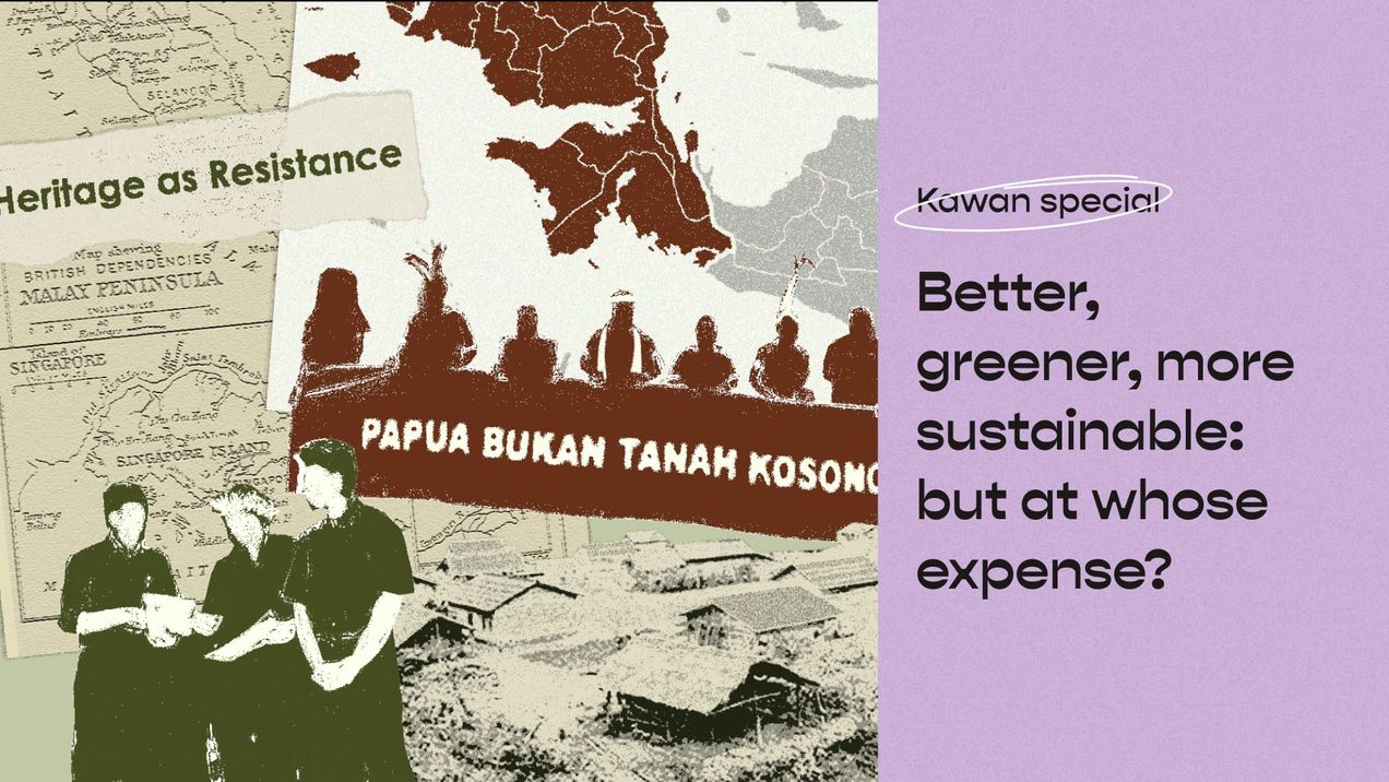
Better, greener, more sustainable: But at whose expense?
We all want a better, greener, and more sustainable future, we also want abundance in agriculture, food production, and natural conservation. But adding the decolonial lens forces us to ask: At whose expense is this better, greener, more sustainable development made possible?
Localising climate change — issue #26
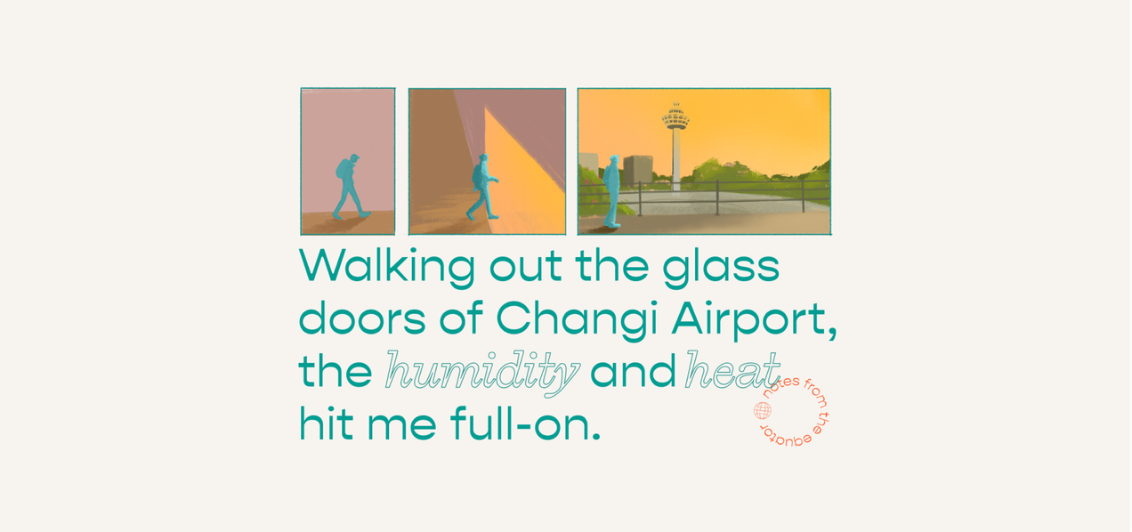
It was 2017, and I had just landed in Singapore after five years living in the United States. The thick afternoon air embraced me, then tried to squeeze the very life out of me. Welcome home, indeed. It took me months to get used to the tropics, but a thought
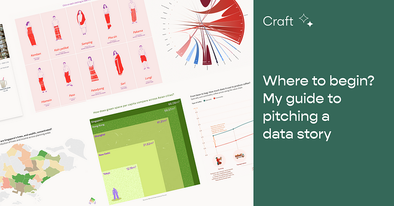
Where to begin? My guide to pitching a data story
I’ll be honest — three years in the field of storytelling/journalism has not made me much more confident about pitching stories than when…
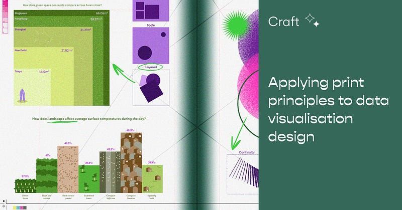
Applying print principles to data visualization design
How can data viz design benefit from design theories like the Gestalt principles?
Meet the Community! Jane Zhang, data viz designer and e-commerce strategist
Jane Zhang is an independent data visualization designer based in Toronto. She’s made a name for herself with her recognisable static…
The might of small things — issue #25
When I was reading history many years ago, microhistories were one of my favourite topics. I love understanding how small things, like folklore and fairytales, reveal a lot about our past. Eventually, I wrote my Honours thesis on Singapore's national day stamps. I got a lot of laughs
Kontinentalist: Insights from user research and translating it into our new website
One fine day in mid-2019, a little more than a year after Kontinentalist first launched, some of us sat down to discuss what was in store…
Kontinentalist: Navigating our new editorial vision
Last week, Pei Ying shared how we’ve rebranded from a map-driven studio to a data-driven storytelling studio… with a fresh new look to…
Introducing the new Kontinentalist!
Hey! You've been part of our story ever since you first laid eyes on our stories—and we wanted to share with you what's been going on with the recent changes on our end. Kontinentalist has now rebranded into a data storytelling studio...with a fresh
We abandoned Wordpress to build our own CMS
Let Dylan and Rifqi, our Lead Developer and Full-stack Web Developer, tell you why. Abandon ship! To answer why, let us travel back in time to when Konti started, as Peiying mentioned in her article on our rebranding. In the early days of 2017–2018, most of what we
Fashion that goes beyond the surface — issue #24
Fashion isn't exactly my strong suit. Almost everything in my closet is Uniqlo—yes, it's the same boring t-shirts and shorts hanging in yours, let's be real my friends. It's cheap, simple, and good enough. But this also means I know
Kontinentalist: A fresh new look, and why we rebranded
We’ve given Kontinentalist a makeover!! Gone are the beige-brown days, and here are the purples, oranges, and pinks.
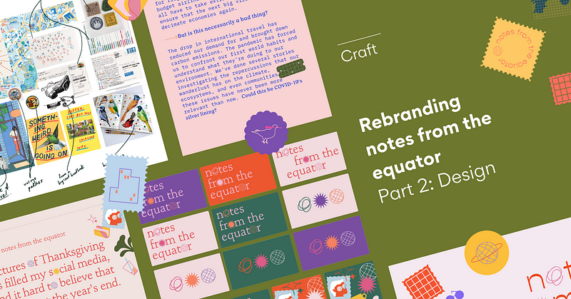
Rebranding notes from the equator (Part 2: Design)
Hello again! In this second post about our rebranding of notes for the equator, our visual designer Munirah spills the tea about…