

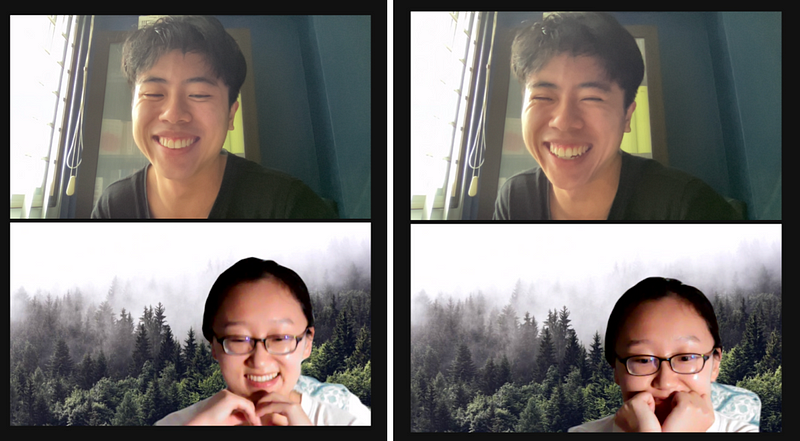
Meet the Community! Catherine Ma, Communications PhD student at University of Miami
We’re excited to bring you our first interview of our Community initiative! Launched in late February, we’ve been hungrily scouring the…
We’re excited to bring you our first interview of our Community initiative, launched in late February! We’ve been hungrily scouring the globe for cool people connected to Asia who are doing data work. Since then, we’ve chatted with some brilliant folks who have kindly lent us their time — and we’re proud to share our first: Catherine Ma!
Catherine is currently a PhD student at the University of Miami, under Alberto Cairo’s supervision. A native of China, she graduated from Tianjin University with a BSc in Mechanical Engineering and a Master’s in Interaction Design. She then worked at Xinhua News Agency, China’s biggest media organisation, as an information designer and product manager of data visualisation products. Multi-talented, Catherine sketches, writes, codes, plays the piano, does taekwondo, and more. She shares her insights about the exciting data vis scene in China and her optimistic view of the potential of data vis in Asia.
How did you get into data vis?
I’m a pretty multidisciplinary person. Can you imagine, for undergrad I did mechanical engineering (industrial design track) at Tianjin University, where we learnt some design and programming. I then went to study Interaction Design [as a Master’s] in 2013, also at Tianjin University. Then, I had two chances that led me to data vis.
- In my first year of grad school, I got to study information design in Korea University, which is one of the capitals of design. At that time, info design was more about static design like infographics and charts, with less interactive elements. I just got really interested in it because I found data vis to be of a higher-level graphical display, because it delivers such rich information.
- In 2015, I went to Nanyang Technological University in Singapore for half a year, to learn human computer interaction (HCI). But it was more about back-end programming and design evaluation, not so much designing data visualisations itself, which I prefer.
So, this was the first step. The initial motivation that drove me into the data journalism field: I was inspired by a Korean TV soap opera called Pinocchio. It talks about the current state of journalism in Korea, where journalists fight inequities and reveal “dirty” social realities. The lead actor and actress were my favourites, so I got really excited about that kind of responsibility. And I love writing and design and data vis, so combining them together brought me to data journalism. Most of my classmates choose to work in internet companies like Baidu and Alibaba Group, but I chose to work in the media industry instead, at Xinhua News Agency as a product manager of information and data visualisation products — this allowed me to get into this field.

Looking at your portfolio, I see a lot of work that has been produced by a team. What kinds of roles did you play?
In most of the projects, I was the project manager; sometimes, I was the writer and designer. It was only for the tiny projects (e.g., one-page things like solo projects) that I’d be doing all three (writing, designing, developing).
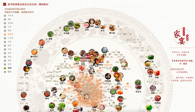
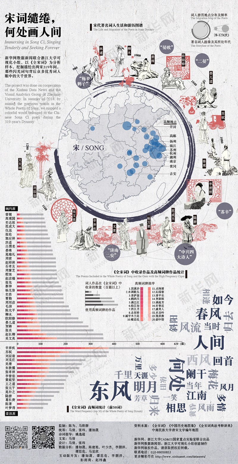
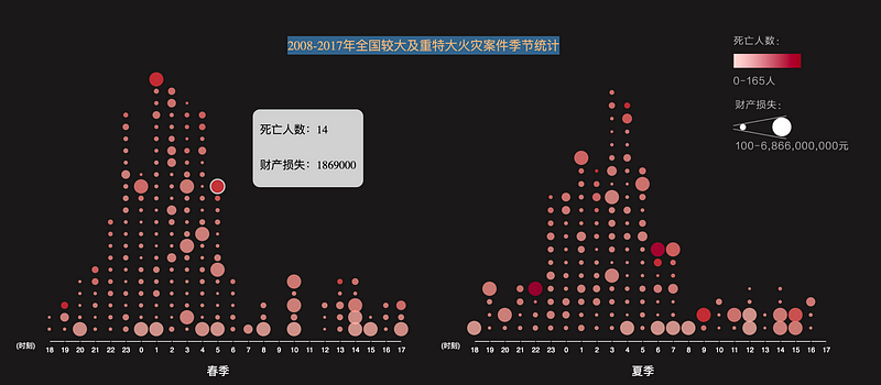
A snippet of her works (with some screenshots below):
A. Catherine did these projects in collaboration with others; some she designed for, some she helped to code
- Chinese Spring Festival Feast
- Song Ci: Infographics version and Interactive version
- Fire hazards
- One night in Beijing
- Variety shows
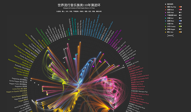
- Pop music evolution
B. These are Catherine’s solo infographic projects
- China Story
- Hong Kong-Zhuhai-Macao Mega bridge
- Jurassic world
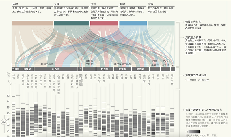
- The body for competing
- Industrial designers
How do you see your work going forward? For example, Kontinentalist specialises in data visualisation and storytelling, but our stories have lots of multimedia elements too. Are you interested in going in this direction?
I’m broad and open to multimedia storytelling. My original major is design, and I can illustrate and play piano too. For one of my works — the Chinese Spring Festival Feast — I played the background music. I’m trying to find new forms of data storytelling; because of my design major, I see all information as data, no matter whether the information is image or sound or textual things — they’re all, broadly speaking, datavis to me.
Do you have topics that you especially love to do datavis work on?
Currently, I’m interested in specific topics like Western classical music, so I’d love to visualise Mozart’s work. I love Asian history, not just Chinese history, so I want to find specific and unique perspectives to connect all history together, for example, food or language — and Asian art too. I’m interested in Asian colours; colour is really unique to distinguish Western and Eastern art. I’m trying to find specific regional explanations, then level up to extract meaning to relate to real-life and society.
Separately, I love writing; I want to be human, so I want to write critical or explanatory essays in accessible language to build connections between abstract knowledge and the real world, in both Chinese and in English. These are things I just do for myself, not for my work.
Currently I’m writing a small essay in Chinese about olfactory memory. Do you have this experience of smelling something which brings you back to a familiar situation? My essay explains why, using metaphor, and discusses phenomenology. It’s the study of how your past memory constructs yourself. So it’s about a scientific topic, which I then relate to yourself.
We should say thank you to our olfactory memory, because it helps us to remember the past in an intuitive and colourful way, like the smell of your hometown you’ll never forget and it lets you go back to your past self. And to remember the past is to grow up. From a scientific topic to a values and philosophical level — I love this kind of stuff.
I’m curious about your choice to pursue a PhD (2019–23). Why choose to do a PhD?
In a way, I’ve been preparing for it for the past ten years. I started to take the TOEFL test when I was a junior in undergrad, because I already knew I wanted to go into a PhD program — but at that time it was in industrial design rather than data vis.
I come from a teachers’ family. My aunt and uncle, they’re all PhD-holders, so higher education was encouraged. I also excelled academically, where I had the best grade in undergrad.
Although I received PhD offers after graduating from my Master’s, I wanted to work for financial reasons. At that time, I also didn’t know how to orient my focus; I loved info design, data vis, and design, but I didn’t like the design evaluation. I liked the [design] production part — which, actually, not many PhD programmes offer.
So you wanted to do a PhD from very young, influenced by your family, but deferred it to go work first. How then did you choose to do your PhD at University of Miami? Was it because Alberto Cairo was there?
Yeah, because of Alberto Cairo for his info design production. I’ve been talking to him since 2016, asking him questions about his book, data visualisation, and my indecision about PhD applications.
He’s an open advisor, interesting, and very different. Dr. Cairo always explains something in an easy way. During my ten years of PhD application, I’ve talked to many professors, and many of them want to make an easy thing into something difficult. But Dr. Cairo is the opposite. When I first met with him in Miami, he said to me, “Before you can be a scholar, you have to be a human.”
Whoa, that’s profound! So, what’s your PhD about? What do you hope to achieve by the end of it?
My PhD’s broad major is communication, related to social science or psychology. But my research focus, the broader one, is visualisation communication — using data vis to communicate info. My specific research focus and dissertation topic is the decision-making in narrative visualisation produced by alternative media organisations.
Can you “do a Dr Cairo” and explain to me in simple terms what decision-making about narrative means?
Decision-making production [is] where professionals produce the story, and during this process [they]meet lots of problems, like what kind of topic we’re going to have. We have to balance lots of constraints and then make a decision, either choosing one data resource or topic or person to be interviewed. Finally [we must choose] which channel we’re going to publish this story with.
Because I’m a qualitative researcher, my ultimate purpose is to extract value… I will start with the dynamics of production in newsrooms and how they make decisions about problems that arise, and then I’ll investigate why they make these decisions and balance these constraints. I’ll describe these values and relate them to aesthetics and epistemology or ontology.
I’m supposed to be a scholar, so the result [of all this] is a word document. And besides that, I’m preparing for a book to emerge from the dissertation, which will explain production in alternative media.
I’ll examine the dynamics of production in newsrooms, how they make decisions about problems that arise, and then I’ll investigate why they make this decision and balance these constraints (e.g., choosing one data resource or topic or person to be interviewed, and choosing which channel to publish the story in). I’ll describe these values and relate them to aesthetics and epistemology or ontology.
What exactly motivates you to do data vis?
Data vis, for me, was a way of combining journalism with my educational background. But in my personal identity, being a“designer” has always been first; even when I become “Doctor Ma” maybe two years later.
What is it about design that makes you so alive?
First, it’s the desire to create. I love complex things, and with design you can satisfy that because you have to balance different constraints and communicate to clients and know their needs. Every time I design a new thing, I have to get into that professional field and background knowledge of that product, and this process of learning new things always makes me feel excited.
Another thing is that I’m a very sensitive person, or good at being empathetic. Whenever I create something and someone says it’s impressive, I feel very happy.
What tools and resources do you find most helpful? I know from your CV that for info design you use Adobe Suites, Tableau, D3, R, 3D modelling, Rhino Cinema, Keyshot, HTML, CSS, Javascript, Python, etc. Do you use any one more than others?
Excel, Tableau, Photoshop and Adobe Illustrator are my most used ones. Rhino, Keyshot, and so on are only for 3D projects. For programming languages, I love Javascript because I love front-end development, as I love interactive storytelling. I can use Python, but I seldom use it.
What was your self-learning process like?
I work from 8am to 5pm. I’m someone who’s quite socially anxious, so I don’t do social connecting stuff like parties. So once I go home I play the piano everyday. Then I’ll spend two to three hours each day learning. I started with front-end HTML, CSS, and Javascript. Before learning coding, I learnt CATTI (China Accreditation Test for Translators and Interpreters) because I love interpretation, and I also read books on art, history, philosophy, or sociology. No matter what, I will do 2–3 hours of learning every day. I love sports, because I used to be a taekwondo athlete. Even now I spend an hour doing sports everyday.
There are some resources to learn coding like Mozilla Developers Network and Stack Overflow. I took a lot of tutorials like Free Code Camp; Github, Full Stack Python, W3C, and one book called Eloquent Javascript.
I took about half a year to build my first thing. It was a one page interactive storytelling. It wasn’t data visualisation it was a general media product, very simple. It’s already been retracted now though, because it’s been five years.
How did you make the transition from learning to doing at work?
After I’ve learnt enough, I told my colleagues, and they let me do some coding; this process took about 1.5 years, and I didn’t have that many chances to do so because my newsroom had professional developers to do that work.
What kind of challenges are there in doing data vis in China?
Firstly, as with all over the world, there’s the challenge of getting good and comprehensive official datasets. Secondly, there’s some insufficiency in data resources. There exists http://data.stats.gov.cn/ — the biggest government data website run by the Chinese government. The database contains every general basic indicator about Chinese development and population, environment, economy, etc. And an open government program (政府数据开放; Zhengfu Shuju Kaifang) exists, but its development is imbalanced between different parts of China. In major cities like Beijing and Shanghai, you can get access to clean data resources on government websites, but maybe not in other areas, such as provinces and smaller county levels.
Data vis and data journalism relies on data — what kind of data sources did you use, especially as you often do cultural data stories on, e.g., pop music or variety shows. Do you reach out to other kinds of organisations like research institutes or private companies?
I collected my own data or I referred to company or research data. For example, for the Chinese Spring Fest story, I collected data myself using Python from a major recipe website. For variety shows, there’s this website, Dou Ban, and I used a Python crawler to collect all the variety shows. I then cleaned the data with Python, too. For the story about nightlife in Beijing, where there’s a heat map showing human activity at night in Beijing, we cooperated with Didi Chuxing, who provided the data for this.
So, aside from Caixin Vis Lab and Xinhua, who are the main players in data vis in China, including non-news organisations?
Caixin is superb; it used to be led by Ms. Chen Huang (黄晨), now it’s led by Ms. Meng Wei(韦梦). There are others like Pengpai and Wangyi. Pengpai (澎湃美数课 (peng pai mei shu ke) is led by Ms. Yan Lü (吕妍), who studied in the US and is a really good journalist; it’s national, located in Shanghai. Wangyi (网易数读 (wang yi shu du) is led by Mr. Yusong Wu (巫雨松).
What about industry? Like in the USA, you may have New York Times and ProPublica, but you also have The Pudding and Pitch studios and other studios/agencies, in addition to freelancers. Is it the same in China, and what are their skills like?
Yes, I want to add two. They are all private data visualization studios. One is Shu Ke Shi (数可视), which was established in 2016 by Mr. Zhimin Huang (黄志敏). The other is Di Shu Ju (镝数聚), which was also established in 2016 by Ms. Qiong Wang (王琼). They are quite popular, and two of a handful of studios in China that possess all skills — writing, design, development — to produce these kinds of data stories.
For freelancers, there’s actually a platform for them in the popular app Weixin (WeChat) to publish their own data stories.
There’s quite a diversity in skill sets. Some freelancers with a data science background produce insightful data analysis, but the design is bad. Some of the studios are video-making professionals who want to do short videos for data vis or motion graphics; so they use only simple data and visualise with bar and line charts. Their video is beautiful, even if the data analysis isn’t very insightful. There are also data artists, combining data vis and digital media art, like Mr. Yuan Ren (任远).
How is data visualisation received by the general public in China?
Data journalism was introduced in China around 2012 or 2013; at that time, the basic epistemology of data journalism was infographic or beautiful charts. Xin Lang (新浪) and Sou Hu (搜狐) are giant internet companies in China; they launched the first two data journalism studios. Charts as a form of data journalism in China is not popular. In English, a lot of news is produced with quantitative methods and the audience may be used to reading news with statistics. But in China most of the people don’t read English and most of the Chinese news is composed of text and maybe images or videos.
Chinese audience’s data literacy levels vary. The general public don’t like to read data visualisation. They like to read quick news telling you what happened in one sentence. For datavis you have to take time, you have to know the basic knowledge about statistics and find outliers and identify trends and generate your own results, then read the journalist’s interpretation. You have to think deeply when you read data journalism.
What about simpler datavis like bar charts and line plots — are they still too unfamiliar to be popular?
Simple charts are popular. Many things contribute to increasing the level of Chinese audience’s data literacy. Internet companies use simple charts and visualisations to show user data. A lot of mobile applications like sports apps have to collect and visualise user data. And lots of people use these apps, so they learn to read simple visualisations. Another reason is COVID-19: data visualisation is used to show confirmed cases and death rates, so now people are getting used to reading statistical news.
Most data journalism stories are shared among a higher-level audience like commercial professionals or people with an overseas background or Masters/PhD students — people who like high-level reasoning articles.
Do you think you’ll return to Asia after your PhD?
90 percent very likely I will go back to China. I want to be closer with my parents. I’m also thinking of Singapore!
Do you see a lot of growth and opportunities in the data vis field and information design happening in Asia?
In China, data vis (as a broad concept) is a rising field, especially after COVID-19, people are aware of data vis’s contributions in general. If you want to work in this industry, there’re these basic positions: writer/data editor, product manager, information designer, and developer. In academia, there’s faculty, in journalism or computer science or in the design department. I heard there’s several research centres in the industry as well; you can be a scholar and don’t have to teach, just research. These are the kinds of opportunities I see for me.
So you’re excited to return to this growing field and are excited to shape how this field is going to go because it’s so new?
Yep. And when I was in Singapore I wasn’t quite in the media perspective, so I don’t know at that time if there were many chances to be in industry in Singapore. I only knew to be a faculty member in NUS or NTU, etc. But I think Singapore is very special in its location [to be able to] provide special opportunities for data vis in Asia.
Why do you think it’s special?
It’s my feeling. When I’m in Singapore I see so many different ethnicities and different types of people. Singapore is pretty small, but there’s so much tolerance; whether you speak English, Chinese, etc., or if you’re from Malaysia or Indonesia or India — everyone can work together. On the basis of this cultural context, you can expect different kinds of chances and info from all over the world. People in Singapore are less insular, look outwards, and are open-minded and tolerate different cultural strains — and I like that. Data vis needs to grow in this kind of environment, because data visualisation is literally, like, a way of archiving human civilisation in this era. Because previously we record everything with words, but in this era it’s data. Data vis is a way to record info and deliver info.
After the interview, Catherine kindly emailed me more information:
Most data journalism people in China that I know are all enthusiastic, smart, and creative. This field in China is small but diverse and evolutive, widely connected with many other fields. Some of the people you may be interested in:
- Two more distinguished scholars doing data visualization and communication are Professor Qiong Wang (王琼) from Wuhan University, and Professor Wei Chen (陈为) from Zhejiang University.
- Professor Jie Fang (方洁) is a data journalism professor at Renmin University. She is running the best student data journalism studio in China.
- Jiaxin Liu (刘佳昕), who is one of the top data journalists in China and Dr. Cairo’s master’s student. She used to be a data journalist in Caixin and now works for CCTV, running a data journalism team. She is amazing.
Stay tuned for more features like this, and let us know of people you’d love to see here!
If you know of anyone who might be a good fit to be interviewed (yourself included!), read our guidelines and reach out to me at mick@kontinentalist.com :)