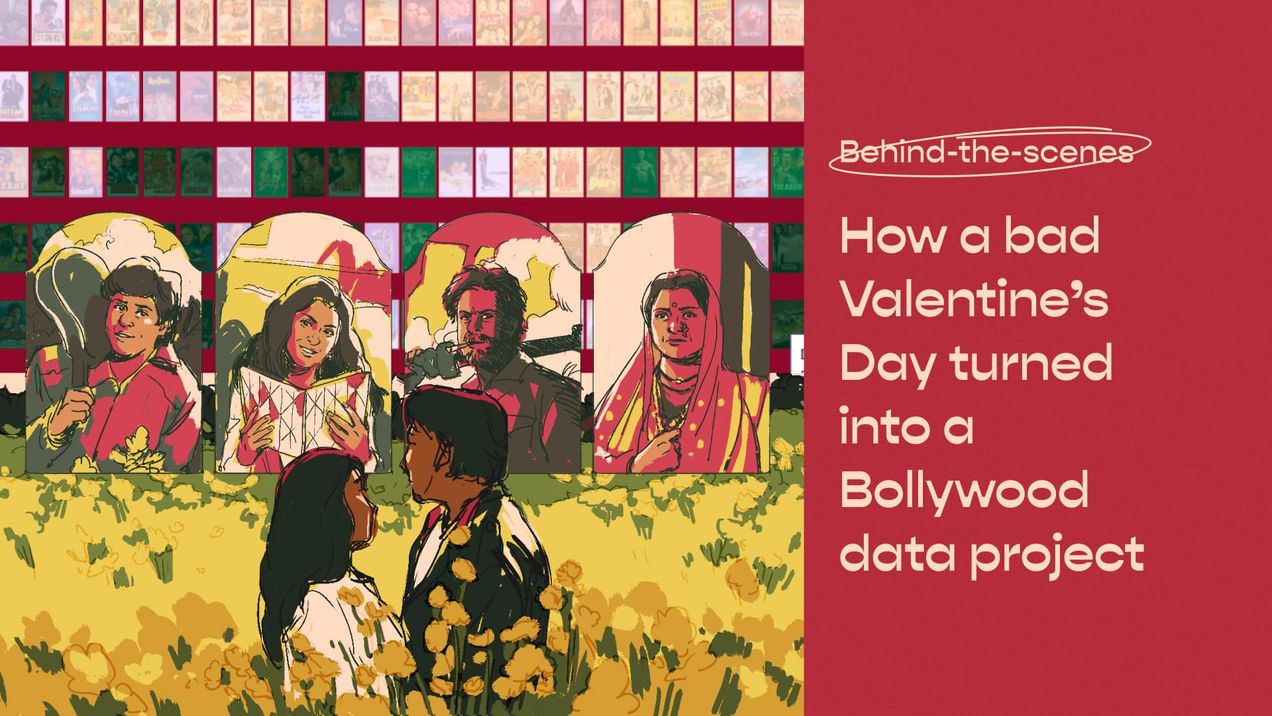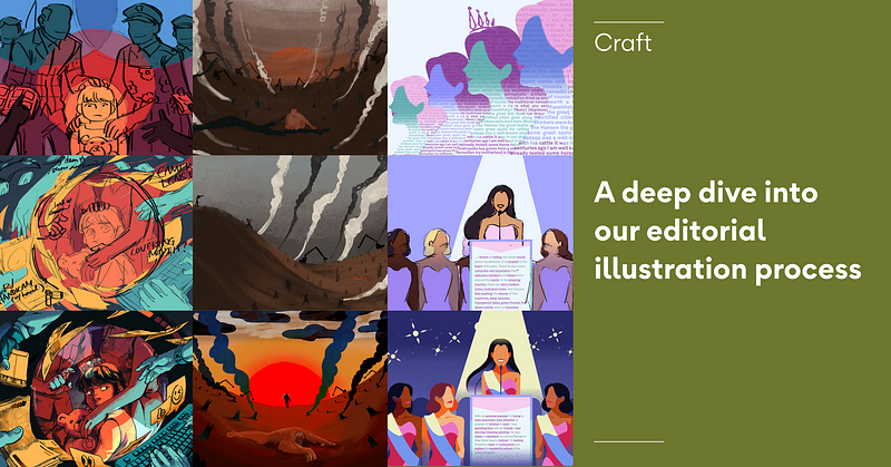
A deep dive into our editorial illustration process
Let me share with you how we came up with our editorial illustration direction and workflow — and what we learned along the way.
So, if you’ve been following Kontinentalist for a while, you may have noticed that we’ve been doing more illustrations lately.
At Kontinentalist, we don’t do data journalism in the traditional sense — merging data with on-the-ground news reporting. Instead, we tell evergreen stories in Asia with a personal touch to our writing, design, and data visualizations. Editorial illustration is used to support our stories in some ways other media can’t: we use it to show qualitative data, imbue creativity and flair, or portray sensitive topics, just to name a few.
Let me share with you how we came up with our editorial illustration direction and workflow — and what we learned along the way—in my role as a multimedia designer.
Editorial illustration workshop: key takeaways
We have used illustrations before in our stories, such as in Bella’s story on instant noodles obsession and Naomi’s story on ghosts and monsters in Asia. But as we honed our storytelling skills and became more ambitious with our projects, we decided to start creating proper guidelines for it in the middle of last year.
To help create the guidelines, we first had an internal workshop (attended by the editorial team and me) where we talked about our editorial direction and how we can create more meaningful and effective illustrations to support it.
Here are the key takeaways:
Searching for a purpose… in our illustrations
If there is one thing we always want to avoid in our data visualizations and illustrations, it’s for them to be superficial and used only as decorations. We have to know what we want to achieve with them.
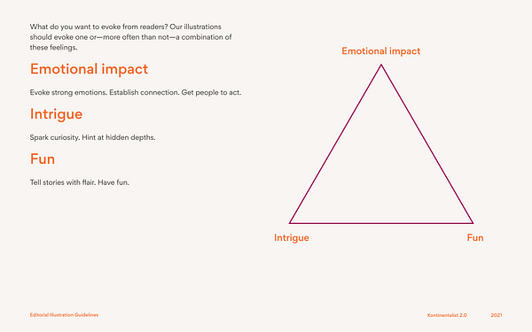
There is no set of universal guidelines for doing this — each team and art director has its own method. What has worked for us so far is to aim for a combination of these three main aspects. Each story emphasises them to different degrees, and we’ve put them in a triangle to aid us in placing our stories.
- Emotional impact
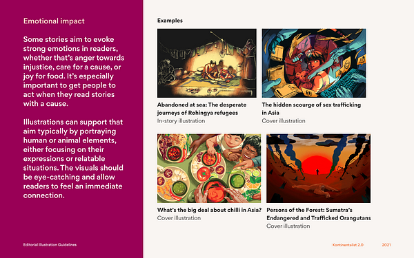
Some of our stories aim to evoke strong emotions in readers, whether that’s anger towards injustice, care for a cause, or joy for food. This is especially important when you want to get people to act. - Intrigue
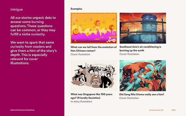
All our stories unpack data to answer some burning questions. These questions can be common, or they may fulfill a niche curiosity. We want to spark that same curiosity from readers and give them a hint of the story’s depth. - Fun
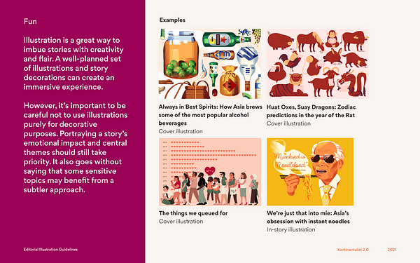
Illustrations are a great way to imbue stories with creativity and flair. A well-planned set of illustrations can create an immersive experience. However, it’s important to be careful not to use illustrations for purely decorative purposes, and to take the story’s context into consideration before adding too much flair.
Of course, after nailing where the story falls within these different types of purpose, we further shape the illustrations and create specific prompts for each story, which we explain later.