
Hey! 👋
Welcome to Kawan—our vibrant community of data heads and storytellers. We’re all about improving data literacy and sharing nuanced stories about Asia. Come hang!

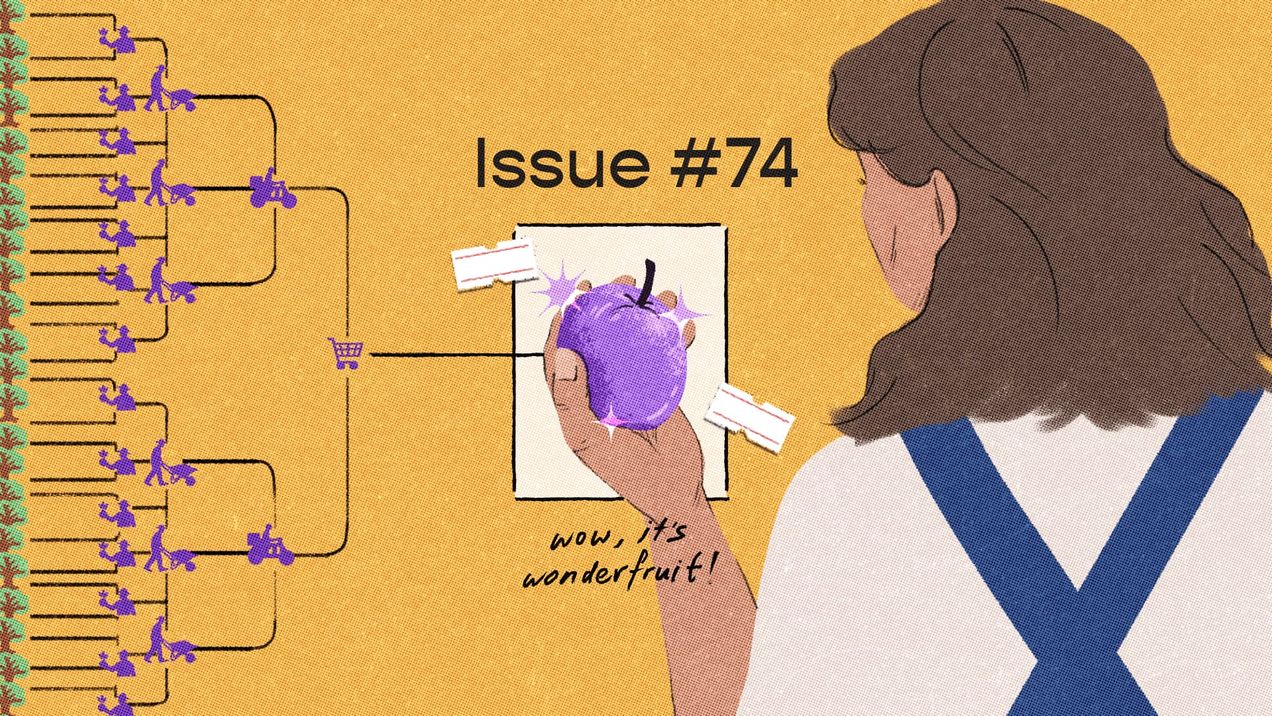
Pluck, pluck, pluck — issue #74
What would you do if you discovered a new resource growing in abundance on your land? What if it comes with a cost? Human behaviour is age-old, and we seem bound to repeat the choices that have echoed throughout history. We ponder access, utility, and the secret calculations we make every day.
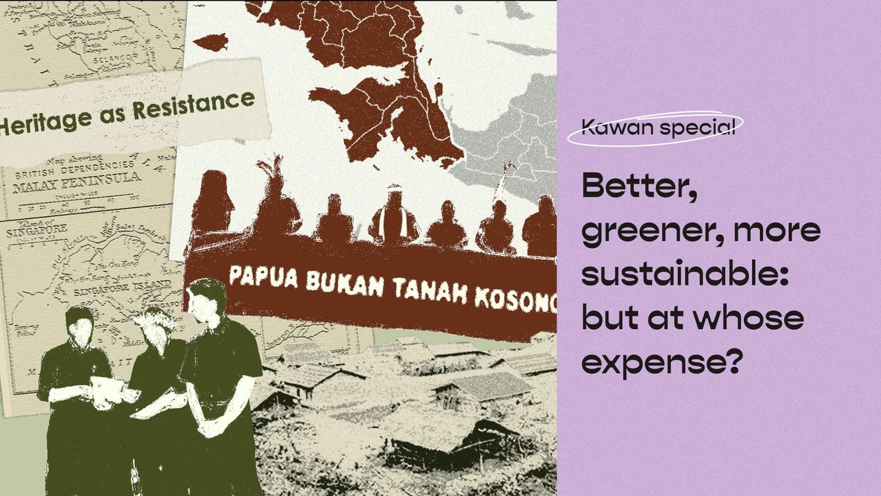
Better, greener, more sustainable: But at whose expense?
We all want a better, greener, and more sustainable future, we also want abundance in agriculture, food production, and natural conservation. But adding the decolonial lens forces us to ask: At whose expense is this better, greener, more sustainable development made possible?
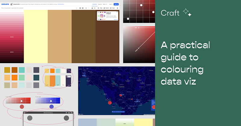
A practical guide to colouring data viz
There are lots of resources out there explaining things like colour theory, but knowing the theory and executing are 2 very different…
Off the gr
I can’t write anymore because of social media. Okay, more like, I don’t write anymore because of social media.

We don't need crystal balls to foretell our future — issue #28
For most of us, the future is a scary place. We're on a one-way ticket there, but we don't know where we're headed—or when we'll reach our station. It's unknowable by definition, and it's unnerving. I&

Meet the Community! Ashris Choudhury, India in Pixels creator
Ashris is a software engineer who studied architecture at university, before going to MIT Media Lab and Hindustan Times, and is currently…
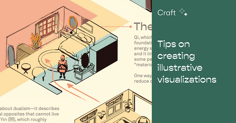
Tips on creating illustrative visualizations
We produce many cultural data stories at Kontinentalist. As such, we may take a more illustrative approach for various reasons, such as…

Humans of Kontinentalist: Bianchi Dy
A researcher in data visualization, artist, and programmer, Bianchi has been helping us bring to life countless stories with her manifold talents! An incessantly curious person, we pick her brain about all sorts of interesting things. Check out our chat with her and her portfolio. What have you been doing

A cheeky guide to working at Kontinentalist
Job hunts are called hunts for good reason. They’re tedious, and when you’ve been at it for a while, stalking for good game and summoning…
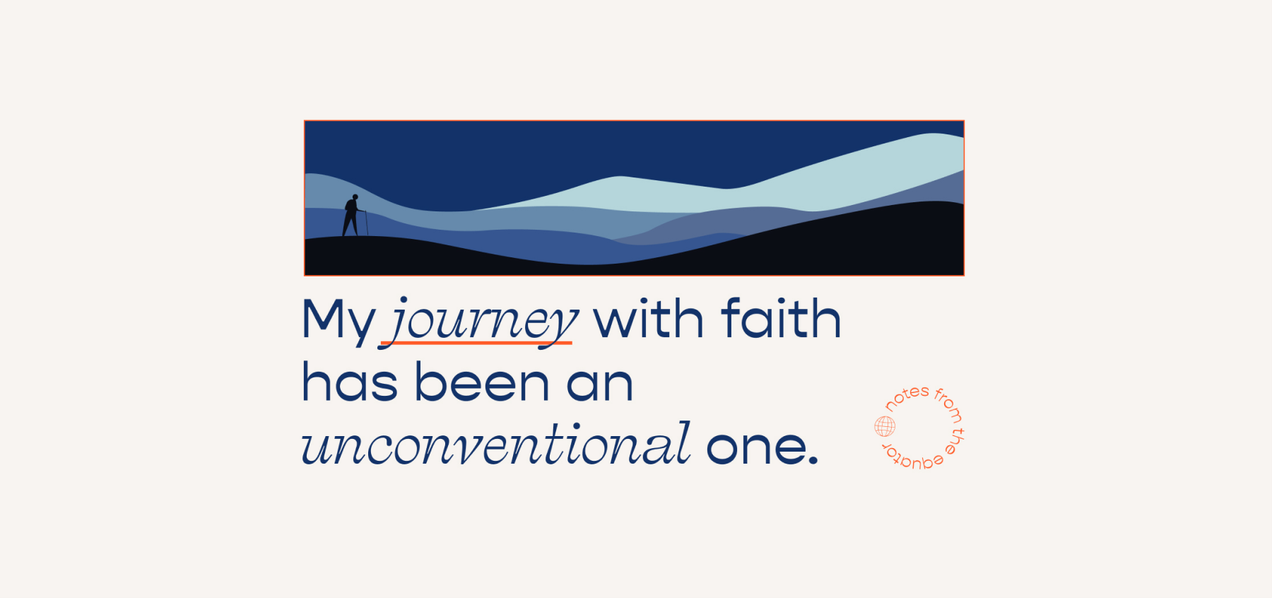
Have a little faith — issue #27
I grew up with a staunch atheist father, but went to a Catholic school where prayer was an everyday routine. As a teenager, it was hard for me to square the two experiences. Today, I still describe myself as an atheist if I have to—but I also increasingly find

Meet the Community! Jack Zhao, data visualisation specialist
Jack Zhao is a data visualisation specialist, co-founder and one of the directors of Small Multiples, Australia’s leading data…

Tips on staying sharp as a developer
Programming is not a stagnant discipline. Being a developer—in my case, a full-stack developer—means you’re always learning to keep up with…

Humans of Kontinentalist: Zenn Wong
Given our mutual enthusiasm in maps, Konti has seen our share of geography interns. Zenn shares what else an internship with us can offer.
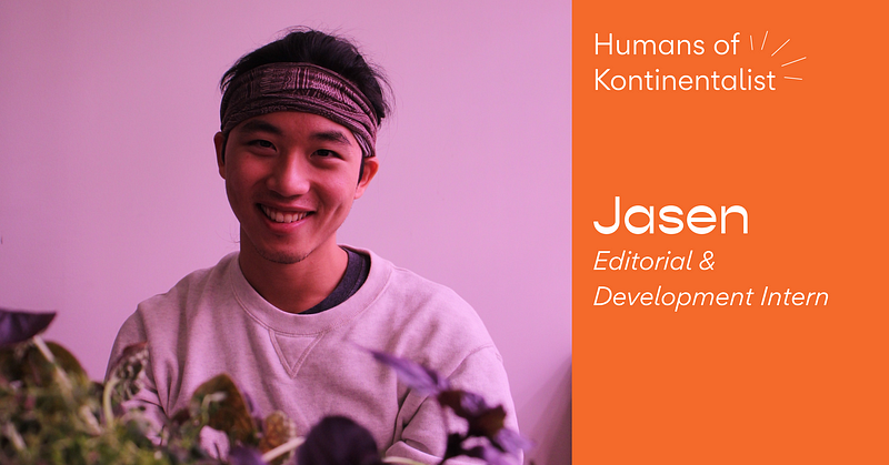
Humans of Kontinentalist: Jasen
Back in August, we caught up with Jasen, our former editorial and development intern who called us from the other side of the world in the…