Kontinentalist: Insights from user research and translating it into our new website
One fine day in mid-2019, a little more than a year after Kontinentalist first launched, some of us sat down to discuss what was in store…
This post was written by Joceline and Amanda, our Product and Experience Designer and UI/UX Architect respectively.
One fine day in mid-2019, a little more than a year after Kontinentalist first launched, some of us sat down to discuss what was in store for the company.
Our publication had just begun to take off, and we were at the tail end of another Kontinentalist project, a more complex map product that involved rigorous user research and — at the risk of sounding pretentious — design thinking practices. It was the sort of design research that we’d never had the chance to do when we first built Kontinentalist. After all, our editorial arm was meant to be just a side project to get our name out there, while we developed the hero product mentioned above. This meant our publication didn’t warrant so much time and effort back then, at least design-wise.
As for the website itself, well, it was best described as a stopgap. Inspired by Google’s Material Design, it was foolproof, quick to produce, and good enough to hold everything together. It was ubiquitous and safe… but we digress.
Back to that day in 2019, we decided to put our hero product on hold indefinitely to give our undivided attention to the publication. We agreed that it was high time we did our due diligence and reevaluated Kontinentalist, including our design approach.
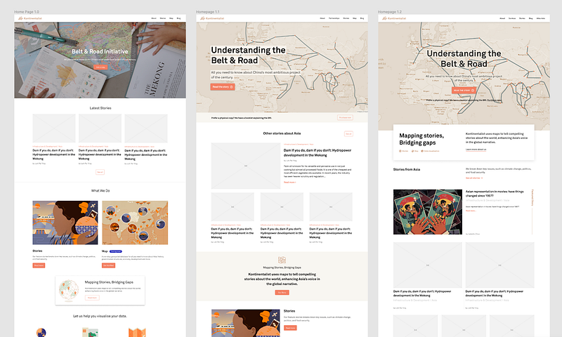
A few key findings from user research and self-reflection pushed us towards a complete overhaul of our website experience and visual language: