Introducing the new Kontinentalist!
|

|
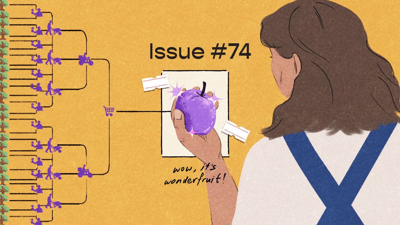
What would you do if you discovered a new resource growing in abundance on your land? What if it comes with a cost? Human behaviour is age-old, and we seem bound to repeat the choices that have echoed throughout history. We ponder access, utility, and the secret calculations we make every day.
Our climates and futures are linked across borders to one another. From the turbulent climate crisis rocking Southeast Asia to the data centre boom reshaping our world, we are reminded that our connections are not a choice, and that no one is spared from our rapidly changing world.


