
Hey! 👋
Welcome to Kawan—our vibrant community of data heads and storytellers. We’re all about improving data literacy and sharing nuanced stories about Asia. Come hang!

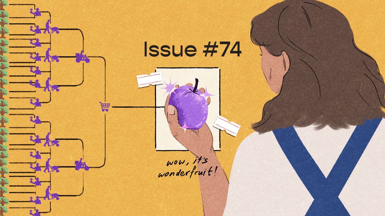
Pluck, pluck, pluck — issue #74
What would you do if you discovered a new resource growing in abundance on your land? What if it comes with a cost? Human behaviour is age-old, and we seem bound to repeat the choices that have echoed throughout history. We ponder access, utility, and the secret calculations we make every day.
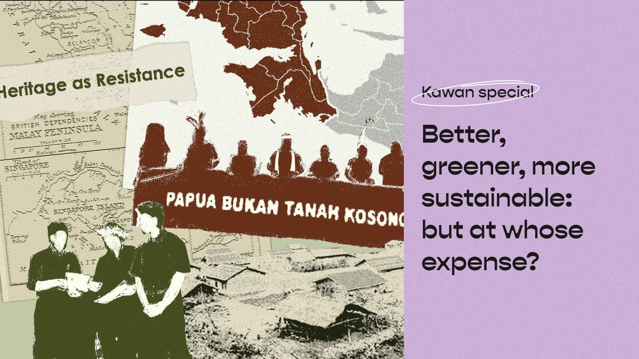
Better, greener, more sustainable: But at whose expense?
We all want a better, greener, and more sustainable future, we also want abundance in agriculture, food production, and natural conservation. But adding the decolonial lens forces us to ask: At whose expense is this better, greener, more sustainable development made possible?
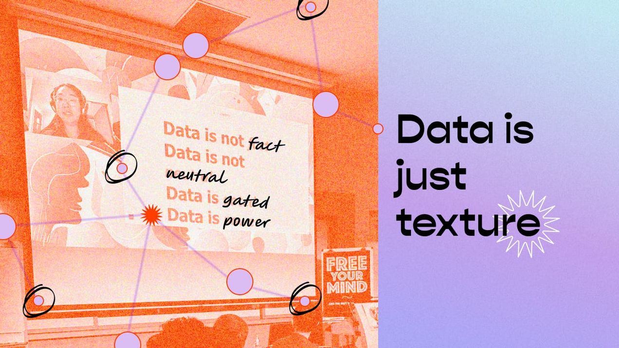
Data is just texture
How can we develop a more intentional approach, methodology, or manifesto around our perspectives towards data? Particularly, how do we think of it ethically, countering eurocentrism whilst applying a feminist and decolonial approach?
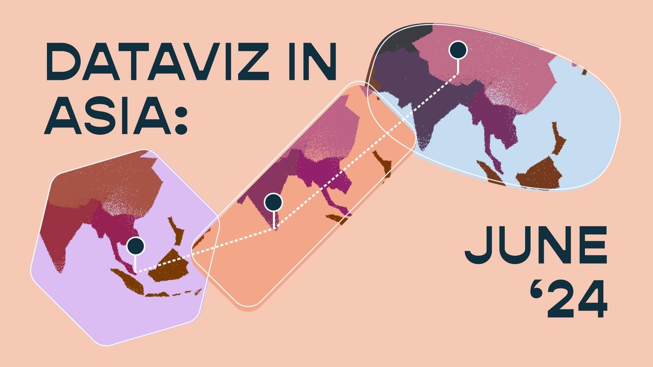
Dataviz in Asia (May 23')
I always joke that working in the field of data storytelling is like attending an eternal university—the learning (and unlearning) never really stops. At Kontinentalist, we're constantly rethinking our approaches to data storytelling, grounding them in lived experiences and contextual understandings. We strive to learn from different
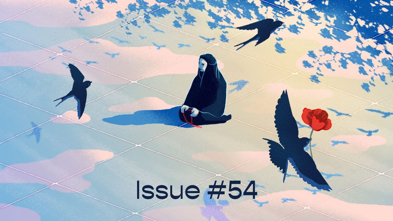
seasons are changing — issue #54
Coming from tropical Singapore, where it’s pretty much hot all year round, spring was never something I resonated with. It didn’t rouse in me feelings people associate with the end of winter: hope, joy, and revival. At most, I’d think of the fleeting beauty of Japanese sakura,
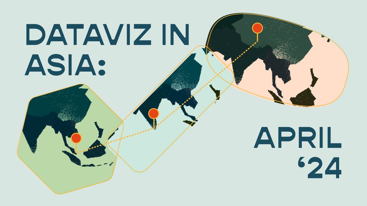
Dataviz in Asia (April 24')
Spring is finally here! As my colleagues Zafirah, Munirah, Michael, and I brainstormed the theme for this issue, we found ourselves drawn to the transient essence of the season in April. It's a time marked by various new beginnings, with festivals such as Ponggal and Songkran happening, and
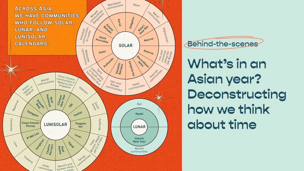
What’s in an Asian year? Deconstructing how we think about time
Working on a story about different Asian new years made our Editorial Lead Nabilah reconsider her ideas about time. In this article, she shares how her research made her question our reliance on the Gregorian calendar and what we can learn from the various Asian calendar systems
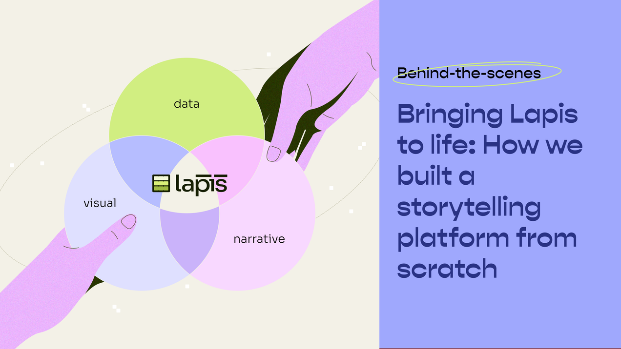
Bringing Lapis to life: How we built a storytelling platform from scratch
After more than two years of hard work, our data storytelling platform Lapis is finally out in the wild! Building our platform as a small team has been a largely iterative process, one that underscores the value of collaboration in our craft and requires us to learn (and unlearn!) as
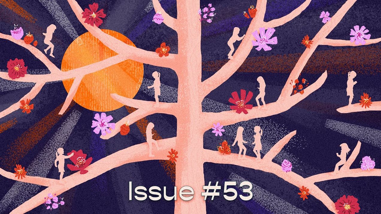
The colours of girlhood — issue #53
Back in primary school, girls in my class used to circulate a dog-eared paperback copy of Judy Blume’s “Are You There God, It’s Me Margaret”, giggling excitedly to the next person in line. I have fond memories of reading about 12-year-old Margaret’s adolescent adventures:
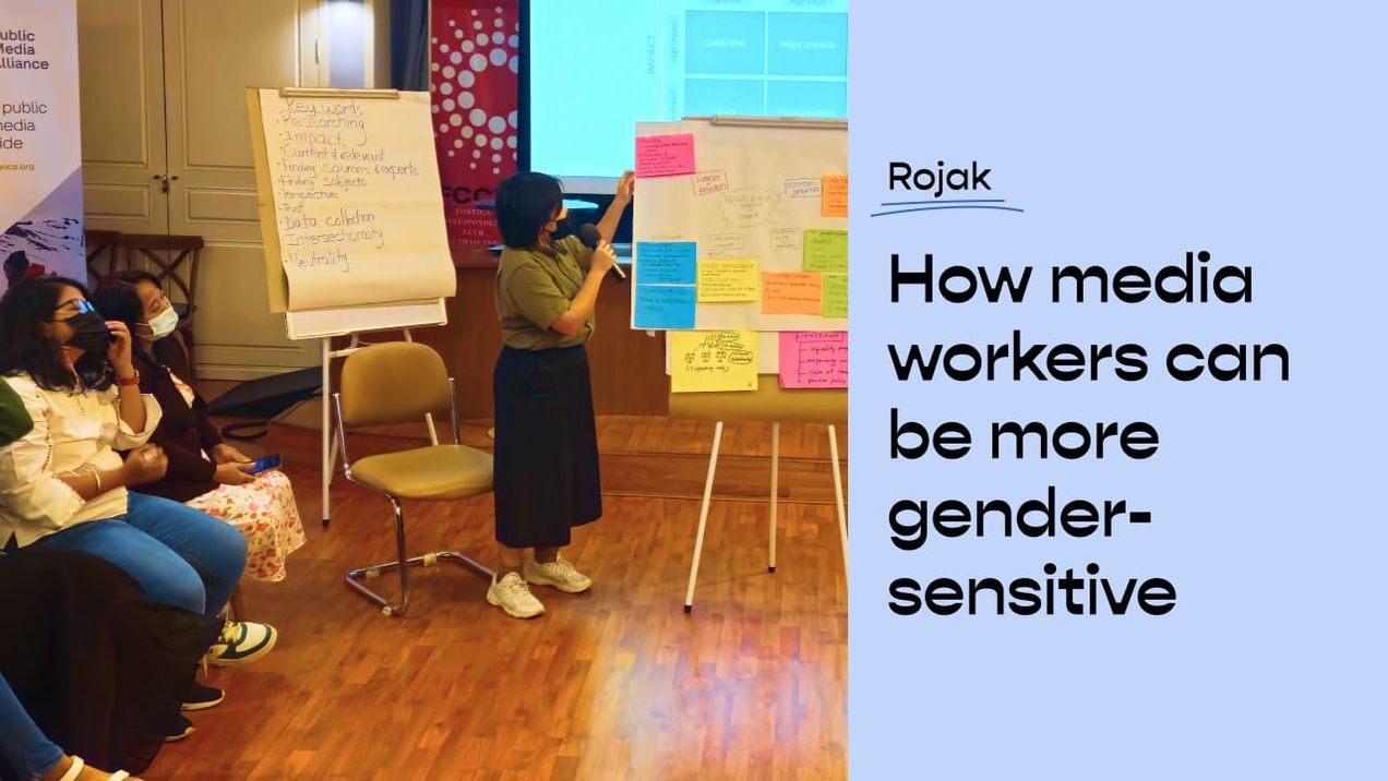
How media workers can be more gender-sensitive
In October 2023, I had the opportunity to participate in a gender-sensitive reporting workshop with some amazing journalists, media workers, and NGO representatives from five Southeast Asian countries (Indonesia, Malaysia, Singapore, Thailand, and the Philippines). It was organised by Public Media Alliance (PMA), a global association of public service
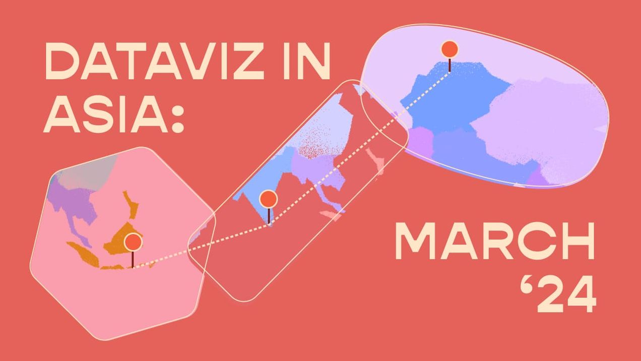
Dataviz in Asia (March 24')
For this month’s Dataviz in Asia, we’re highlighting works by two of our favourite female data viz practitioners. Shirley Wu and Gurman Bhatia both use data to amplify the contributions of women in the arts and entertainment industries. We’re self-professed patrons of the arts here at
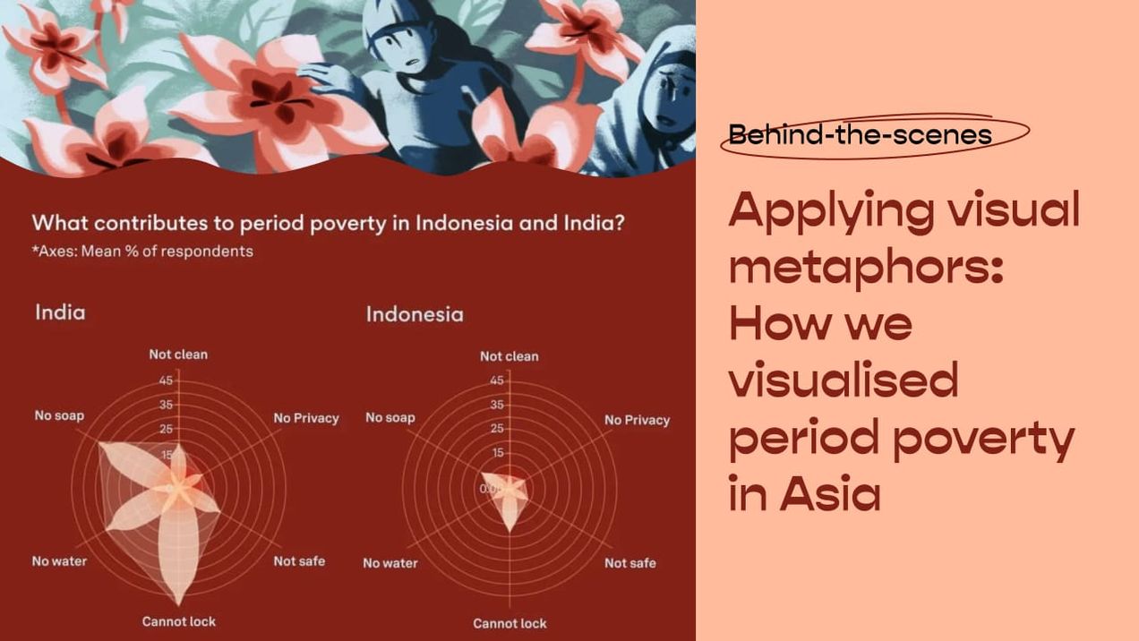
Applying visual metaphors: How we visualised period poverty in Asia
This microstory came about when Singaporean period care company Blood launched its “Period-Positive Workplaces” movement in 2022. A communications agency had sent over a press release of the initiative, which included survey findings on period shaming at work. Having never experienced bullying or pressure of any kind related to

Love, interrupted — issue #52
February means many things to us. For some, it’s a month of love which centres on that special day on the 14th. For others, it’s just another 29 days, each one not any more special than the other. For those of us who celebrate Chinese New Year, it’
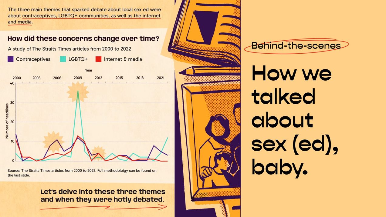
How we talked about sex (ed), baby
We share our process of creating a microstory about the evolution of sex education policy in Singapore over the past two decades, shedding light on its pivotal role in shaping the nation's attitude towards sexuality—and vice versa. We delve into how we collated and analysed over 200