Tips on creating illustrative visualizations
We produce many cultural data stories at Kontinentalist. As such, we may take a more illustrative approach for various reasons, such as…
We produce many cultural data stories at Kontinentalist. As such, we may take a more illustrative approach for various reasons, such as conveying qualitative data, making data more relatable, or appealing to a specific audience.
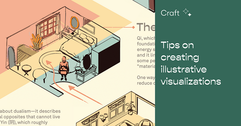
I’ve talked about our overall editorial illustration process earlier this year, but I’ll be focusing on the process of illustrating visualizations and any illustrations that convey a lot of information, such as the ones you see in our stories on the history of rubber in Singapore and modern martial arts in Asia.
These are some things I’ve learned to keep in mind:
Identify the story’s audience and aims
Each writer’s pitch comes with main questions and a target audience, which in turn influence the art direction for illustrations. Some questions we always start with are: Why should an audience care about this story (nut graf), and what’s the takeaway? More specifically for designers and illustrators: What kind of imagery would be recognisable and appealing to them?
Identify the illustrations’ main takeaway and flow
After deciding on the story’s overall aims, we go deeper into each illustration and the section it supports. When dealing with qualitative data, it can be difficult to decide what to portray in our illustrations. Ultimately, we have to ask ourselves and the writer what’s the takeaway, and how can it support the story’s overall aim and complement the other visualizations in the story.