
Transitioning from journalism to data storytelling: Telling human-centric stories
Let’s be real — it was tough. During my first few months at Kontinentalist, I can now admit with less shame (since I’ve accepted it’s all…
Zafirah’s transition from journalism to data storytelling: Telling human-centric stories
Let’s be real — it was tough. After having spent almost a year at Kontinentalist, I can now admit with less shame (since I’ve accepted it’s all part of the process) that at some points I had absolutely no clue what I was doing, how I was going to go about what I wanted to do, and how I’d ever match my affinity for words with data (which seemed like a whole lot of scary numbers).
Coming from the humanities, I had severe math anxiety. I think everyone who knows me knows I am horrible at numbers, and graphs, and coding… which is what the writers at Kontinentalist work with to take their ideas and stories to the next level. I remember being in awe that my editorial colleagues could do so much more with their stories than write — which was what I’ve been doing for years before my foray into data storytelling.
You see, while the data resources and books that Pei Ying (our editor-in-chief) passed to me were an inspiring and helpful introduction to this new world, trying to reproduce and replicate the snazzy visualisations and getting into a data-driven mindset was a whole different ball game. I found myself struggling to apply the skills I had to my new role as a writer telling data-driven stories on Asia.
I entered Kontinentalist with a background in journalism, having studied and worked as an environmental correspondent covering the climate, sustainable business, and human rights beats in the region. While my previous stint was similar to Konti in the sense that editorial was not a slave to the news cycle and often covered deep dives into a specific issue, it definitely tended towards traditional journalism.
The foundation of my articles was based on heavy research (which sometimes did involve a substantial amount of data) and analysis, but also interviews with various players and people relevant to my story. So, I worked a lot more with people — how to ask the right questions, how to tell a good story/angle from a seemingly casual conversation, and how to weave in the human perspective or experience with hard facts on the matter.
It has been pretty different at Konti. For one, my first point of contact would most likely be a hefty dataset, which I had to understand, analyse, filter, and organise. While interviews, news trends and reports used to be my primary methods to uncover new angles, here, the analysis of raw data sets was the one most likely to reveal hidden stories or fresh insights. I also had to think of things like data hygiene — which proved itself extremely important when I could not keep track of certain dataset changes for a recent story I did.
Second, I had to figure out ways to relay the story, informed by data, in an impactful and visually compelling way. Previously, my experience with visual storytelling had been through photography and other forms of visual documentary. I love photography and wanted to be a photojournalist when I was younger. For me, a good photograph poignantly documents a point in history, stirring up emotions in the viewer. A great photograph can go as far as to capture the complexity of human experience. How could I achieve the same with data?
Telling human-centric stories is something I’ve yet to master, but it is an area that I have always been drawn to. At Kontinentalist, I’ve learnt some ways to tell better stories by combining my journalism skills with new data visualisation tools and taking notes from the best.
How to bring out the human angle in data-driven stories
1. Never forget the story in data storytelling
Connecting people and information through a narrative or story allows what started out as abstract data to take shape and make sense. When you weave insightful data to a good yarn, your story is more likely to pull readers in and make them want to know more. Data is meaningless unless it can be presented in a narrative that makes it emotionally and biochemically “tasty” to our brains.
A flowing and emotionally compelling narrative that goes beyond hard numbers and straight facts will allow people to more easily digest and store information. When we listen to stories, our brains light up with emotion, and we are more likely to empathise with what’s being relayed to us. There is also a higher chance that we will remember it.
2. Focus on the human experience
Data storytelling is not just about numbers. After all, numbers alone cannot speak for themselves. Behind each number lies a voice, a human story, and datasets that require someone to give their values meaning. In order to do this, data storytellers have to use their creativity and pair facts with emotive and descriptive language to create empathy and provide contextual understanding for their readers. I find that digging deeper to find out the human stories behind a dataset or extracting details from supporting interviews or anecdotes helps to bring out the human angle and make the story more relevant or relatable.
3. Visualising the data with impact
We are living in an age where we’re completely inundated with information. The ability to quickly obtain data on just about anything these days means that we are often faced with a deluge of information that we don’t have the time or capacity to process. Rolling statistics on the numbers of ill or dead during natural disasters or manmade calamities have left us desensitised to the horrors being reported.
For people to be moved by a story, it has to leave an impression or impact. For a human-centric story, this will most likely be an emotional imprint—or even an impetus to act.
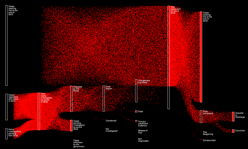
During my first data storytelling workshop with Konti, one of the data visualisations that hit me hard was a mobile Sankey graph in a story on rape in India. The massive movement of the 173,608 dots — coloured in a symbolic red — to show the different outcomes of rape crimes in 2016 drove home the severity and tragedy of the issue.
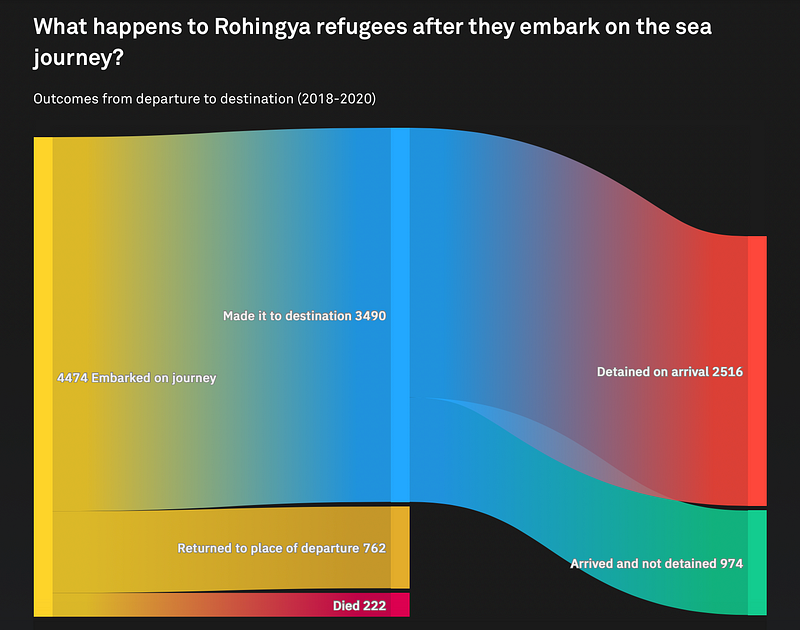
Another story that left an impact on me was a story on migrants and refugees who have died or gone missing while crossing borders. Mohamad A. Waked’s visualisations, particularly the moving dot plot, inspired the visualisations in a similar story we did on the Rohingya refugee crisis at sea.
4. Ask why you care about the story, and why people should
I find that I’m not able to tell a good human-centric story if I don’t care or feel anything for it. This might be a bit duh to some—or one might ask, what do you mean by feel?
In order to bring out the emotional resonance in a story, I have to tap into my own feelings, however wishy-washy that sounds. Knowing why I care about an issue or a cause helps me figure out why people should give a damn, and how I can make them care. I usually ask myself why this story needs to be told, and what difference it would make if more people read this story. After all, we tell stories not just to relay information but to connect people—and reveal our common humanity along the way.
“What does it all mean?”
That is the first question I ask when I’m confronted with data. And after rounds of data processing and organising, I find myself asking this question again—what does it all mean? To me; to my readers; to history?
At the end of the day, data isn’t the story—people are the story. As a data-storyteller, I have to think of how best to humanise data, either through the way I present it or in the way I write to make the data come alive and be felt. After all, a data point is a record of human history, and a data story an account of what had happened. It signifies a people, in a place, at one point in time—just like a photograph.
There’s much more to learn and understand about the art of storytelling and data visualisation, but I’m definitely embracing the journey now with more excitement than anxiety. Finding my way in this field takes a lot of patience and practice.
If you have any other tips on how to tell human-centric, data-driven stories, do share them with me in the comments!