
How I design custom map styles with Mapbox
As told through a map style inspired by Indonesian Batik.
At Kontinentalist, we use maps to tell stories. Typically we use Mapbox’s ready-to-use map styles, but there are times when our stories are unique enough to warrant highly customised maps.
Creating a map style in Mapbox can be overwhelming. However, after a few attempts at custom maps, I eventually found a process that made things a little easier. So this is how I go about designing a map style, explained through Batik, a thematic map that I created for our story about the traditional Indonesian textile.
The data
The most important part of a map visualisation is the data. If the dataset layer is dense and complex, I use a plain base map. For Batik, because the data were just location points, I could afford to experiment more with colours and patterns.
The inspiration
I like to set the overall look and feel of a map from the beginning.
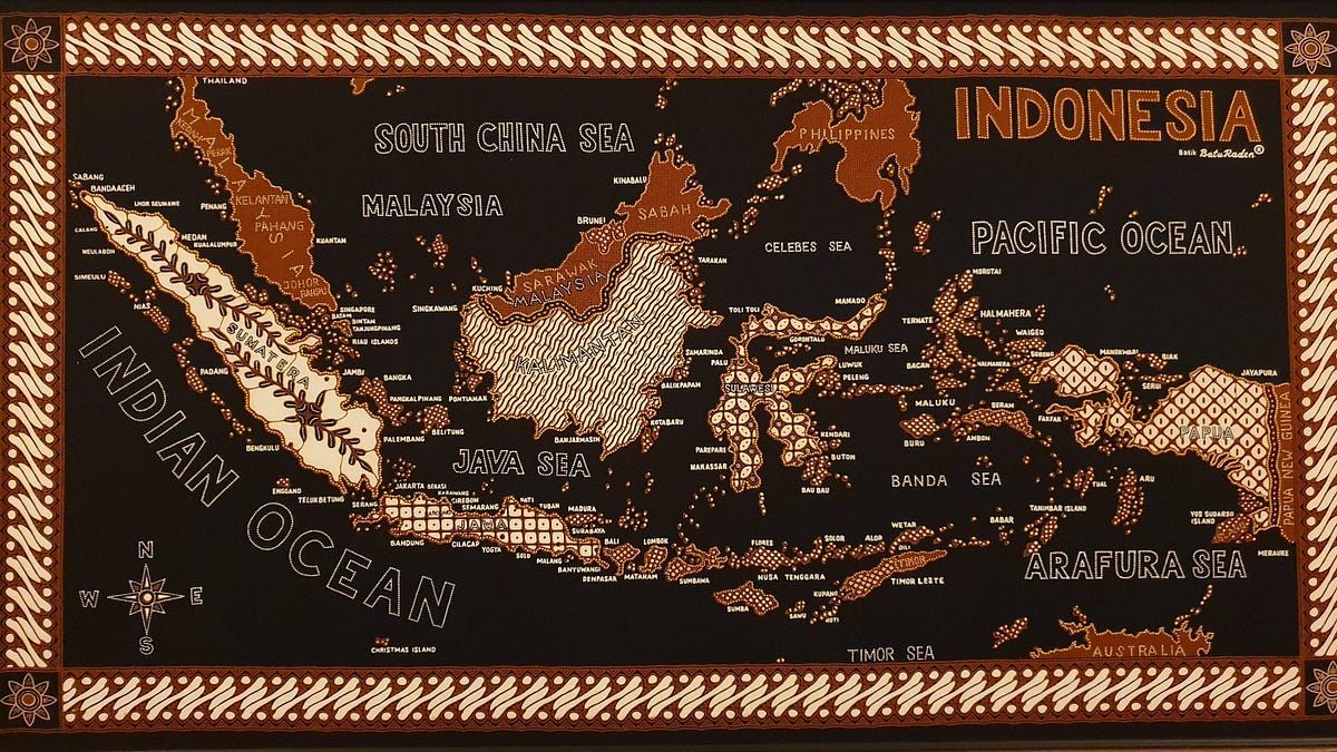
For Batik, I envisioned it to look like a real piece of hand-dyed Batik, which you can find in textile shops in Java. For most Indonesians, including myself, Batik is not just a traditional textile but also a time-honoured art form that is very much a part of our culture and identity. Therefore, I wanted to create a sense of tactility and artisanship by adding fabric-like textures and hand-produced details to the final product.
Knowing the rough direction that I want to take, I then create a mood board on Pinterest. I usually just pin whatever I find relevant, but sometimes I find an image or item that greatly inspires me.
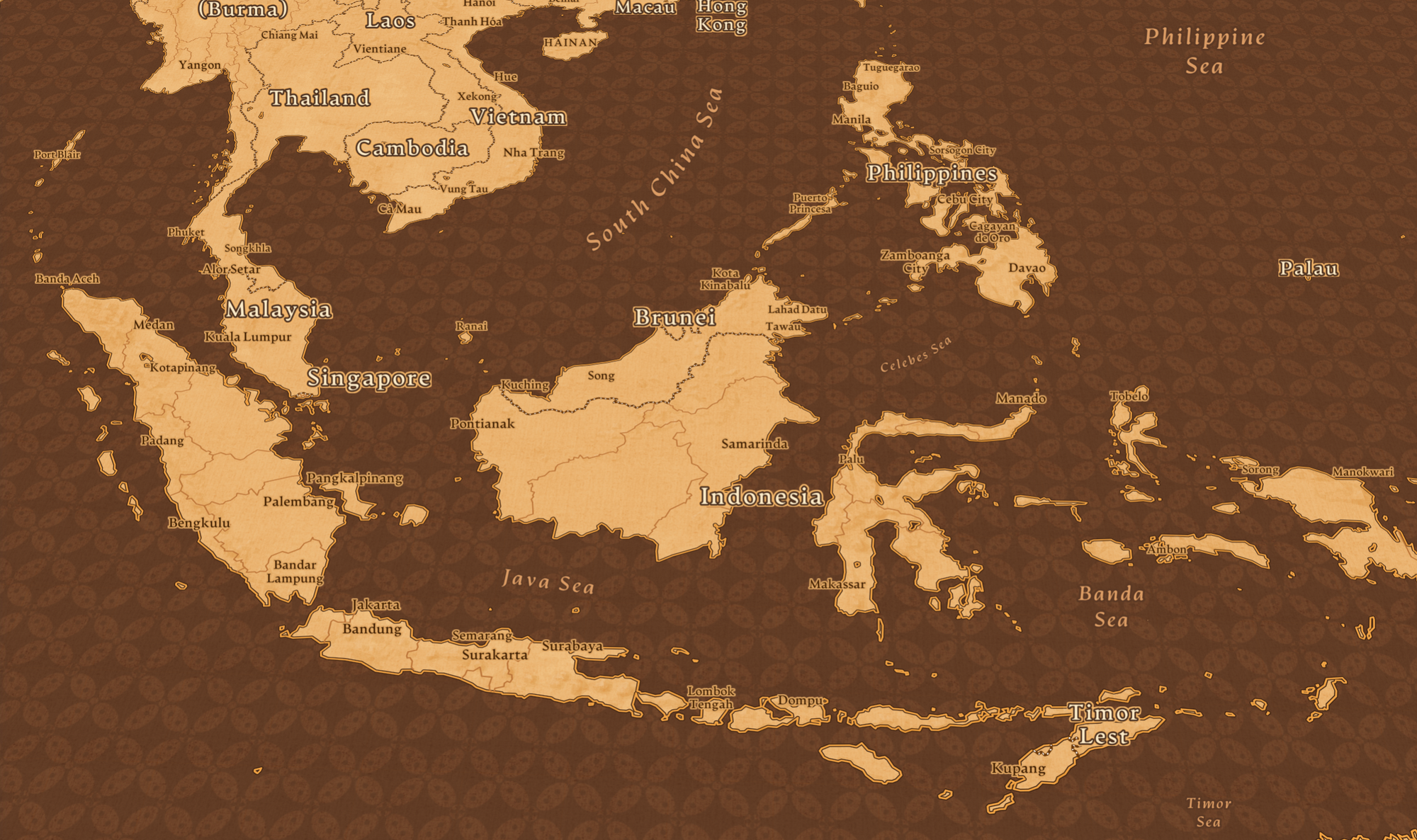
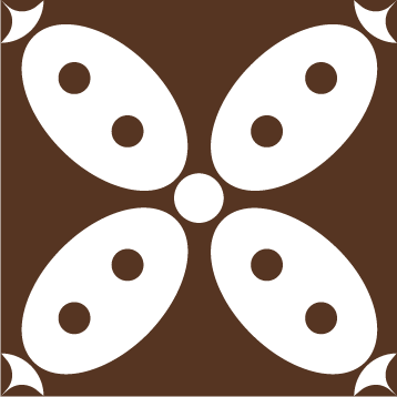
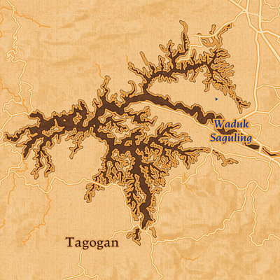
This map served as my key inspiration for Batik. The way I see it, the map captures the essence of Batik: it’s ornate and intricate, but also balanced.
The design
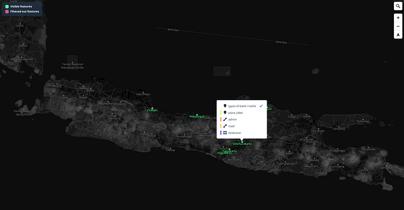
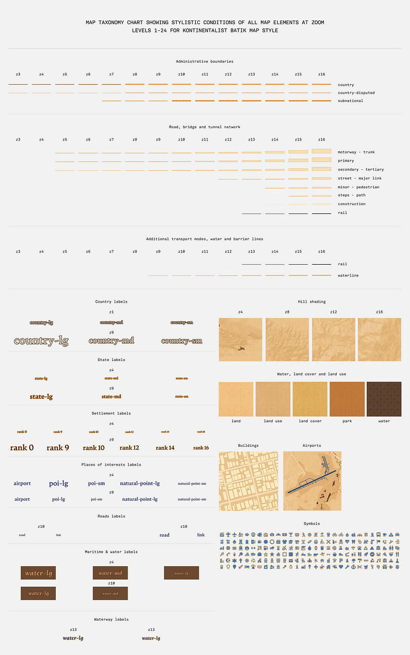
Mapbox recommends starting with a taxonomy chart when creating a map style. Just like a component library, the taxonomy chart helps to keep most of my files organised in one space. It also acts as a guide to help me ensure all visual elements follow a hierarchy and rules that work cohesively in a larger geographical context. To be honest, although my final chart looks decent, my process is often a haphazard one, as I hop back and forth making changes in the taxonomy chart and the actual map in Mapbox Studio. In fact, I often make minor (and major) adjustments even after the map gets published. Although the chart is great as a planning tool, there’s really no pressure to make it perfect from the get-go.
The typeface
Because different typefaces have different personalities, I like to experiment to find one that best suits the map style. My only criteria is that it has to be highly legible and render correctly no matter the font size and weight.
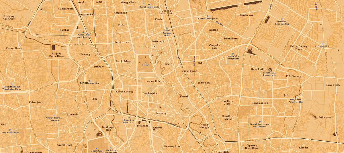
For Batik, I briefly considered using a handwritten typeface such as this one. Although it added to the look that I was going for, I decided against it because it was too hard to read. In the end, I took cues from Batik Keris, a well-known Batik department chain store in Indonesia, and used a humanist serif typeface with a pen-like quality. Because humanist serifs are rooted in calligraphy, the typeface still fits my desired look for Batik.
The colour palette
A cohesive colour palette does not just make a visually arresting map but also helps influence how viewers perceive the map. For example, in an outdoor or terrain map, colours and shades often give visual cues that help viewers quickly understand the physicality of a terrain.
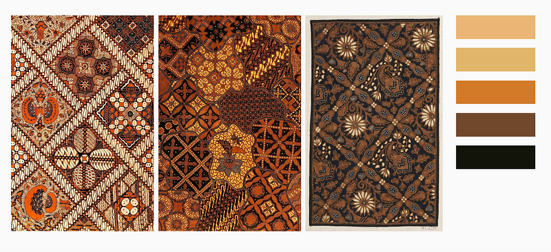
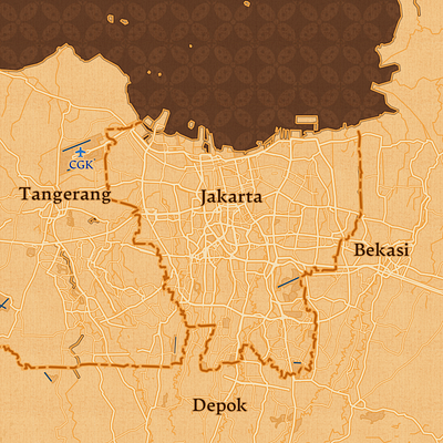
On Batik, colours are mainly used to enhance the material’s aesthetic. Most Batik have a brown tone from a colourant called Soga, used in one of the dyeing processes. This dye comes from the bark of the soga tree and ranges from light yellow to dark brown in colour. Likewise, I tried to capture this quintessentially Batik look by using a brown-and-yellow-toned colour palette.
The pattern
I rarely use ornate patterns on a map—they can be distracting and interfere with legibility and readability. However, for this map, I knew that I wanted to include at least one Batik pattern from the very beginning.
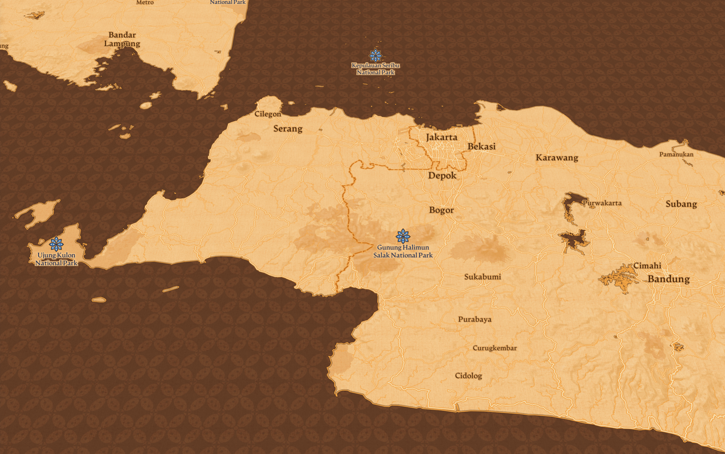
At first, I thought that it would be cool to stitch together different Batik patterns from different regions. However, our story focused on Batik patterns from just five particular locations in Central and East Java, which are marked with location markers. To make the markers stand out, I chose not to use any patterns on land. Instead, I used the Batik pattern on water, inverting the inspiration map.
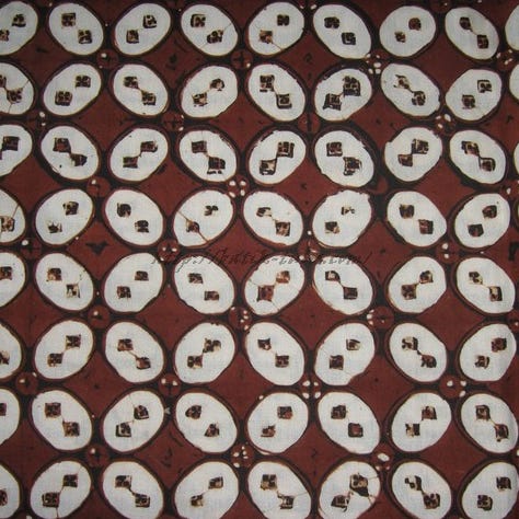
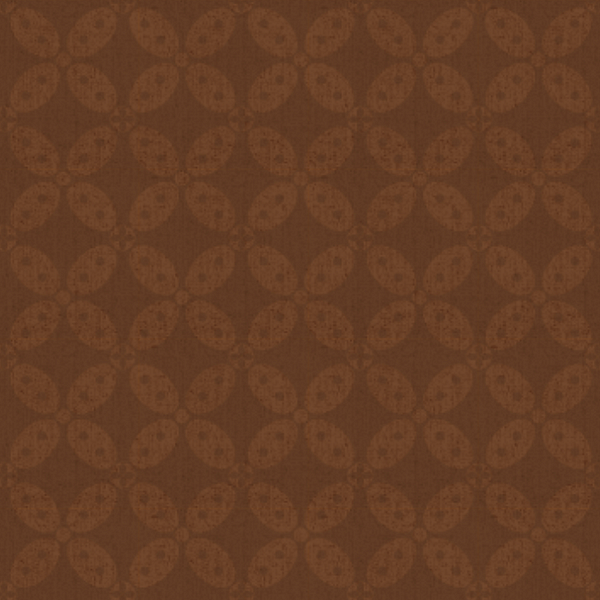
The pattern I used on the map is one of the oldest Batik patterns, originating from Central Java, called Batik Kawung. I chose it because it is recognisable, simple to vectorise, and uses geometric shapes that make for a beautiful, seamless tiling pattern. I lowered the contrast between the pattern and the background to make the pattern more subtle.
The texture
I like using textures on Kontinentalist maps because it adds a surface-like quality that makes them seem touchable.
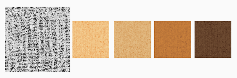
I wanted Batik to look like real fabric, so I layered a vector grit texture on top of fill colours. When zoomed out, the grit texture mimics the texture of linen.
The details
“The devil is in the details” is a motto that I live by. Sometimes, I go the extra mile to achieve a specific look in my maps.
Because the Batik technique is a labour of love that involves elaborate processes, I wanted the handmade feel to be especially evident on the map. Batik artisans use a handheld spouted tool called tjanting to directly apply wax to the fabric and repeatedly dye it by hand. The results are somewhat imperfect, which is quite the opposite of vector art.
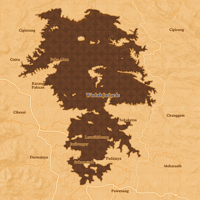
To recreate this, I layered two to three strokes of different colours, often with colours close in hue and lightness, to create uneven lines with the effect of blended, seeped dye edges. To add more variation in detail, I used dotted lines to mimic the dotting technique used by Batik artisans. Similarly, I used the same colour with varying degrees of tone for land cover and land use to create a smudged look.
The icons
I don’t usually create a custom set of icons unless it’s absolutely necessary. I love using Maki icons because they are already optimised for Mapbox Studio and can be easily used with expressions.
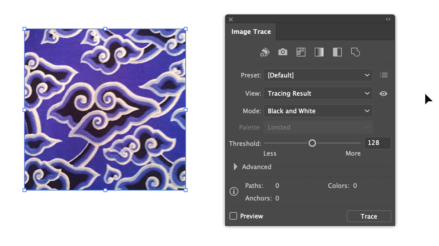
However, for Batik, I created five custom location markers that reflect the Batik patterns originating from each locations. To create them, I image-traced scanned photos of the patterns in Adobe Illustrator and adjusted the colours where necessary. When creating and uploading your own icons, it’s always good to refer back to Mapbox’s SVG guide.
The workflow
When I create a custom map style, I often start from Mapbox’s monochromatic theme. From there, I selectively remove or add layers.
After the layers are pretty much set, I start work on changing the fonts on all labels. As a general rule, I try not to change the weight and size of the labels. If I do have to adjust the size, though, I do the same adjustment to all labels proportionately for consistency.
Next, I adjust the colours and textures. I personally feel that this is harder than changing fonts—changes in hue can be disorienting and uncomfortable, especially when the new colour clashes with the old colours. To prevent this, I always turn all my layers off and work my way from the base up, and from the smallest zoom level inwards. My order of work is usually: background > water > land uses > terrains > water bodies > roads, tunnels, and bridges > POI > labels > dataset. This way, I can see the map coming together piece by piece.
Finally, I always check if the map looks alright at all zoom levels on both large screens and small screens. I also check three to five areas with different geographical makeups—such as urban areas, forested areas, and islands with high coastline-to-area ratios—to make sure the design works in geographical contexts other than the one I’m designing for.
As I continue learning from other designers and creating more map styles on Mapbox Studio, I hope to become more confident and efficient in my process and design. I’d love to make more experimental and eccentric maps in the future. If you have any tips and tricks on using Mapbox Studio, please share them below! 😊