How COVID-19 has changed the data storytelling landscape
We’re at the midway point of 2020 and, quite unbelievably, the world has been brought to its knees by the invisible yet pervasive COVID-19…
We’re at the midway point of 2020 and, quite unbelievably, the world has been brought to its knees by the invisible yet pervasive COVID-19. I won’t go into details, since you’ve probably heard this a million times by now, but this virus has dramatically changed the world around us.
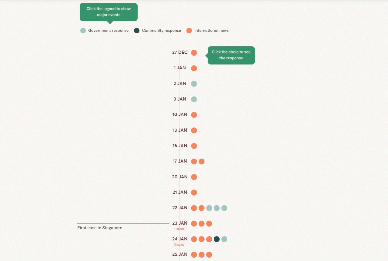
The virus has also changed the field of data storytelling. Major newsrooms all around the world have put out daily charts and graphs, and ministries worldwide are scrambling to build dashboards — all for the single purpose of explaining the exponentially growing numbers of confirmed coronavirus cases to the public.
What is data storytelling, exactly? Put simply, data storytelling is the practice of telling a story around data—or, conversely, letting data drive the narrative of a story.
Everyone’s a data expert
On the eve of the almost-global lockdown, one particular article stood out — “Coronavirus: Why You Must Act Now” by Tomas Pueyo. The article has since been read more than 40 million times and translated into 40 languages. It was also around this period that everyone kept repeating the phrase, “flatten the curve”. It’s befuddling that a phrase typically used to describe a line graph has now become part of our everyday vernacular.