How can a data visualisation be racist?
Halloween fell on a rainy Saturday this year, and I was feeling restless and bored. But instead of doomscrolling through Twitter and…
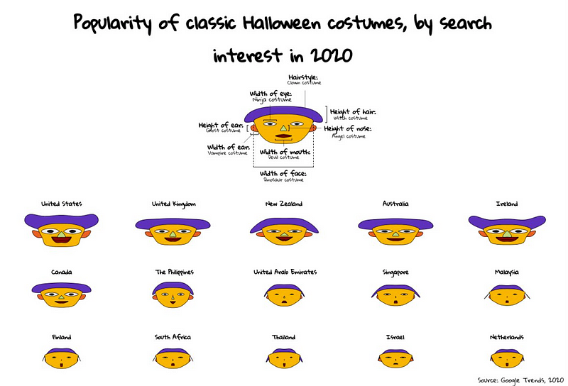
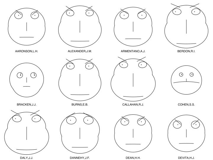
Halloween fell on a rainy Saturday this year, and I was feeling restless and bored. But instead of doomscrolling through Twitter and feeling left out of the festivities, I chose a more productive alternative: browse through Flowing Data’s data vis library. A particular vis stood out amidst the sea of lines, dots, and maps — the Chernoff faces.
Created by mathematician Herman Chernoff in 1973, it is a glyph of facial features that correspond to different variables in a data set. His logic is that since humans can read one anothers’ faces pretty well — a debatable assumption— a visualisation of different faces would be an instinctive way to make comparisons of up to eighteen variables.
But hold on, you say, as you touch your face in spite of these COVID-19 times… I only have five facial features, including my face. How do I get up to eighteen?
Well, that’s because Chernoff faces have different ways of encoding: by size, angle, position, width, and length. That means that one facial feature (e.g., your mouth) can denote two variables, differentiated by the width and height of said mouth.