Getting started with basemap design for map first UI — a non-cartographer’s guide
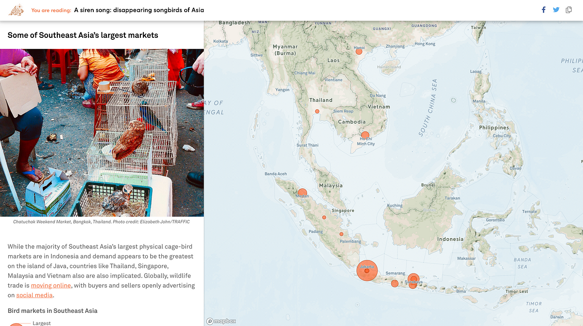
From apps like Uber and Snapchat, to storytelling platforms like National Geographic’s Geostories, the map has increasingly taken centre…
From apps like Uber and Snapchat, to storytelling platforms like National Geographic’s Geostories, the map has increasingly taken centre stage in user interface design. Often taking up a big portion of the screen’s real-estate, it is integral to how we explore and use apps. There may be a tendency to not put too much thought to maps when most of them look similar. However, a map can make or break the entire user experience.
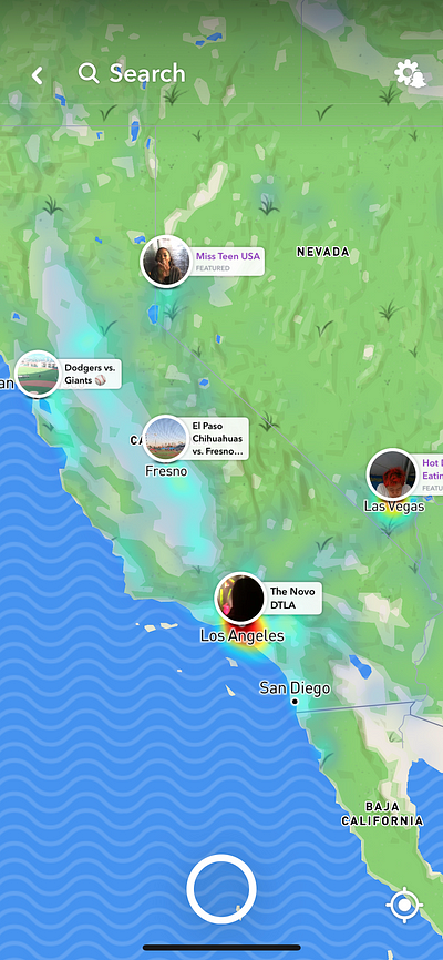
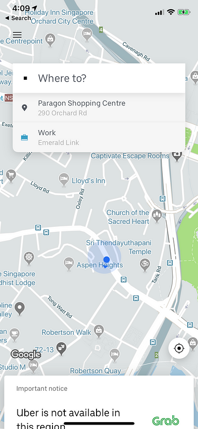
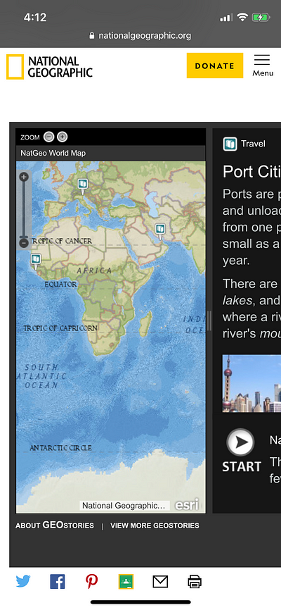
The rise in map-centric user interface in recent years means an increased demand for modern cartographers, who have the skillset to be map producers and data analysts at the same time. Admittedly, I’m neither of them. A little over a year ago, I started working as a UI/UX designer at Kontinentalist, a new startup in Singapore that seeks to push the boundary of storytelling with maps and data visualisations. Over the months, my responsibilities extended to designing maps that could elevate our storytelling experience. This includes creating basemap templates that our writers could use for their data-driven stories.
Without any cartography experience, map design was daunting. It took me a while to figure out a workflow that I was comfortable with. I am by no means an expert now, but my experience have allowed me to put together a little mini-guide to help you kickstart your own basemap design. If you’re in a similar position as I was, this is for you.
1. Understand the anatomy of a digital map
Without any understanding of the framework of a digital map, jumping headfirst into a mapping software can be overwhelming (been there, done that). Knowing how a map is structured will help streamline your process and give more precision to your styling.
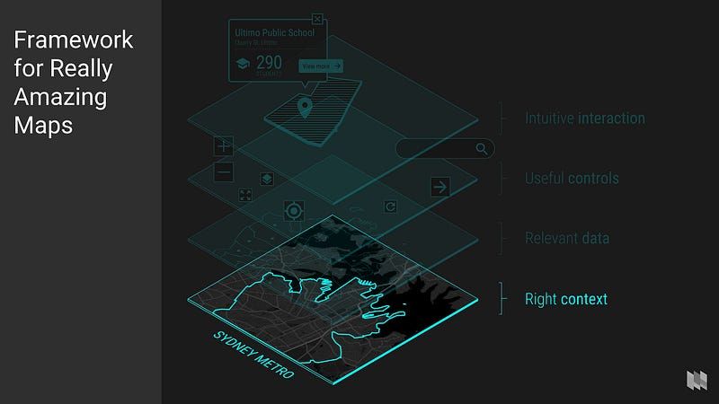
To put it simply, a digital map is built on layers. Each layer displays and deals with a particular dataset. Generally, a map consists of the following: basemap layers, features (data) layers, controls, and interactions.
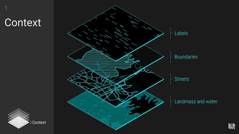
A basemap is the bottom-most layer of a map and plays a vital role in giving geographical context to your content. It is the backbone for rendering your features, and makes up 90% of what you’ll see in a map visualisation. It may include a rendered background image (such as satellite view), landmass, water, geological features, urban features, boundaries, and their corresponding labels. What determines a great basemap is really how well these individual layers complement each other as smaller parts of a bigger picture.
2. When selecting a map design tool, focus on what you need
On one hand, there are Esri GIS products, which are the flagships in mapping software and still the most widely used among industry professionals. On the other hand, there are open-source alternatives such as Carto and Mapbox. Which tool to use ultimately depends on your needs, goals, and financial capabilities.
What I needed was simply a software to create and edit basemaps. For this purpose, Mapbox Studio was the clear winner. It’s a mapping tool with visual interface that allows designers to easily customise individual map features. Part of Mapbox Studio’s appeal is its lightweight and sleek UI, and familiar layer-based styling, which reminded me of modern design apps like Sketch and Figma. If you’re already using those apps, Mapbox Studio will not be hard to grasp.
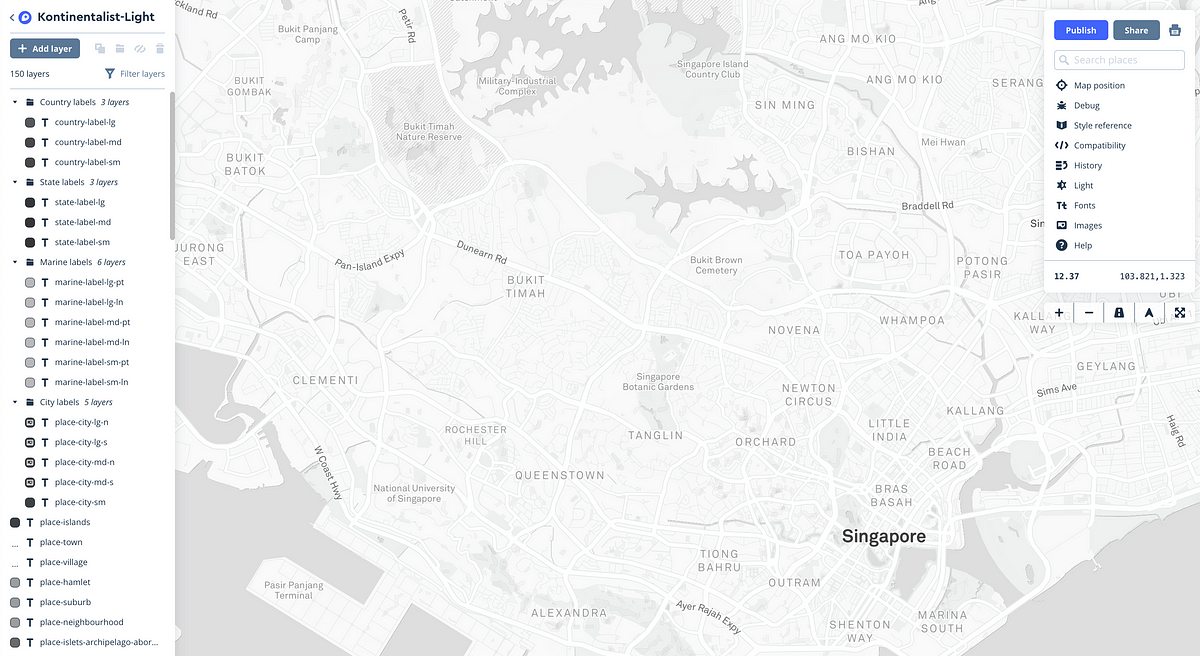
What makes Mapbox’s vector map so powerful is the latest OpenGL technology behind it. The same technology supports nuanced styling based on zoom levels and feature properties, allowing full flexibility and absolute control over every aspect of your design.
3. Your use cases determine what kind of basemap you should have
If your map is the story, the basemap is the setting.
Just like how good world-building can immerse players in video games, customising your map style to your intent will help communicate your content to the user and increase their overall experience.
To start with, you can ask yourself, what’s the purpose of your map? For Kontinentalist, all of our maps have an overarching purpose: to give context to our data and stories. However, the actual purpose of each map differs from story to story, depending on the story’s own objective and content. Because it would be inefficient to come up with a new map style for each story, we outlined our most common use cases and created reusable basic templates for each use case.
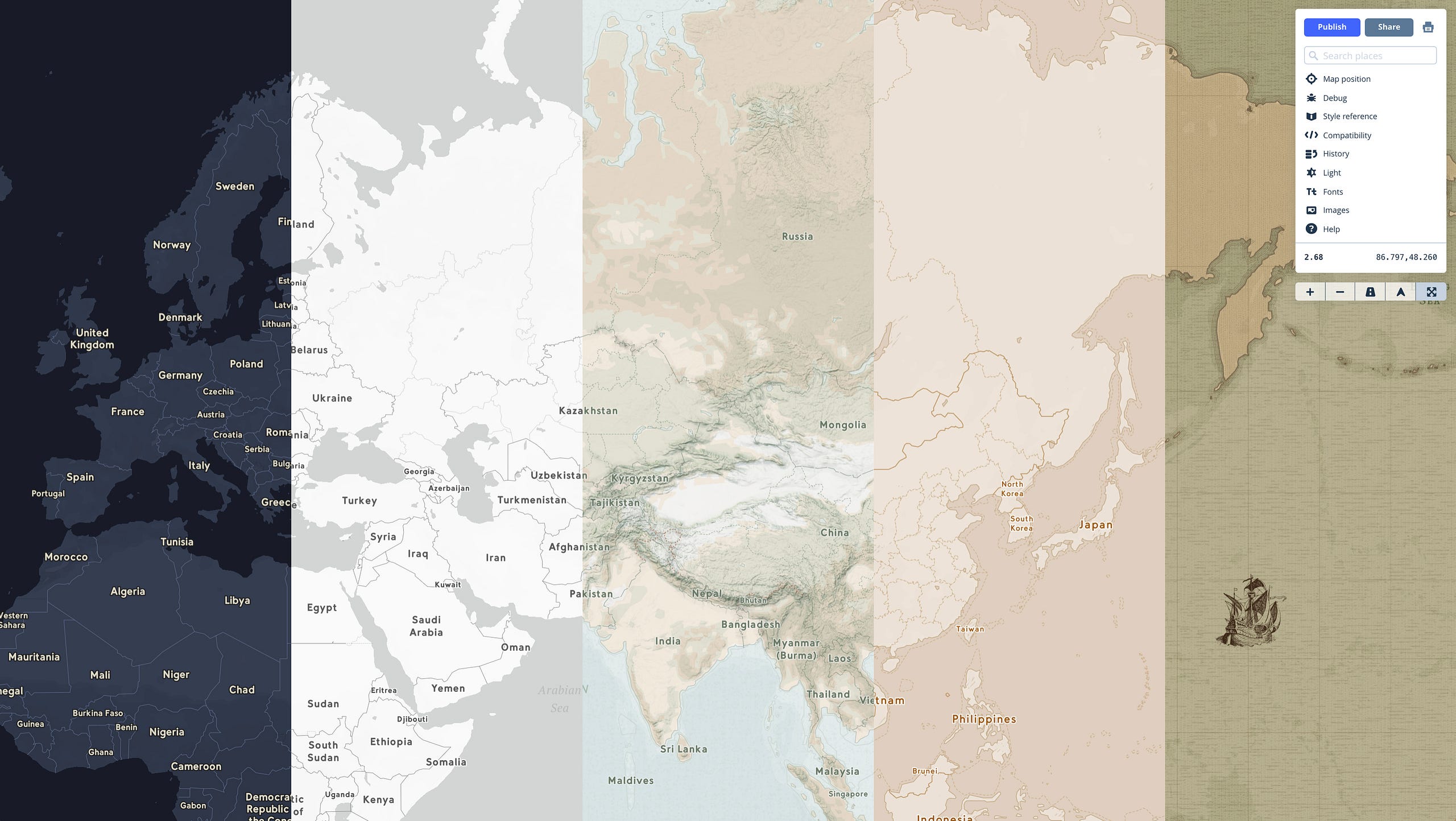
These are a few of Kontinentalist’s basemaps and the functions they serve.
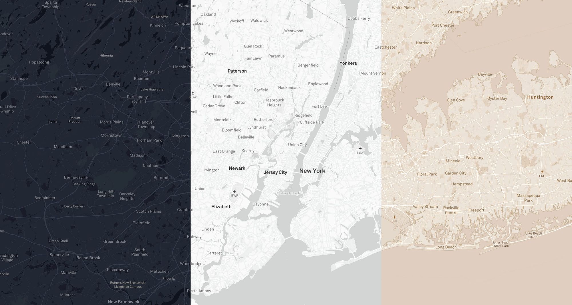
- Tonal basemaps for data visualisations. The colour palette is largely monochromatic and has a low contrast to ensure that the basemap remains subtle and doesn’t distract the viewers from the content. I created three different themes to suit most content: light, dark, and beige.
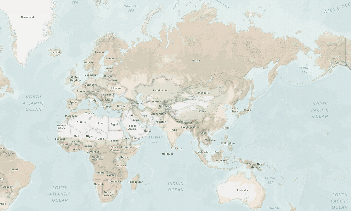
- Terrain basemap to highlight data about outdoors, nature, and hydrology. The terrain basemap has a more earthly and conventional colour palette. It also comes with hillshading, contour lines, and bathymetry which can be hidden based on the story’s requirements.
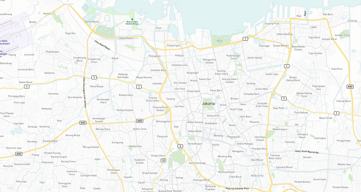
- Street basemap to highlight data about the urban environment.
- Thematic map, which is more stylistic and experimental, to enhance the atmosphere and themes of a story. Note that we only use thematic maps when there are no complex layers of data to work with.
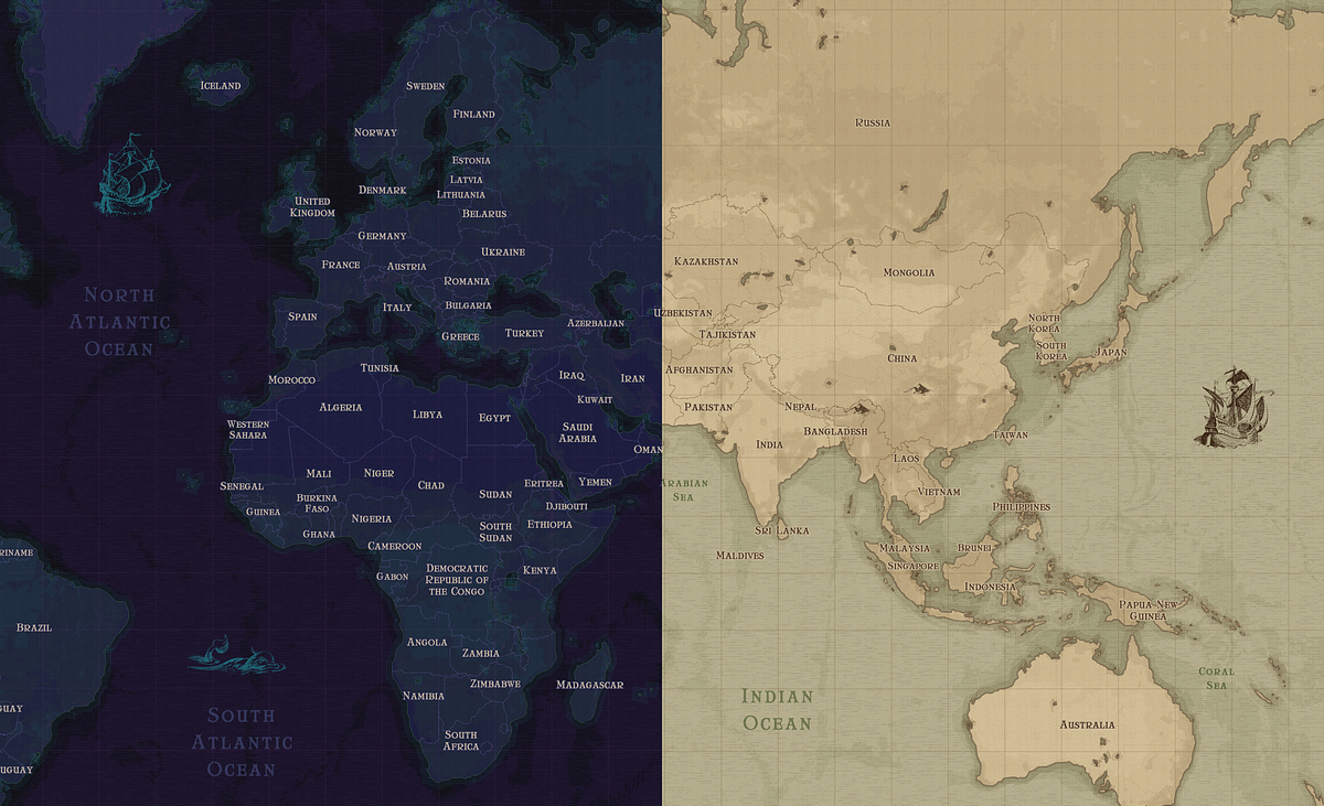
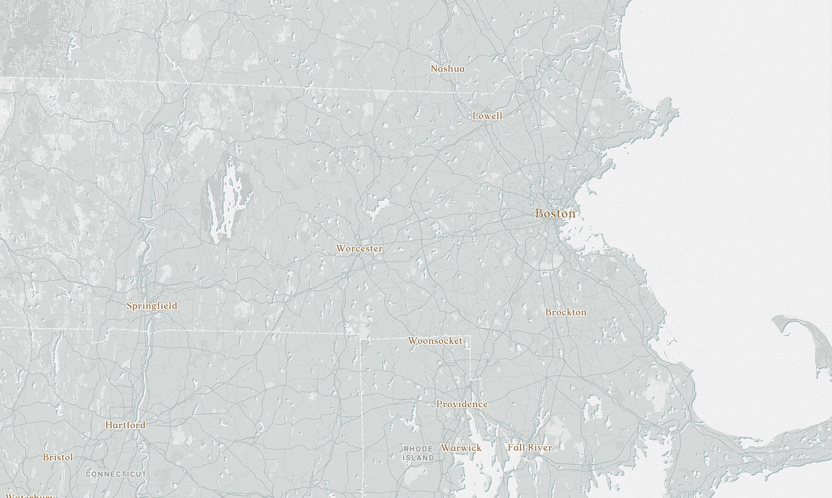
If required, we might refine the map styles to suit the objective of each individual story by making minor layer adjustments. For example, to achieve a tighter narrative focus for certain stories, we may hide unnecessary layers. By having templates to build from and fall back to, we ensure a consistent and streamlined map experience for our audience.
4. Build from existing template styles
Unless you have cartography knowledge and know exactly how to build a complete representation of the world from complex geographical features, I would advise against creating your own basemap from scratch. Most mapping tools, including the ones I mentioned above, provide starter basemaps which have been carefully optimised to look good against most data visualisations. You can use them as they are, or customise them to suit your brand. That was what I did for Kontinentalist’s basemaps. It saved me a lot of time and it ensured that my maps adhere to the best practices.
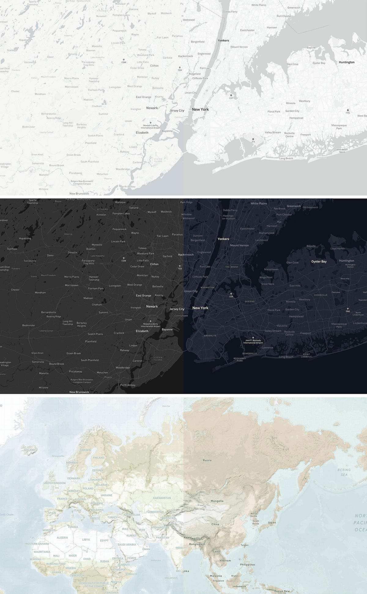
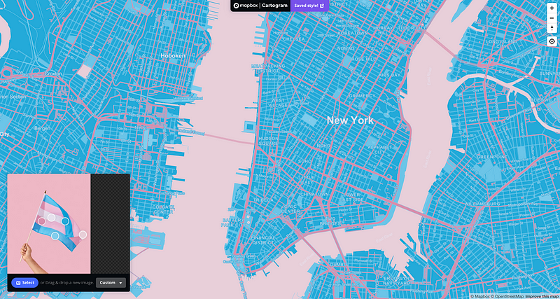
Kontinentalist’s light and dark themes were derivatives of Mapbox’s Light and Dark themes respectively. Kontinentalist Terrain was built upon Mapbox’s Cali Terrain style. Most of Kontinentalist’s thematic maps were modified from Kontinentalist’s light and dark themes. Sometimes, when I require something quick, I will use Mapbox’s Cartogram tool, which auto-generates a map based on an image you upload.
Once you are comfortable enough with editing features, you can always make the styles your own. I wanted Kontinentalist maps to have a more humanist and organic feel to the maps, so I overlayed textures and line patterns on them. Having common elements across all the maps create an overall more cohesive and distinctive look for the brand.
5. Use your design principles
If you’re a designer, this is where your knowledge and experiences come in handy. In Mapbox’s “Guide to Map Design”, Mapbox designer Amy Lee Walton outlined four key principles that will ensure a well designed map style: contrast, hierarchy, density, and legibility. If you choose to build from pre-existing templates, most of these would already have been taken care of. However, if you are making adjustments or working on your own map styles, make sure to carefully consider these design principles when working with colours, typography, symbols and textures:
- Contrast determines how well your features stand out against the surrounding elements. A good contrast creates emphasis and interest on your intended features. It can be achieved by choosing the right colours (colour theory helps here), and data visualisation.
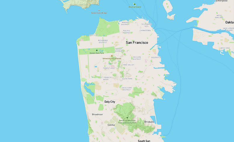
- A strong, visible hierarchy guides the viewer’s focus and helps them identify patterns. A big metropolitan city would have a more prominent label than its surrounding suburban settlements. Besides typefaces, a strong hierarchy can be achieved through colour and by manipulating scale at different zoom levels. For example, a primary road trunk would be coloured more prominently and at a thicker line width than a secondary one.
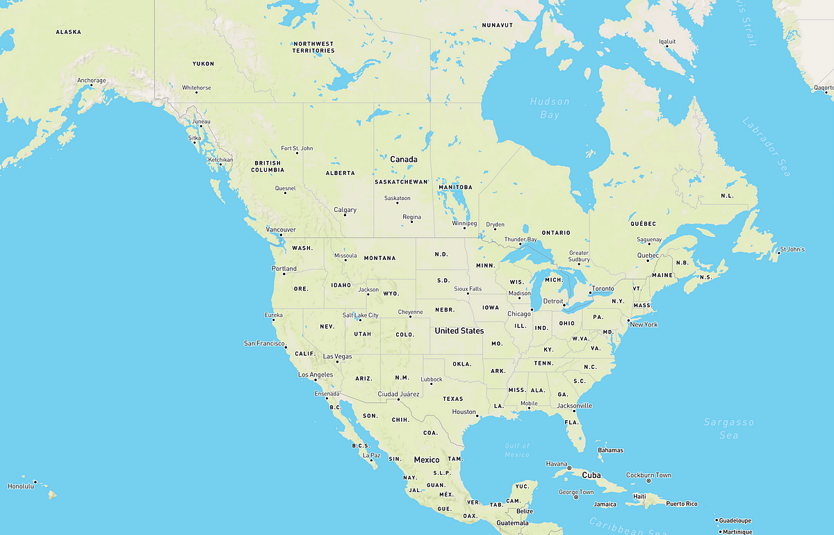
- Density determines how much information is displayed to the viewers in a particular view (it often depends on zoom levels) of the map. Limiting some information to a particular zoom level is useful to guide the narrative and help the viewers digest the data.
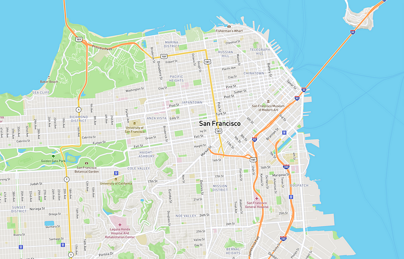
- Legibility is of utmost importance in map design because how well a user can understand your data depends largely on how easily they can read labels and see symbols. Legibility is determined by your typographic choices and proximity of the labels and the map elements to each other.
That pretty much sums up the basic things you need to know before starting on your journey as digital cartographer. If you want to dive deeper, there are plenty of detailed technical guides out there, some of which I listed down below. Through trials and errors and with some patience, you’ll be able to hone your skills and grow as a cartographer.
Useful resources
- Small Multiples, a data visualisation company based in Australia, has a guide that will aid in your understanding of the frameworks that make great maps.
- The people behind Mapbox frequently share their own design processes when creating a new map style in Mapbox’s official blog. It’s always an insightful read.
- Mapbox’s comprehensive guide to digital map design is available for free online. From how Mapbox vector maps work, to choosing colours and typefaces, it is filled with all the technical and design knowledge you ever need to customise your own map in Mapbox Studio.
- For inspiration, you can check out New York Library’s digital collections of maps and Stamen’s innovative map designs.

