Designing data visualisations for social media
As Kontinentalist’s Multimedia Designer, one of the things I’m in charge of is creating social media assets as teasers for our stories…
As Kontinentalist’s Multimedia Designer, one of the things I’m in charge of is creating social media assets as teasers for our stories. Among the most difficult but fun parts of the process is figuring out how to present data visualisations from our stories in a meaningful and easily digestible way.
Data can be intimidating for a lot of people. In fact, coming from a pure animation and illustration background, I had trouble understanding the concept of data storytelling when I first joined Kontinentalist. Because of this, we used to populate our Instagram feed with photos and illustrations. After all, data visualisations are packed with information, and we thought this made them too unattractive for the platform.
But Kontinentalist’s aim is to bridge this gap!
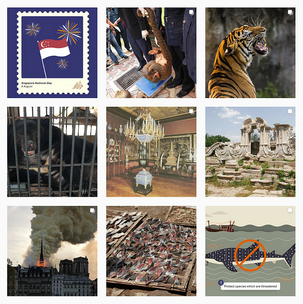
Instagram is a very visual platform, and one that people usually like to browse through quickly. As we honed our data storytelling skills and saw how other data visualisation creators like The Pudding and Gabrielle Mérite use the platform so effectively, we started looking into how we can repackage our stories’ data visualisations for Instagram.
It took some trial and error, but here are some things we’ve learned: