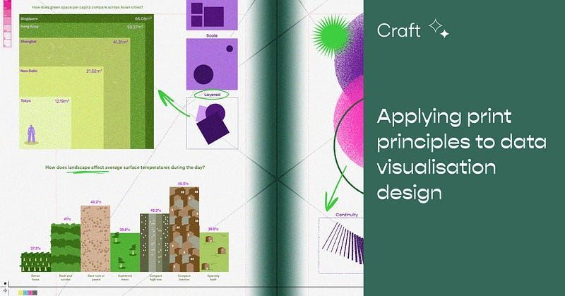
Applying print principles to data visualization design
How can data viz design benefit from design theories like the Gestalt principles?
Back to Basics
Before we can even begin designing anything, designers always refer to the core fundamentals: understanding and emulating visual hierarchies in their rawest form.
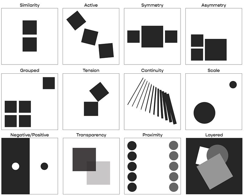
Data visualization design is possibly one of the most central pillars of presenting information in a visual hierarchy. Great data visualization is often based on ‘Gestalt principles’, a design theory that simplifies and organises elements, patterns and complex forms. This design theory is the backbone of all human designs that we know and see.
And, like just about every area of design, today’s data-viz can be traced back to print media. In a nod to the original medium, paper, I’ll dive into how data visualization has always been part and parcel of print — and how I translate these principles to data as a visual designer at Kontinentalist.
Let’s begin with the history of how we present data. This can always be traced back to physical reading materials, like clay tablets and ancient manuscripts. Examples include the Plimpton 322 Babylonian cuneiform scribe (on a table of numbers in relation to Pythagorean theorem) and the hieroglyphic Mayan Dresden Codex (an infopedia of cultural history, astronomical tables, and arithmetic). Later manuscripts like the Dresden Codex showcase a more sophisticated combination of illustrated images and hieroglyphs, usually packed in a single-page surface, to preserve information for future reference.