
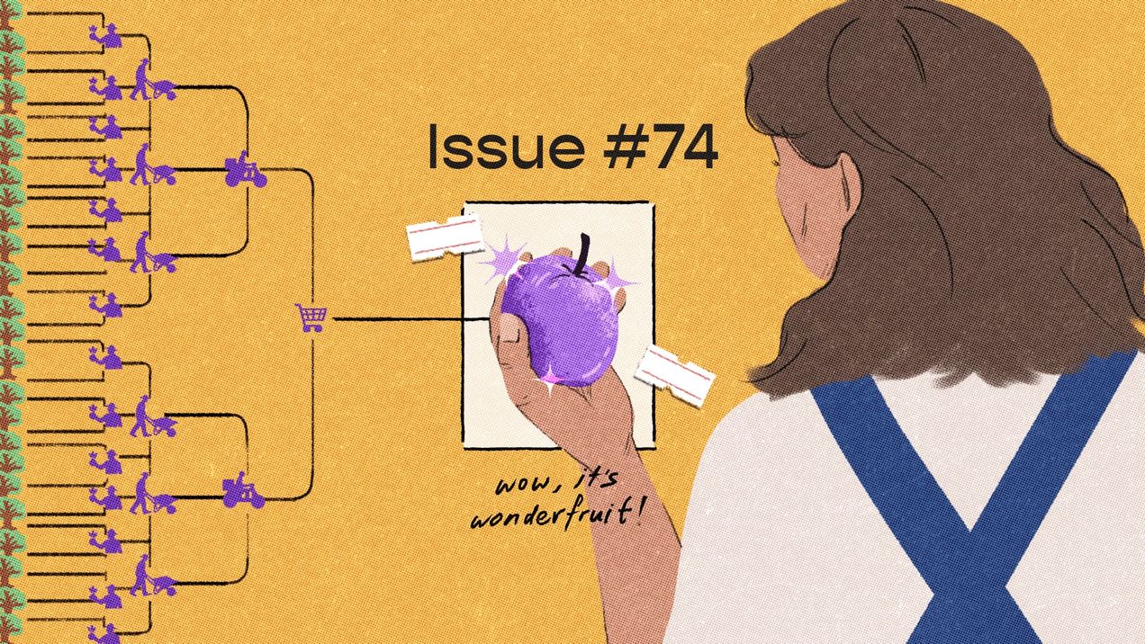
|
|
Whether staying at home has turned you into a fitspo or a couch potato, you're in for a treat. Did you know that yoga, ice cream, and the OG Red Bull—amongst other things—were Asian inventions?
|
|

|
|
Understandably, the global pandemic is driving us slightly kooky. From almost two million people pretending to be ants in a colony on Facebook to girls on Tiktok asking their SOs if they'd still love them if they were worms, we dream of shedding our human forms and escaping into the more logical society of insects. But the miniature worlds of organisms have their own challenges, too—if this story on the fantastic creatures of Asia is anything to go by.
|
|

|
|
Blue is a colour that requires no introduction—it may even be your favourite colour! Still, we guarantee this story on its origin, trade, and symbolism will pleasantly surprise you.
|
|
|
How are infographics different from data visualisations?
It's important to first acknowledge that both are visual representations of data. This infographic equates the amount of condom usage to the weights of blue whales, which makes a visually powerful statement due to the contrast in their sizes. We could have conveyed the same message about the 70,000 tonnes of condoms produced each year with a line graph or bar chart, but you'd probably not remember the statistics as well.
Which brings us to one of the advantages of infographics over data visualisations: infographics have narratives built into them. We're innately attuned to stories, whether as oral traditions or visual stories. Infographics may be simple, but they still contain the elements of a story—they guide readers linearly, leave them with a strong and central takeaway, and include helpful descriptions to provide context. A well-designed infographic, therefore, faces the challenge of a well-written story: its images should be added meaningfully and with economy.
When do I use an infographic?
From a writing perspective, an infographic should be self-contained. It can be a summary of a process involved or express a statistic in its entirety. Data visualisations, on the other hand, can be snapshots of a dataset—their main takeaways are usually highlighted in the chart titles. In this case, a story can have multiple data visualisations depending on what data we'd like to highlight at each section.
On a more casual note, because infographics are beautiful and standalone, they're great assets for social media marketing.
Are there other data vis types you're curious about and would like us to spotlight? Let us know at hello@kontinentalist.com!
|
|
Each month, we curate a list of content related to our newsletter's focus. Here's our pick of things to check out on the theme of objects of interest:
- Typography has the ability to subtly affect our moods. Follow the journey of font designers from Japan, China, and Hong Kong in the documentary Hanzi to gain insights into how the humble font encodes visual culture and identity.
- Do you find yourself gazing at the night sky, reflecting on how tiny you are compared to the vastness of the universe? Well, now you can concretely visualise that with this creative project on the size of space. Plus, we're all made of stardust, so please don't feel too bad about yourself!
- Don't be like the Park family from the movie Parasite and ignore your erratic light blinkings! Learn about morse code through Google's gamified tool, and you just might uncover a secret hiding in your basement...
- Throughout this newsletter, we've encouraged you to stop and notice things, but that could be misguided advice. As the saying goes, a watched pot never boils.
- Another visual experiment on perception distorting our sense of time—through the lens of explaining why time itself has felt different in 2020.
|
|
|
|
|


