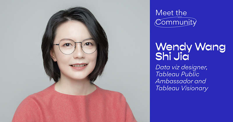
Meet the Community! Wendy Wang Shijia, data viz designer, Tableau Public Ambassador and Visionary
Wendy Wang Shijia is a Shanghai-based data visualization designer, Tableau Public Ambassador and Tableau Visionary. Drawing on her decade…
Meet the Community! Wendy Wang Shijia, data visualization designer, Tableau Public Ambassador and Tableau Visionary

Wendy Wang Shijia is a Shanghai-based data visualization designer, Tableau Public Ambassador and Tableau Visionary. Drawing on her decade of experience in web design and development, she’s famous for incredibly creative and effective data visualisations in Tableau about a wide range of topics. She’s most recently into Blender, and she kindly shares with us her circuitous journey of self-learning and discovering, and drops some design gems.
Perhaps we can start with how you got into data visualisation. I know you had 10 years of experience in the web design industry, then seemed to switch to data viz in 2018.
At the start of my career, I majored in industrial design in university, where I learnt that I loved design but not 3D modelling. After that, I got a job in an advertising agency doing graphic design for packagings and prints. There, I saw my design go from an idea, to a prototype, to clients, then to the factory where it was made, and eventually to people who interacted with them. When I think about that experience, I think the most important thing was that I gained a lot of confidence seeing my work being used by other people.
But I felt it was hard to just design a website and give it to someone else to develop, without knowing how a website gets developed. I went to New Zealand at that time, I took a 10-month web development course in a local school and enjoyed it very much. [Added after interview: The school Wendy went to got acquired, but the new school has a very similar course covering basic design and front-end development.]
During this course, I first learned about data viz and started doing it, but I focused too much on the technical part, and didn’t think much about what topics to choose and what story I should tell. So after I made a couple of dataviz about myself, I ran out of ideas. Data viz was interesting, but between data viz and web development, I chose the latter, for a higher income, which makes it easier to make a living.
For the next few years, I did web design and web development jobs, taking my idea from start to end — that is, when the website goes live. At the same time, I moved back to China and got some contract job opportunities in local agencies, which began my user experience design journey. I didn’t know about user experience design at the time, and I learnt by doing — I had to show clients my whole process of making a website, including the wireframe, interface design, and flowchart logic. Previously, I’d only do things and see if it works after it went live. But with this experience, I learned theory and technique, and about why something works or doesn’t work.
After I became a senior designer, I thought, “Do I become a design lead, study user experience more, or do something else?” Since data analysis training was popular in China then, I took a 2-day course to learn the basics of data analysis and Tableau. This course opened a new door in allowing me to find stories from other people’s data. Since then I started using Tableau to make dataviz. Now I have both dataviz and UX design jobs.
What about data visualisation really appeals to you?
There are two layers to this. One, I like looking at other people’s work. I’m not patient enough to read long paragraphs, so if it’s a good chart, I can understand it immediately. Two, I use data viz to express myself. I’ve tried different ways of expressing things, like writing short blogs and taking pictures. I’m not good at writing or photography, but when I tried data visualisation, I felt that it was something I had been looking for for a long time. And I have lots of topics I can talk about!
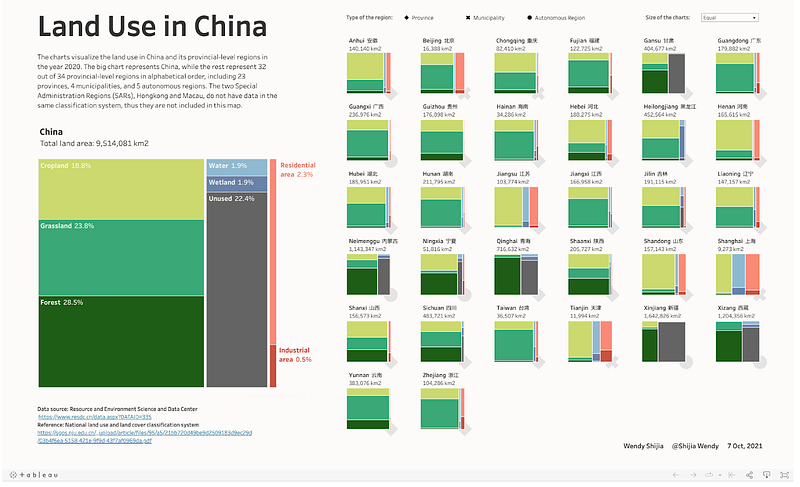
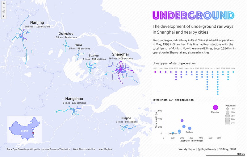
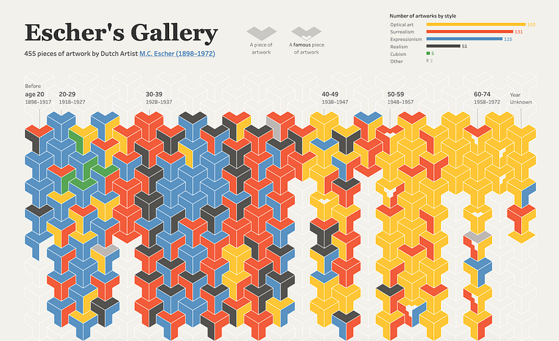
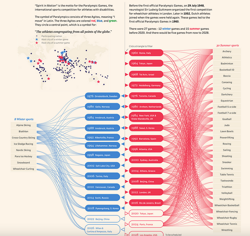
Some examples of the wide-ranging topics Wendy has explored using data stories!
What would you say you’re known for in the data viz world? I did notice your data viz style is really very creative, in the sense that they don’t use existing chart types and it’s literally a whole new way of visualising data.
I think I’m known for visualising interesting topics in an interesting way. I would say I don’t have a fixed style yet because I’m still learning about data visualisation. So I want to try different charts and tools. What you see in my profile is the best solution I had at that time, after weeks or days of thinking and testing.
Speaking of interesting topics, what have you noticed resonates most with people? Is it mostly about the data viz’s subject matter, the technique involved, or some degree of luck or timing?
I think the topic is the first thing that attracts people, then the design, technique, and storytelling analysis. From the user experience design point of view, I need to anticipate who my readers are and how they will read my work. My readers are mostly from all over the world, and usually on Twitter and in the Tableau community as well.
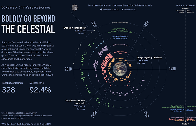
I try to find topics that I’m interested in, and that my readers might also be interested in. For example, in mid-2019 I noticed that space exploration was a popular topic, because July 2019 was the 50th anniversary of the Moon landing in 1969. I’m curious to know how China has been doing since her first satellite launch, and I guess my readers might be interested in it too. So I made my visualisation about Chinese space journeys. It’s been almost 50 years since China launched the first satellite in 1970.
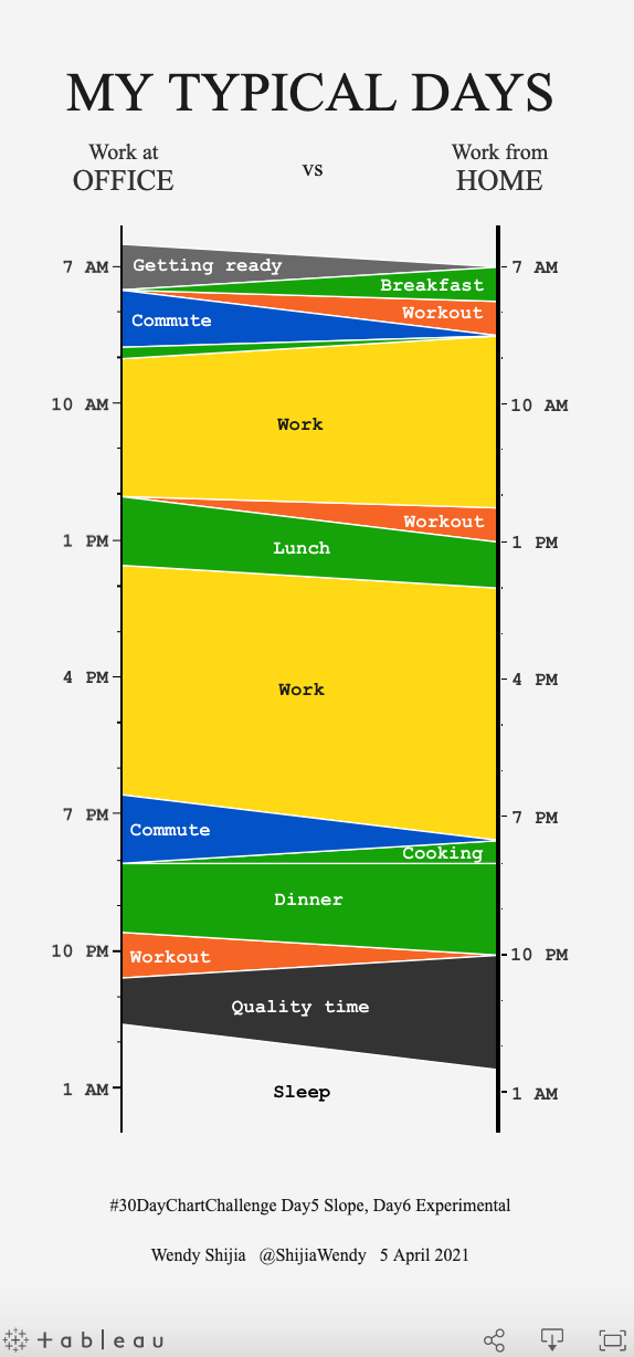
The reaction to some other projects surprised me a lot too. For the “My Typical Days” visualisation, I was comparing the two jobs I had at the time — the outsourcing job I do from home and the contract job where I work with clients at the office. When I put the chart out there, the audience interpreted it in their own way.
[Editor’s note: “My Typical Days” was a chart that went viral during the COVID-19 pandemic as many people thought it was comparing work patterns before and after remote working kicked in.]
What are the steps in your data viz creation process?
I keep an eye out for potential topics all the time — when I’m reading, walking the streets, or talking to people. When I’m inspired by something, I’ll save it on my computer. When I see a topic that’s really interesting, I’ll look for data. Then I’ll write down the title, the topic, and start to refine the questions and the data I have, and figure out what the possibilities are.
It usually takes much longer than I expect because I do lots of research in the first two steps. Once the topic and dataset are ready, I will use Tableau to inspect the data — it has a “show me” panel that allows me to choose different chart types and to see if there’s anything interesting about the data that I can talk about. Only after I know there’s something interesting, I will start on the design. Sometimes if I have very good design ideas, it won’t take much time. Sometimes ideas that are too small for a good story are perfect for daily challenges.
My purpose is to visualise the data, no matter what tools I use. I’ll watch a couple of tutorials and try to use the tool that helps me achieve my goal.
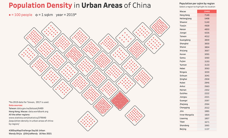
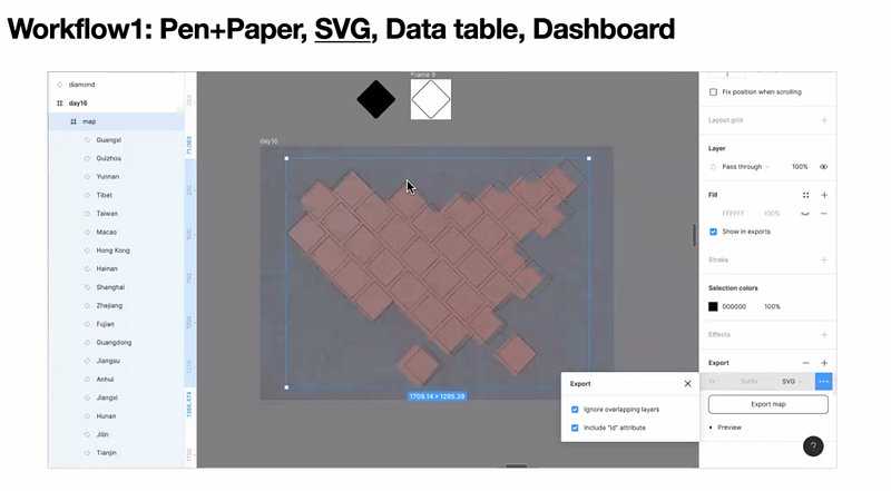
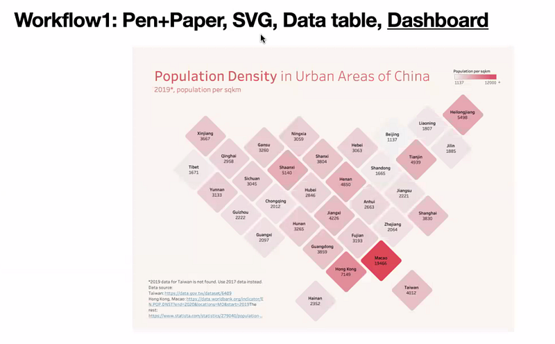
[Wendy walked me through a tiled map she showcased at Outlier, first shown above in this interview.]
One of the prompts for the 30-day map challenge was “Map made without using a computer ”, and I wanted to make a tilemap of China as I don’t see many of those. I decided to use a pen and paper, and started with three to four designs, and submitted it for the challenge. But the next day I thought, “How about I make an interactive map in Tableau?”
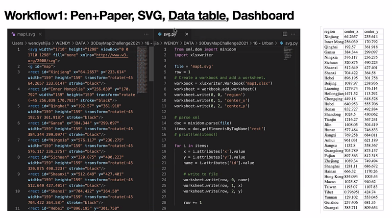
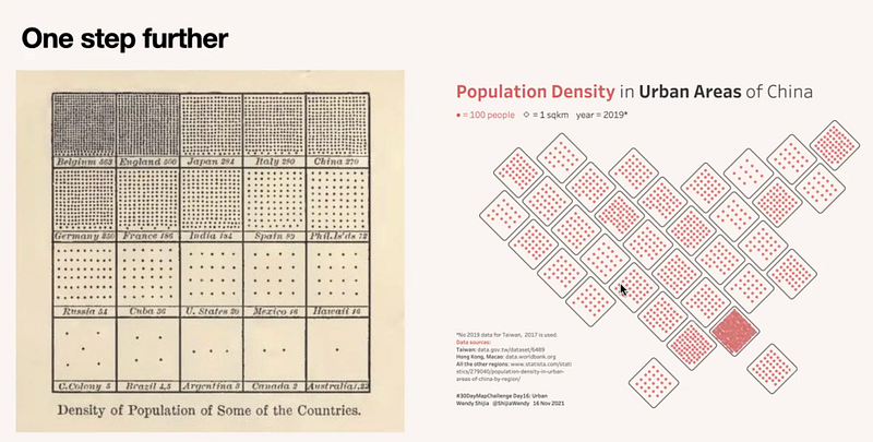
I started with using an Excel table to give a location a x or y number, but the design wasn’t very aligned. So I tried this workflow — creating a design in Figma, exporting it as an SVG, opening the SVG in a text editor and using Python to calculate population density, extracting the SVG data, plotting the x- and y-positions, and putting them in an Excel table. I could then make a Tableau dashboard using that data table. Once I had this workflow down, it meant that I could reuse it in the future. [See the screenshots and their captions below for her workflow.]
Do you collect your own data?
I collect data frequently because a lot of data about China aren’t in a format that I can use. Take, for example, the water levels about the Yangtze river, the Hydrographic Bureau publishes daily updates in a complex data table in an image format.
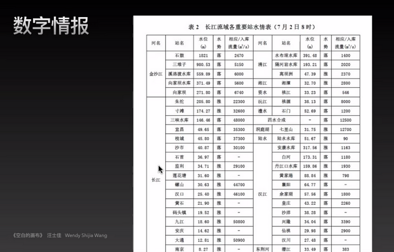
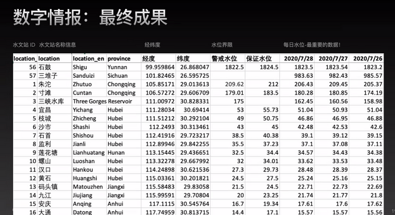
I manually collected three days’ worth of water levels at the beginning, and tested to see if my visualisation worked. Once I knew it would be useful, I went back to the data source and collected the rest manually so I wouldn’t waste time.
Would you say your design style is intuitive or analytical? Is it informed by data or any other design principles?
I design in a logical way. I inspect the data first and that informs my design. For example, the Panda data viz is my favourite. I had read the news that Canada had to return their pandas to China due to a lack of bamboo during COVID, so that triggered my question — Why does China send pandas to foreign countries, and when will these pandas be returned?
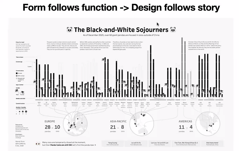
The first paragraph is about why and how, and that’s it. In the data, I noticed that there are two exceptions where the pandas don’t need to be returned — those given to Mexico in 1975, before the policy came into effect. So I needed the story to show that, for instance, in general this is the rule, then this is the exception. That’s why I started with Europe, then moved to Asia-Pacific, and ended with the Americas (where Mexico is), which is different from usual world maps where the Americas are shown on the left.
So your design principle is that form follows function, like Bauhaus?
Yes, I absolutely agree with that. Don Norman proposed three layers of design: visceral, behavioural, and reflective. In other words, how it looks, how it works, and how it helps people to reflect. Visceral is the first layer — it’s what first attracts people. After that, we need to consider the experience people have when they use the product, to do things that will solve their problems. Lastly, the reflective part is about how to make sure people keep using and engaging with the product for a longer period of time. Does the user feel related to, and does it remind them of a previous experience? For example, after publishing the Panda data viz, people messaged me to share their experience of viewing pandas in their country or other countries.
I’ve also seen you explore Blender, most recently with geometry nodes. What inspires you to explore, and how do you go about learning new things without getting overwhelmed or neglecting your current strength?
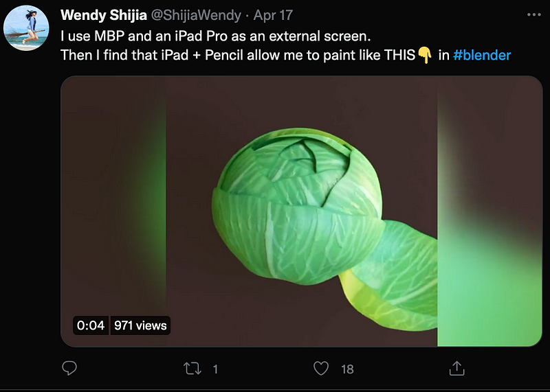
Some snippets of Wendy’s explorations in Blender, which she shares on her Twitter:
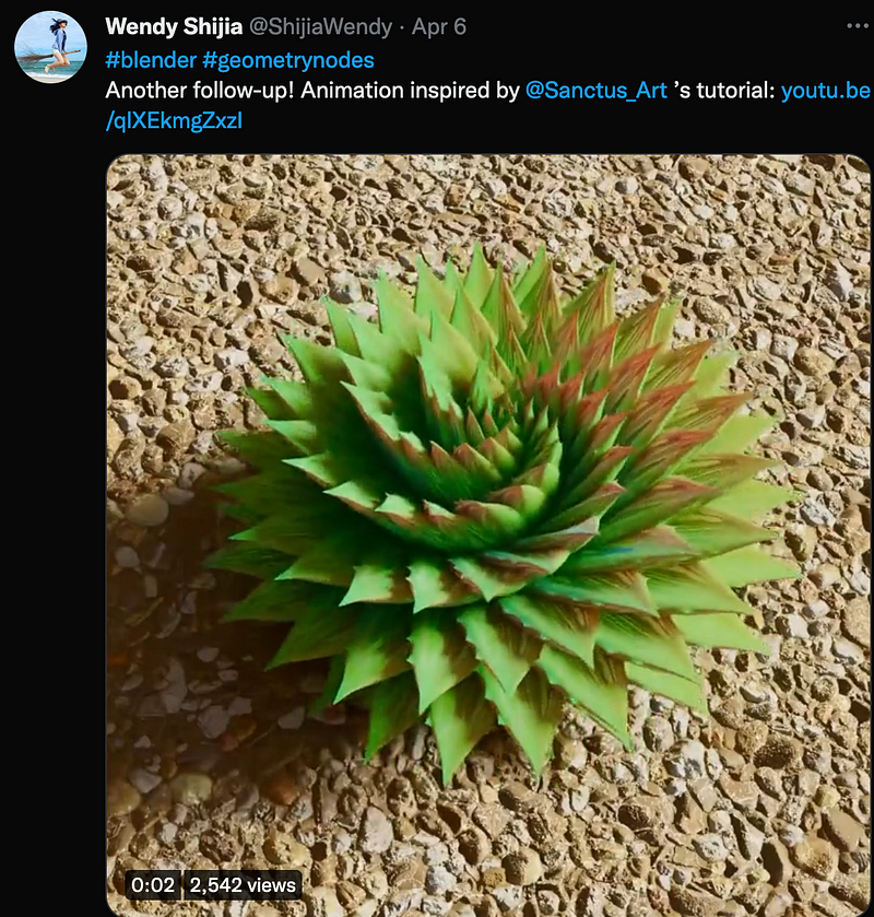
Since I started around three years ago, my goal is to publish a data viz every month. But now that I’m too into Blender, I haven’t published anything for two months. Blender is so interesting! I told you earlier that I didn’t like 3D modelling at university because at that time, the computer was too slow, and I didn’t want to spend so much time just sculpting something or spend a long time rendering. Now, both software and hardware have developed so much. And Blender uses the procedural modelling approach, which I find very interesting and different from manual modelling. I found a couple of friends to learn it together — we watch tutorials and share skills with one another really quickly. Besides geometry nodes, I also use Blender to experiment with 3D maps or spatial data animation. It’ll be a powerful tool in my dataviz toolbox in the future.
What’s data visualisation in China like in terms of use and job opportunities?
In China, we have some media outlets like 澎湃美数课 (Péngpài měi shù kè) or 网易数读 (Wǎngyì shù dú) that are really good at data visualisation. They use simple but very interesting charts to help improve the data literacy of the general public. But their work is not quite like South China Morning Post’s data viz style — such as those big charts and data art styles, which I like a lot — because most people use WeChat or a web app to very quickly browse the information rather than spend time admiring a big broadsheet.
Currently, from my online search, there are only business intelligence or data science jobs, which is a bit far from designing data viz. So I do these personal projects and keep publishing and telling people what I can do. I’ve had a couple of clients reach out to offer me some opportunities to do data visualisation. It’s a new industry for me, so I cannot tell you about current trends. I hope there will be more opportunities in the future, especially since the data literacy level of the population is growing, and more people will accept this way of showcasing information.
Any tools and resources you think people should check out?
- Tableau, specifically the discover page on Tableau Public — it has lots of great examples of data visualisations from the Tableau community. A category that people might not know is business dashboard — use it as inspiration.
- A course by Federica Frangipane, because I love her work very much. In this course, she shares her process of creating data visualisations, which is very different from mine and the tools she uses are different. Looking at how other people work is really useful because she explained how she would encounter problems, solve them, and other tricks to put together the final piece.
- Blender I first downloaded Blender to make 3D maps (not 3D pie charts or bar charts!) Then I found that people are using it for different purposes, including generative art, character design, landscapes, or visual effects. Blender and its community has inspired me a lot, opened my imagination, and even brought me job opportunities.
Do you have works and people that you’re inspired by?
I’d say the people you’ve been interviewing for your community series! All of them are very inspiring people.
Do you have parting words of wisdom, such as a piece of advice for people?
Do things and tell people. Usually we do things and keep it to ourselves. But I recommend anyone who wants to start your personal project, make something and publish it, then get feedback. That will help you progress quickly, and show people your progress along the way. Don’t wait until it’s perfect.