
Meet the Community! Ri Liu, data viz designer/developer
Ri graduated from Queensland University of Technology with a degree in Communications Design/Creative Industries/IT. She worked as a…
Ri graduated from Queensland University of Technology with a degree in Communications Design/Creative Industries/IT. She worked as a designer at various companies in Australia before relocating to the US, where she worked at a data viz–focused agency. After experimenting with Studio Metric, her own data viz consulting studio, she has been freelancing on editorial data visualisation developer work for major news outfits like the Guardian and ABC, Australia’s flagship public broadcaster.
How did you get into data viz?
In short, I majored in Communications Design/Creative Industries/IT at university, then went into web design. In university, I was fascinated by creative coding and the data viz world — I liked the logical and technical and creative, and I wanted both sides of myself to be in whatever I do. Data viz as a field combines both sides very well.
[Later in my career], I lived in the US for a few years, and there was a very active community there, and I went to amazing conferences like EYEO. I was very inspired, and I’d been playing around with D3 at that time when I had some time off [in between jobs], so I dug into the library and got into it then. From there, I ended up moving back and into the more editorial world, and worked at the Guardian and ABC here, doing interactives and data viz.
What keeps you really interested in data viz in particular, as opposed to other forms of multimedia storytelling, for example?
There’s something interesting about the data — I think data is dehumanising, as it takes people and makes them into numbers and something that’s abstract. We see now all the negative social effects of collecting too much information. So I’m curious about how we can take that power back and make people learn something about it, so it’s not something that we passively let happen to us. This is very broad but it’s what I try to do when I do a project — how do I make people connect with this on a human level? If it’s a bunch of numbers, how do I make people feel?
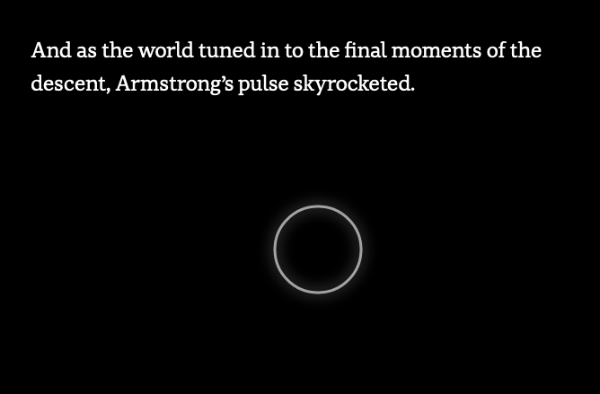
At ABC, we were asked to do a piece about the moon landing; they were talking about the data they had, and there was heartbeat data. I was like, everyone has a heartbeat, so everyone can connect to them to get the sense of stress in the story. That’s the stuff I’m passionate about — not really the technical stuff, but how to bring the emotional side to something cold and unfeeling.
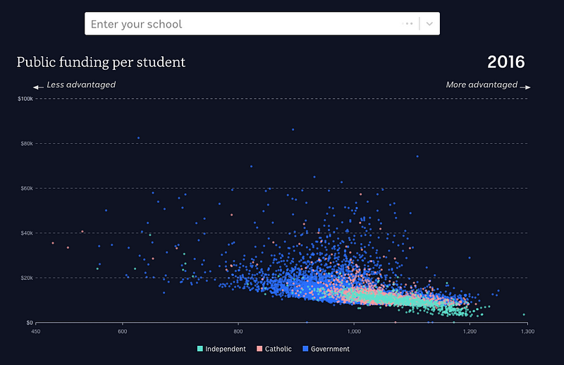
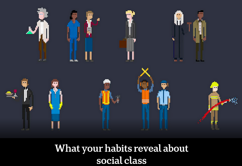
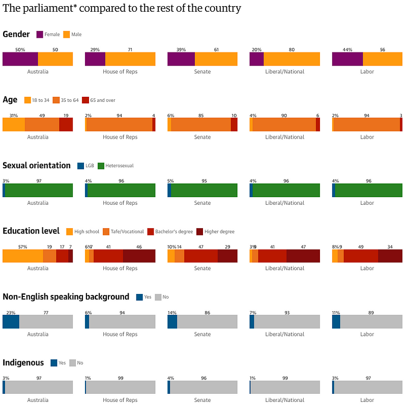
Looking at the work you’ve done, I noticed a lot of your projects are themed around comparative equality and Australian topics — cultural and class tastes, education resources distribution, political representation — is there a reason why?
Some of those topics likely came from people on my team, but maybe something in my subconscious led to these commonalities. Even my personal work has a bit of this — it’s my sense that data can make visible those things that we have feelings about, but once it’s out there, we can see it and it’s indisputable. Maybe making some of those feelings visible — that’s what I’m interested in.
I’m wondering if you could elaborate on your experience in the data viz scene in Australia versus the USA. What differences did you see in terms of industry maturity, or skill sets, or is it just a numbers issue in terms of talent or client interest?
I think a lot of those things, actually. I think the US, and probably Europe, has a larger community and more of an established history. Some really talented people exist here [in Australia], but [data viz is] not big enough in our population. In terms of work, I don’t think the local [Australian] industry is as aware. There’s people who want [data viz work], but maybe people don’t have the language for that and think in terms of dashboards, for example. I feel like many things aren’t as developed because of the scale and time.
But this is just me speculating! I haven’t kept track of the community internationally since I left; I’m only peripherally aware of stuff going on. Another big difference is the big data viz conferences that happen in US/Europe, and [how] a lot of people just know each other. If you go to the conference, there’d be familiar faces and the network is very important; I don’t think I’d have gotten experience without that.
What are your views about how data viz has evolved generally?
I think the data viz community has shifted in its focus — this may sound a bit old and crotchety — it felt [that, when data viz was new,] people played a bit more and did things that were out there, and it was more about the art side than the technical and “wow” factor. Earlier, I felt like it was about creative coding and passion and exploring the boundaries of what you can do in the data. Every year in the early 2010s era, you’d get really amazing stuff that would come out; maybe it was [because of data viz’s] links to the Processing world, like Casey Reas and studios doing lots of innovative stuff.
Unfortunately, I haven’t felt as inspired by the work that’s coming out, and I don’t know if that’s a stage in the industry — maybe because more people are doing it, and there’s business applications for it. Now, the forms are a bit more familiar. People play around more visually. So Giorgia Lupi and Stefanie Posavec, who’re also from that “old world”, still play a lot with the form of it.
I guess I’m struggling to articulate the difference, but it’s about the mix of code and form and interactivity. We could speculate, like how once it started to reach a broader audience you needed to worry about accessibility and the audience being able to understand what’s going on, so you can’t have something too weird with lots of clicking around. Mobile friendliness is also something that’s come up since then. I don’t feel like lots of data viz moves me as much as it used to, but I’m not sure if it’s me, or the industry, or both.
Interesting! I’m very new in this field and would have thought, “now is the time data viz is taking off,” but obviously I lack that historical perspective. Do you have examples of these early projects that really inspired you?
The classic one is the guns by Periscopic. Jer Thorp had an agency for a while that did some really cool stuff too — Office of Creative Research, another small agency. The early days of when Snow Fall had just come out of New York Times, and people were just playing with the medium, not just in the editorial space but in art and academia too — it was a bit weirder.
How much of your coding and design skills came at Uni, and how much came after?
University is a great place to meet new friends and network, but it doesn’t give you direction; you have to create that for yourself. Like if you took coding, it’d give you a rough structure, but you wouldn’t know any specific tool that you’d need for a real job — so a lot of the stuff I picked up on my own, lots of googling and Stack Overflow.
What are your main tools?
I primarily use Javascript, specifically the D3 library. It was tough to learn, but I haven’t used anything else. I use the blocks website run by Mike Bostock — an amazing learn-by-example kind of library, where you find the closest example of what you were trying to do, then learn from the way it was built. Python and Jupyter — sometimes I use it for number crunching and analysis.
[Ri kindly mentioned, after the interview, to check out ObservableHQ for D3 examples and tutorials, as the blocks examples are no longer maintained.]
What is the data viz scene in Australia like? Who are the main players?
There’s a bit in academia. Monash University has an Immersive Analytics Lab and Sensilab, both doing interesting work. [In the] news world: Nick Evershed’s team at the Guardian, which I worked with; ABC has a Story Lab and Digital Story Innovations team. The Age (Craig Butt) and Sydney Morning Herald have data viz teams too. It’s scattered across academia and news. ABC having public funding drives a lot of the data viz work.
Regarding ABC being state-funded and having the most active core team of data journalism — is that a coincidence, or is that stable funding pretty critical to data journalism?
I’d say so, yeah. It takes longer and [more] effort than traditional journalism stories. It’s quite important also, having a proper team that operates differently from traditional editorial models, because I don’t think that works. Editorial environment you still had these deadlines and expectations. You’re going to have bugs, and a life beyond the publishing date. Having also worked in startups and tech companies, it’s quite a stark divide in the cultures [between those places and newsrooms].
What other structural challenges do you see inhibiting data viz growth in Australia? I guess the one you identified, the public funding. With the pandemic, universities and the research side that drives a lot of the innovation might be at risk.
With the news funding model, a lot of newsrooms are resistant to change and need to move to digital and interactive stories. I see lots of big newspapers are hiring for Data Editors — the demand is high, but it can be tough. I did burn out working in news; it’s not uncommon, and honestly probably more common for people who aren’t white.
How has your experience in a data viz field as an Asian-heritage person been?
[In Australia, there’s some awareness about diversity problems in newsrooms, but] it’s not really spoken about and addressed. Given how substantial the Asian population in Australia is, [representation is] quite concerning. I was maybe one of two Asian faces in newsrooms that weren’t on the Asia-Pacific beat (those who cover Chinese content).
[While] I don’t have anything concrete [about how this might have impeded me in my career], I get the general sense that my experience would have been different if I’d been white. When you walk into a big space and you don’t know everyone, that can be a bit confronting and isolating.
To wrap up, do you have hopes for data viz in Asia?
I hope [it gets easier for] Asians working in predominantly non-Asian environments… And I’m from Australia, so there’s my bias, but we’re getting so Western-dominated. And I think generally having that unique experience and making that global, there’s a lot of value there. I feel like I have a unique perspective that not everyone in the industry might have.