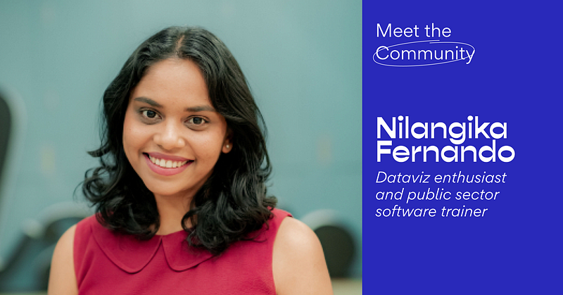
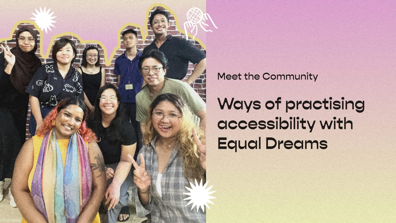
Meet the Community! Nilangika Fernando, data viz enthusiast
Nilangika is a data visualization enthusiast from Sri Lanka. She started her career as a researcher at Verité Research, one of Sri Lanka’s…
Nilangika is a data visualization enthusiast from Sri Lanka. She started her career as a researcher at Verité Research, one of Sri Lanka’s leading think tanks, helping to make its research more accessible through visualisation. Drawing from her empirical observations about audience responses to Verité’s various outputs, she spoke at Data Visualization Society’s Outlier 2021 conference about dataviz in multicultural environments, and is passionate about how dataviz enhances information accessibility.
How did you get interested in data visualization?
As a child I was relatively good at drawing and would only read snippets. It was important to me that information was short and that it would spark my curiosity. So that’s why, to me, data visualization is important, because people might not grow up with the environment or the background of reading a lot. And a lot of information is actually kept in books. Growing up, everyone tells you, “read, read, read”, but if you aren’t into reading, there’s no other way for you to get that information — data viz can really bridge that gap.
Another thing is that people may not have that much time to read, whereas a quick data viz can give all the information you need, as opposed to reading a ten page analysis. It’s not the same, absolutely not, but it communicates information much faster to people — which is something we could really use.
How did you move into data visualisation?
It started when I joined Verité Research. To be honest, I’ve never really thought of myself as an academic or researcher. I was more creative on one side, and a bit more corporate on the other. After learning about a university senior’s experience at Verité Research, I applied for an internship there. And I ended up doing my university internship there for three months, starting with data analysis and a bit of number crunching, and then ended up working there for close to six years.
The culture at Verité is amazing in the sense that if you are interested in a topic, they’ll let you explore that. So I was allowed to not just plan research and analysis, but also work on web development with a developer by telling them “this is how we want it to look like, this is the information we want to put out there”. The organisation understood the need for research dissemination, and data viz was one of the primary ways of getting the analysis out. I was lucky to be involved in projects that had data viz as requirements and just learnt on the job.
When I look back, there are so many things I’ve done in my life that have seemed completely unrelated, but when you look back in parts, they make sense to you!
How did the prominence of dataviz grow while you were at Verité?
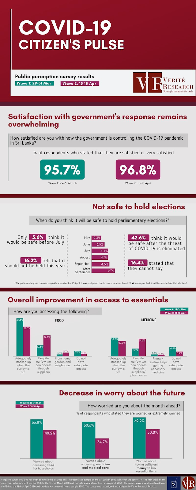
A lot of organisations in Sri Lanka use graphs and charts to present their financial information. But in terms of putting policy reports out there, a lot of it came through perhaps because of COVID-19 — through seeing a lot of international organisations adopting it and exposure from other countries as well as] social media. Now think-tanks and NGOs have used data viz for communicating that message […] because the public needs to know about possible solutions [and] you need public support for particular policies. If people don’t know, how are they going to influence the policymakers or the decision makers, politicians, and so on?
One thing that Verité believes in is you don’t just give research without data to back it up. It started with articles having a chart of two and moved into more attractive visualisations for social media.
One of the big data visualization projects you did was the one about the Sri Lanka government’s budget promises for 2019. What was the thought process behind the design of these visualizations?
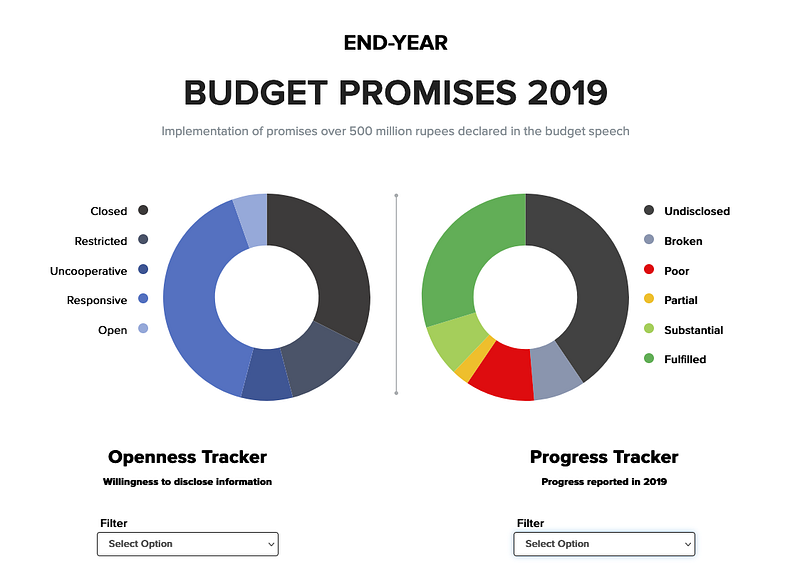
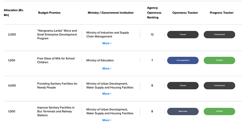
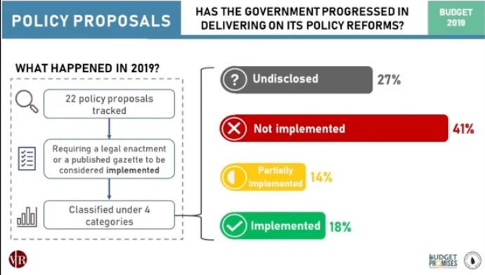
[Elaboration added later: The platform was created to show both the budget execution and the openness of the government about the execution. The layout, graphs and colours were based on what the categories were measuring and we wanted the media and public to easily understand the results of the research we’d spent so much time doing.]
When we originally came up with the methodology, we wanted to assess how well the government managed the budget. A lot of the talk around the budget, and media traction, would happen just before or during the budget conversations for the next year. But no one was asking what happened the previous year. So what we wanted to do was ask, what happened last year?
So we started searching online for information on budget execution, but then we realised there’s not a lot of information. This was the same time that the Right to Information Act was passed, so we thought of using it to get as much information as we can. But we realised even if we ask for the data, it’s such a hassle to get it. And [the government body might not even give you the right information. So then we wanted to ask another question: How open were they about it?
Halfway through the year if a government body determines that we don’t have the budget or we don’t think it’s a feasible idea, that’s fine, but you can make that public — we wanted to highlight to people that the government has to make data and information available to the public, as all of this information is collected from your money.
An aspect of data viz you seem to be passionate about is the idea of visual diversity and language, specifically aesthetic variations linked to ethnic groups — why?
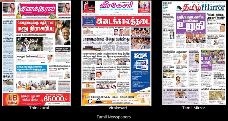
One of the things Verité’s media team did is run a Facebook page called Ethics Eye. They looked at newspapers, mostly done in Sinhala, and did a small graphic on their ethical violations.
The researcher who was doing these graphics had a very different aesthetic to what I was used to. there’d be lots of colour, a mix of both pastel and bold colours, pictures, and extracts from the article. When I saw that visual, I thought that it was very loud, because I was used to a different aesthetic, one with plain lines and white space.
So when I saw that, my first advice to her was to keep the lines clean, stick to a neutral palette, have a plain background, things like that. But when I looked back at the previous graphs, there was still higher audience engagement with the loud graphic as opposed to the simpler plain graphic. And it made me wonder if my advice to her was incorrect, because clearly something was working, for people to pay attention and to talk about it. Was there something in the aesthetic that I’m not appealing to?
My colleague was exposed to more Sinhala content, and perhaps she knows something about that audience that I don’t. When I brought this up with my colleagues, they said, I don’t really know, it has never really crossed my mind, but you’re asking good questions. Because even I didn’t realise it until that particular incident, and I thought, is this something worth exploring?
The interest in language diversity came because most of those graphics were done in Sinhala, whereas the infographics I did were in English. In Sri Lanka, the way our demographic is, all Sinhalese would know Sinhala, most Tamils would consume Tamil information.Your ethnicity and your language are very close knit. I chose to look at language because that’s more recognisable than your ethnicity, which can be a lot more nuanced. And because information was presented in that particular language, that’s what I wanted to explore.
[Elaboration added later: This was important to me because I wanted research to reach people. We would take the content and create infographics in three languages following the same format, and check if it was appealing. I noticed a significant variance between the aesthetics of the content between the languages, and to make our graphics more attractive we may have to change our approach.]
You’ve talked about data culture. In your view, what marks a society as having a data culture and why is it important?
I think that for a country to be data friendly, you need to have access to the data, you need to be able to rely on that data, and you need to use that data. And I mean, not just policymakers — policy-makers need to have that data backing up all of their decisions — but also the people.
So the first one is, you need to have access to the data in Sri Lanka. While there is quite a lot of data collected, they are mostly done by the government, because they can collect most information. But the data that they do collect is mostly related to the financial side (e.g., by the central bank or the Ministry of Finance). We don’t really have a lot of people who collect other forms of information.
And even within whatever information that the government has, some are not really available to the public, you actually have to pay to get access to that database, or pay to get access to import/export data. So while they collect data, they don’t give it out. This limits Sri Lanka from being a data-driven culture.
[Elaboration added later: I believe if we can create a more data literate culture everyone would be able to make informed decisions faster. For a country, it can help citizens understand what is happening and also hold people accountable for the action or inaction.]
What is the data literacy or dataviz reception like amongst the general population in Sri Lanka?
Public exposure to data visualisation is very limited — we rarely see a graph or a chart in any newspaper. The only times we do have it is during elections, where there are lots of maps and bar charts. COVID-19 paved the way for data visualizations to become more popular. So people started plotting charts, exponential graphs — but how people read an exponential graph is a different matter.
For example, when we had analytical pieces that were written in all three languages, the English one and the Sinhala one would always get published with the graph. The Tamil one, they would be very reluctant to publish it. We didn’t know if it was written too literally, too technically, or if it was too economic jargon heavy for a general audience, but we realised there was certainly a gap there — while there’s economic information that needs to go out to the people, there’s been very little reception from them.
We’re still learning about how our own people see data and how that varies within the language as well. For example, think about how we are exposed to shapes at a much younger age, so we know the area of how those shapes are calculated, as opposed to a spherical circle. So we are a lot more familiar with those basic shapes than we are with perhaps a line graph or a bar graph.
I would love to have a lot of data within one graph. But I limit myself from that, because I know that it’s not very people friendly and it won’t be well received, therefore, it would be redundant. Right now, what we need is small, bite-sized pieces so that people would be exposed to more data first; then they’ll start being more curious about a graph or a chart or numbers.