
Meet the Community! Krist Wongsuphasawat, data visualization engineer
Krist Wongsuphasawat is currently an Engineering Manager of the Data Experience team at Airbnb. He often publishes data visualisation work…
Krist Wongsuphasawat is currently an Engineering Manager of the Data Experience team at Airbnb. He often publishes data visualisation work (storytelling pieces, open-source libraries/tools and sometimes academic papers). Previously, he was a Data Visualisation Scientist at Twitter and a PhD student at the University of Maryland. He’s known for his original research in data visualisation and human-computer interaction, as well as playful and accessible writings on Medium. Check out some of his projects here!
How did you end up in data visualisation?
At a young age, my dad bought a computer for general use and work at home, and I got to use it sometimes. I felt that the invention of the computer was almost like magic — look at what we can make happen with our own hands! So I enrolled in a computer engineering school at university, during which I noticed that while a lot of people were concerned about writing the correct code or getting things done, I cared more about user interfaces — for instance, where to put the buttons or how to design the webpage. This was at a time when UX design wasn’t so big yet, so I was wondering where I could learn more about the skill or practice more. I also wanted to study abroad, so I looked up places where I could pursue knowledge about human-computer interactions, and thought maybe after that, my path could lead somewhere.
At first I was only intending to complete a Master’s programme at the University of Maryland. Then I went to Ben Shneiderman’s lecture, where he was showing a visualisation of some kind of network. It was so powerful and I thought, ‘Wow, this is so cool!’ So I took his class and did an independent study with him. And yeah, the experience was great enough to convince me to do a PhD. So I spent a few more years with that.
What about data visualisation appeals to you?
I feel that information visualisation helps me explain complex information to anyone and makes it a lot easier to understand. That really resonates with me — the power of explaining, the simplicity, and the beauty — it’s so humbling but it helps us understand a complex thing we couldn’t even get an idea of before.
You’re also famous for a PhD thesis you did about temporal event sequences using electronic medical records. How did you choose this problem to focus on? After I went through it, even with very amateur knowledge about the topic, it seemed like such an obvious thing that needed to exist!
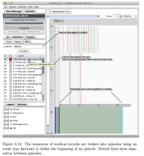
A screenshot of LifeFlow, a scalable visualisation that uses medical records to provide an overview of event sequences to support user exploration and analysis of patterns. It’s one of Krist’s many contributions in his thesis. Learn more about this project, including an explanatory video of the data viz software Krist built, here: https://kristw.yellowpigz.com/projects/lifeflow/
Ben introduced me to the initial problem by showing me a collection of medical records and got me to look into the data by exploring questions such as, ‘How do we search or query medical records?’ I had been doing research and going to conferences where I met people who worked on event sequences, and I realised one particular thing nobody can really provide is an overview of these event sequences. For instance, if you have a million sequences, how do you know what insights they can provide as a whole? Is there a way to provide an overview to summarise all these events? That was the challenge I set for myself at the time and thus it became my thesis topic. As a whole, graduate school — including both Master’s and PhD — took me five years to complete.
What do you think are the basic principles we should always keep in mind when designing viz for temporal data or that shows a series of events?
God! Principles of visualising temporal data — my goodness. I’m being brought back to school here (laughs). I start with questions — for instance, ‘What are we trying to achieve?’ And then, ‘How can we achieve that from data?’ After I’ve found the data, I’d ask, ‘Is this even the right data to answer my questions?’
Let’s say the so-called problem should be answered with temporal event data, then there are different angles you can approach the data with. For example, you could ask, ‘Do I only care about the order of things?’ If you don’t care about how data changes across time and just want to know about exact events that happened before and after the others, then you can ignore the time aspect of the data. But if you want to see how data changes across time, then that gives you a different constraint. Other approaches include asking, ‘Do I only care about a few samples or do I want to show the overall trend?’, ‘Do I need to try to aggregate?’, or ‘Am I looking for a new perspective in order to link it back to what I’m trying to show?’ Figure out what you are trying to achieve with the data, narrow it down, and simplify the data set.
How does interactivity best support exploration?
I think interactivity helps to layer information. One mistake I made early in my career was being too eager to show too many things. I tried to jam as much information as I could into one visualisation.
I realised later that when you try to tell a story, or when you want to encourage people to explore data, it helps to bring them in slowly. As they progress through your work, you can increase the complexity of the visualisation or make more information available with interactive aspects. For instance, if they’re interested in a particular part of the visualisation, they can interact with it in a certain way, which is when you can bring up additional data. This is better than throwing it all at their faces at once. So yeah, interactivity reduces the amount of things people need to process at one go.
How and why did you move from academia to industry?
I have always wanted to work in the industry in a more applied manner. In academia, you spend a lot of time writing research papers, trying to look for new ideas, and emphasising novelty. Many times, I don’t know when or if anyone would pick up the work I researched and do more with it.
So when I neared graduation and started looking for a job in the industry, I wanted to gain experience in solving a real problem with real data. Even the thesis project — the one where we compiled data from hospitals — was only a slice of a real problem. Twitter gave me the opportunity to apply my skills, and when I joined, it was the early era of data science, when lots of companies were starting to build their data science teams.
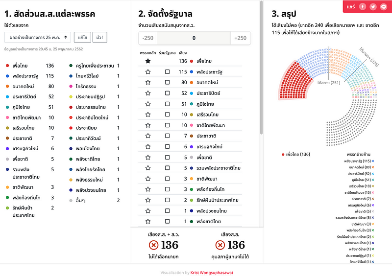
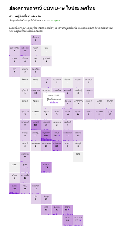
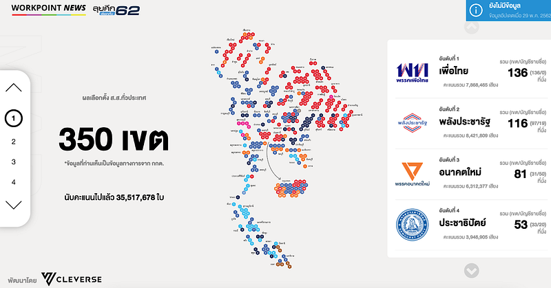
Your projects touch on very diverse topics, including Game of Thrones, Boba, the Thai elections, and COVID. How did they come to your mind? Were the projects that were based on tweets inspired by your time at Twitter?
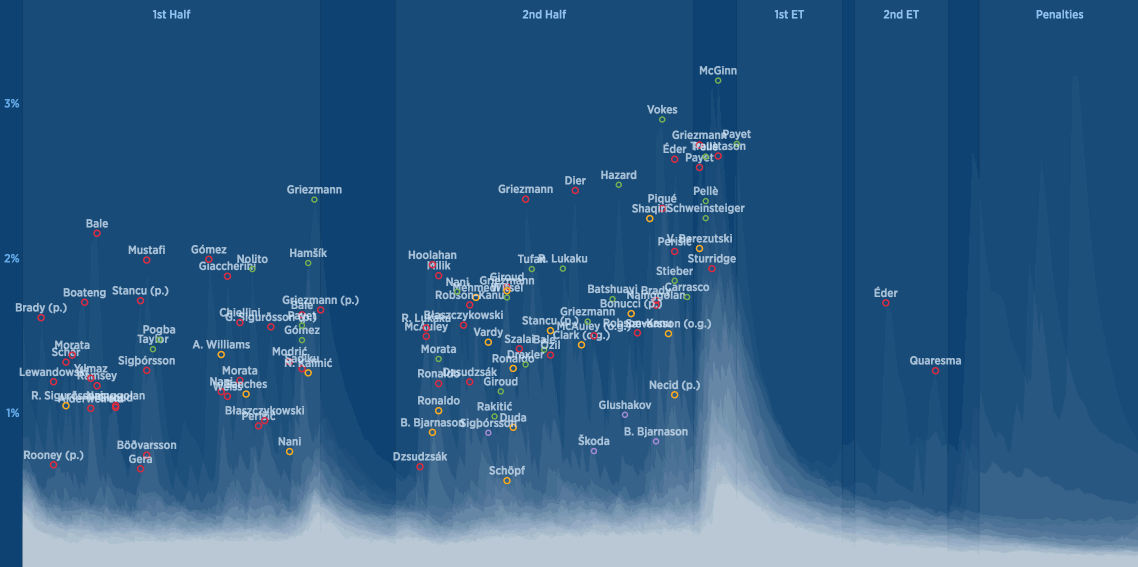
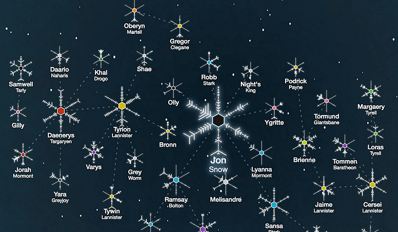
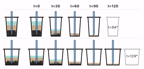
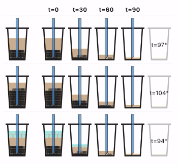
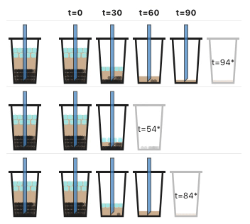
When I joined Twitter, the company was still growing rapidly and thus that was a good time for us to initiate many things. Having access to tweets made my work a playground. I had so much data, and I could invest my time into analysing Tweets about anything related to my interests. I’m a big football fan, and I like Game of Thrones. I’m also passionate about Thailand, as it’s my home, so anything relevant to the country is always a priority for me (laughs). The boba thing was my personal passion project — those are the most fun to do, because I can invest time in it without feeling like I’m actually working.
Could you explain the difference between being a data scientist and being a data viz engineer?
They are just titles. Most of the time, my day-to-day are still building data tools that people can reuse over and over (web apps). The key difference when I switched from Twitter to Airbnb was that previously I was in the data science organisation and I was closer to the data, in a sense. For instance, most colleagues who sit around me take the data, develop metrics or plan a study, and analyse it to solve a certain business problem. And it was quite natural for me to chime in or try something on my own with data. Whereas in my role at Airbnb, my org is more focused on engineering a data platform and building tools for data scientists, so that others can use data more effectively and cost-efficiently. My colleagues now focus more on engineering and building distributed systems. I learned new engineering skills and practice, but no longer analyse the data directly as much.
Also, at Twitter, the exploratory storytelling projects we made would be shared with the outside world because Twitter was about what’s happening and the PR team often shared content about recent events. At Airbnb, those are not the focus. Instead the company cares a lot about design and experience, so the team put a lot of energy to find the right blend of UI/UX design, data viz and front-end to make the data experience of the people in our company better and help them utilise data more effectively.
I came across Airbnb’s VISX platform and it said, ‘At Airbnb, we made it a goal to unify our visualisations stack’. I was wondering why a flatshare company needs its own data visualisation stack — what is the importance of data viz to Airbnb?
It’s because we have several products internally that have a data visualisation component. These projects use different libraries or might have internal requirements (performance, customization, etc.) that are hard to solve with third party libraries.
Take the example of A/B testing tools — when these tests are ongoing and you open the Facebook or Twitter sites, it may look slightly different from what your friend sees when they open the sites. This is because there might be 100 experiments going on, with some more visible than others. The test is judging features from a different colour of a button to the way things are run on your timeline. After that, in order to know which way is better than the other, we will use some metrics to make the judgement. So overall, we run users through those experiments, collect the data, and then look at the results and try to decide whether we will ship the feature out or not.
The engineers and product managers from different parts of the company have to make these decisions. So we build a user interface to present this information, in order for them to see what they need to see from the experiment results and make sure they’re making their decisions based on the right information. Tools like these are essential because without these tools, you can hardly decide anything. You can collect data, but if you cannot analyse and process them, then there’s no point in tracking the data at all.
What brings you the greatest joy and excitement at work as a data viz engineer?
Getting to solve a complex problem and seeing people benefit from it — a combination of that is what brings me joy, I think. If you solve a very complex problem and nobody uses it, then it doesn’t matter that much. Or if you built something that everybody uses, but it is something that anybody can build, then while there’s some fulfilment, it’s missing that specialty. If it’s a nice blend of both, then it is very unique, because it is something that maybe only a few people in the world can do. Sometimes it also does not have to be a very complex problem, but putting extra care into the solution and elevating it to the next level.
How do you see your work evolving going forward?
I’d like to expand my coding skills and my knowledge of engineering practices. I’m still searching for ways to use visualisations to bring value to the company or to solve problems we see now in the world. I also want to connect the knowledge that I have seen in research communities, like visualisation practices, and make it applicable on a broader scale.
I know you’re friends with PUNCHUP and you’ve gone back to give talks at your alma mater, so I’m curious — what is the data visualisation landscape in Thailand like?
Yes, I know PUNCHUP, but I don’t know any other data viz-specific organisations. I think it’s kind of difficult to have a standalone data viz firm. It’s very challenging even in the USA. There used to be several such firms, but nowadays there’s not that many standing. There are probably some data viz freelancers around too. In terms of interest, many people are interested but most of the time people are more drawn to data science instead of data visualisation specifically.
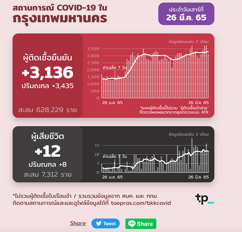
I feel like in the past few years, like during the past election, there were a lot of nice election data visualisations and a lot more attempts in sharing data with high quality visualisations compared to when I was young. It used to be that election data visualisations would mainly be ugly 3D pie charts or something similar. But in the recent one, we had very neatly done maps. Also, with the COVID situation, there were some nice dashboards that people made to showcase COVID statistics. There’s a lot more demand for open data and such lately too. There are more data sets available online compared to many years ago. That said, it’s still going to take time for data viz to become mainstream because you can’t take a very analogue organisation and turn it upside down, to make it digital in a day (laughs).
I noticed some of your Medium articles are in Thai — I’m curious about what they cover?
I try to pick topics that I believe can be valuable to Thai people. Obviously, I chose to write in that language because I wanted to target such people. I wrote about data viz-specific topics such as when not to use a pie chart, and other broader topics, including what it is like to be a programmer in Silicon Valley, or what API means. Other topics I wrote include the common keywords or vocabularies that you should know in engineering life, as well as a guide for interviewing. Some of them immediately took off in popularity — the article explaining API in layman terms is one of the top results on Google. In that article, I explained the data API using the analogy of someone selling meatball noodles (laughs). It was a hit, so that style of writing seems to resonate well with people.
Are there things you wish you knew earlier in your career?
The painful thing about data visualisation is that the output is sometimes so simple (laughs). So people see it and they may think, ‘What’s hard about it?’ (laughs). It’s a paradox, right? When you make something very complex so easy to understand, people sometimes fail to appreciate the process. So later on, I would show more of the process and explain why it’s so complex and the trouble I went through to get to the final product. Then they’d appreciate it a little bit more.