
Meet the Community! Kimly Scott, Tableau Data Visualisation Specialist
Kimly Scott is an Australian Tableau data visualization expert and analytics manager. Although her data viz journey started just three…
Kimly Scott is an Australian Tableau data visualization expert and analytics manager. Although her data viz journey started just three years ago, she’s already making splashes with her incredible Tableau data visualisations, being nominated for Visualization of The Day eight times. Check out more of her work here!

How did you get into data visualisation?
I started in web analytics as the only analyst in a small agency, looking at user and customer behaviour on websites. Eventually, we began to get clients who brought in different types of data, like offline retail data and media data. So I had to figure out how to combine all those disparate data sources and show my clients what was happening. When I was living in Singapore, one of our clients started to use Tableau, which was how I got an invite to attend the Tableau user group. That’s when I discovered this whole community of people who do data visualisations and are so passionate about it, they create personal projects in their own time. So I began practising and participating in Makeover Monday, during which I realised that this is something I really liked doing. That was three years ago, and I’ve been doing it ever since.
How would you describe your current data visualisation work in terms of style, process, and inspiration?
I like to keep things simple, sticking to simple charts that people can easily understand. At work, some people don’t deal with data day in and day out, so they may need simple visualisations to effectively understand what the data is telling them. Similarly with my personal projects, I use minimal colour and minimal images. I do all my work on Tableau and upload it onto Tableau Public.
Sometimes, my ideas come from looking at other people’s work or articles, from which I’ll find some data related to that topic and build something! Makeover Monday’s also a good source of inspiration. They provide an original visualisation and a dataset — your job is to build something a little bit better than the original. If I’ve got a few spare hours and feel like doing some data visualisation practice, and I can’t be bothered to refine my own data set or can’t think of a topic, then I’ll go do Makeover Monday.
But there are also topics that I want to highlight to people and thus want to visualise. One of my recent visualisations was about refugees and refugee resettlement. It’s meant to show how once refugees are resettled, that’s not the end of the experience. There are many things that they experience once they’re in a new country, such as racism, discrimination, and language barriers — and I wanted to highlight that.
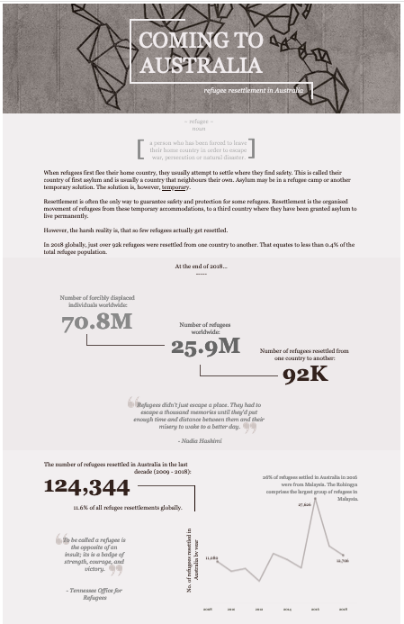
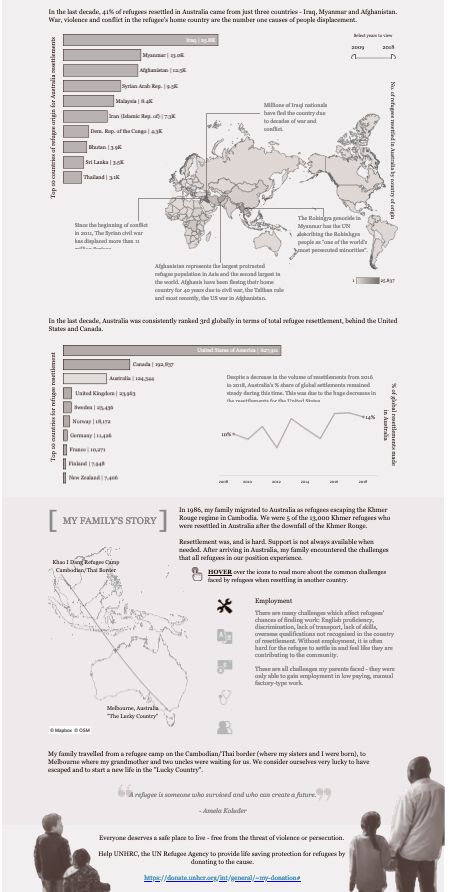
This project drew on my background and experiences. My two sisters and I were born in a refugee camp. We lived there until I was two, when we were sponsored to come to Australia. But even when you’re in a new country and managed to escape everything that happened in your home country, it’s still not a walk in the park. When we came to Australia, we pretty much had nothing and had to rely on charities and family members who were already there to help us. My parents worked day and night. They took three jobs to support us. They went to night school and learned English, because they didn’t speak a word of English. In the 80s, the area that we moved to did not have many Asians. So my sisters and I were the only Asians at school, and not having people who looked like us and who have experienced what we’ve experienced was challenging as well.
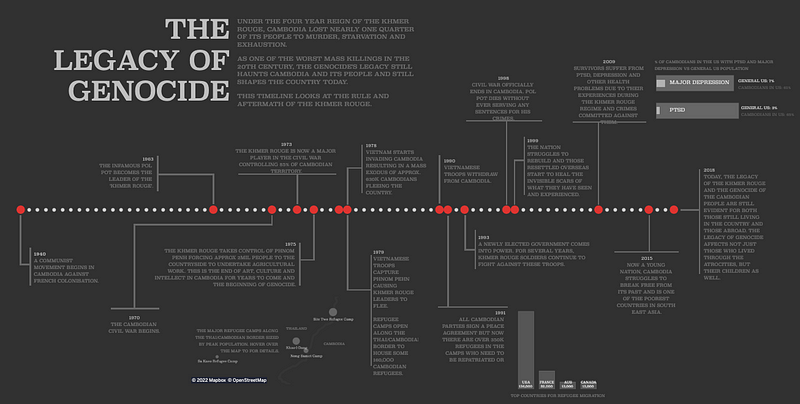
If you’ve seen the timeline about Pol Pot and the Khmer Rouge regime [above] — even though that’s all in the past, there’s still so much trauma that the people who lived through that episode of history still face today. My parents lived through that, and I wanted to bring that to light.
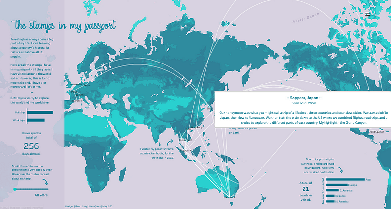
This was a viz I made for the “Quantified Self” project by Iron Quest. We were supposed to come up with and visualise our own data, such as fitness data from a Fitbit etc. I manually keyed into an Excel sheet, and visualised all the places in the world that I visited.
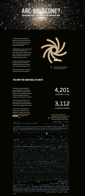
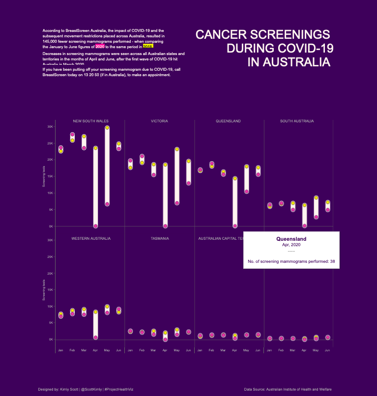
I also submitted a viz titled “Are we alone?” to Iron Quest. There was a prompt for mysteries and magic, and I wanted to do something about space because it’s so mysterious. I had the idea of doing something with star maps, and initially I couldn’t find any kind of interesting data sets online, but eventually I stumbled upon the exoplanet data set distributed and maintained by NASA. I thought, “Oh, this looks interesting.”, so I imported that into Tableau.
Then I started to play around with the data and came up with this idea — rather than looking at exoplanets and the constellations that they’re in, I asked the question: ‘Are we alone among these exoplanets? Could there potentially be life on these planets? How many planets are inhabitable zones? Which are the planets that could potentially support life?’ That’s how the theme evolved from my original concept to the final product.
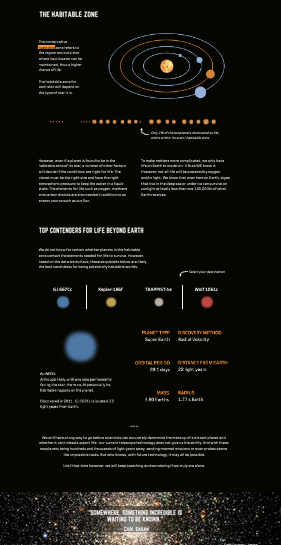
Another community project I worked on was the visualisation of cancer screenings during COVID-19 in Australia. This data was supplied to me — a lot of these initiatives supply data, but the data is usually UK- or US-based. Since this one was Australian data, which was less common, I was really keen to participate in the project.
Going forward, how do you see your own data viz work evolving?
I’d like to tackle more social issues. Specifically environmental issues, inequality, racism, homelessness, women’s health, and mental health. It’s something that I wanted to do in the past, but I wasn’t really confident in my abilities to portray that kind of sensitive data at that time. As I started to participate more and get more feedback from the community, it gave me a bit more confidence to tackle those topics and create visualisations for the public to see.
How exactly has your process of creating data visualisations changed since you first started three years ago?
My process definitely changed as I experienced lots of hiccups, lots of trial and errors, and lots of Googling. When I first started, I had to Google even the simplest things, such as how to do a year-on-year comparison. I didn’t have the background knowledge of the best practises on how to visualise certain types of data. Now I’m more confident in my skills, and I’m a bit more flexible when I approach a data set and am more willing to experiment with different chart types as opposed to just doing what the client or stakeholder wants.
Is there anything you wish you had learned sooner when you were just starting out with data?
When I was just starting out in data viz and putting my personal stuff out there, I felt a bit down if there was not much interaction and feedback from other people. Now, I don’t care about that. I think it’s important to create the work for yourself, not for anyone else, and worry less about what everyone else is doing. What you create is for your own personal growth and journey. If you love what you’re doing, and you’re learning and growing from it, then that’s all that matters. It probably took me a good year to realise this.
Were there moments when you almost wanted to give up?
I have lots and lots of abandoned projects. You come up with an idea and you think, ‘Oh, this is great, I’m gonna start!’ Then it doesn’t pan out and you abandon it. That said, I sometimes go back to it later with fresh eyes, and the project often turns out better than what I’d expected.
One example is the project about the moons of the solar system. I started that ages ago — I had the data, and I experimented with different graphs and colour schemes. None of it looked good, so I kind of left it after a while. Later on, I came across a viz which had a black and white theme and reminded me of my solar system viz. I applied those ideas and the solar system viz ended up being better than what I had originally envisioned, so I submitted it to Iron Quest.
Every time I come up with an idea for a data viz, I write it down in a document so I don’t forget it. I struggle with finding the time and energy to do this stuff as well. As I already do data viz in my day-to-day work, sometimes the last thing I want to do after work is more data viz, even when they’re personal projects. The challenge comes in finding the time and motivation to keep working on data viz once I finish my day job.
How much time do you dedicate to these personal projects?
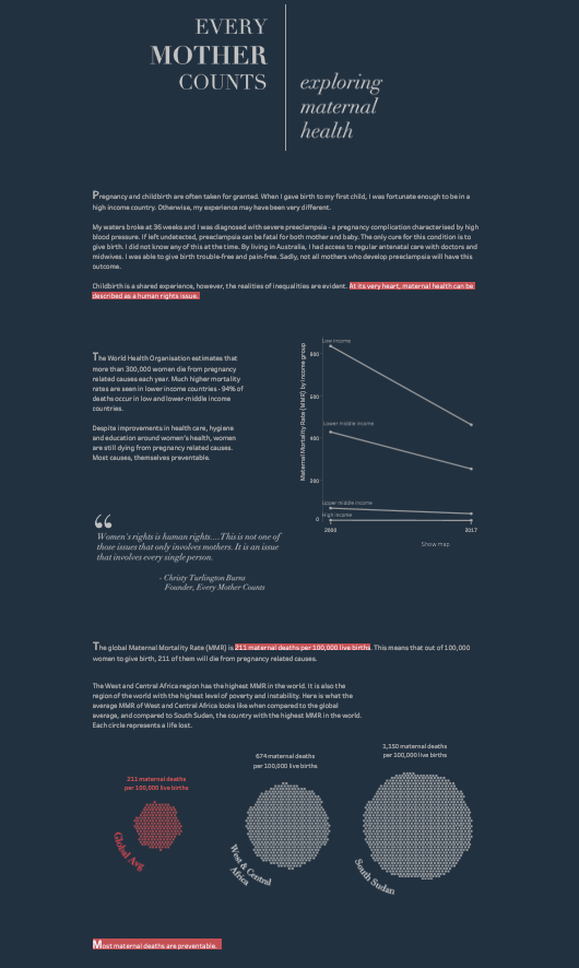
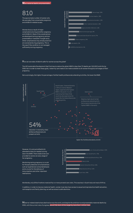
It’s all done outside of work hours. I work on my personal visualisations between 10 and 12 at night, which is the only time I have once my kids are in bed and I’ve watched a bit of Netflix to relax. Some of the longer form visualisations can take hours — I have to find the data, explore the data, come up with an idea or concept, and draw out a wireframe. The most recent long form viz I did was one titled ‘Every mother counts’, which looks at maternal health around the world. That took me two weeks in total. Even when the viz looks ready, I might sit on it for a day or two before going back to change something. That’s why some of my projects take a lot of time to reach the stage when I’m happy to publish them.
You’ve spoken about developing a data-focused culture and bringing data to the forefront of business decision-making. Why do you think this is important?
Most people nowadays have got an abundance of data — for instance, sales, customer, or web analytics data that have been available since the advent of Google Analytics. I think if companies are still relying on their gut to make decisions, they’re going to be left behind. There’s no reason why they shouldn’t be using this data to make their decisions — whether it be how to market their products, how they should invest their money, or how they should target and communicate with their customers. If they don’t keep up, they’re not going to be able to compete against other companies who use data to make those decisions.
Data can be used to help business operations as well. Everything is trackable now, so there’s accountability. If an employee spends money, the leaders can quickly know how they’ve performed and what the return on that investment is. Having that data visualised helps in making decisions and empowers people too — now, when employees are asked, ‘You spent this much money on this particular campaign, what was the return?’, they can say, ‘I’ve generated X amount of revenue from that campaign alone.’ With this sort of data, employees can actually quantify how much they’re bringing back to the business and how much value they’re adding.
How do you think data viz will change within the next five years?
I’ve seen explosive growth in the field of data analytics and data visualisation. A lot of people are making a career change into the data visualisation space because there’s so much data everywhere and people have access to tools like Tableau, which is easy to learn even without a coding background. In the next five years, there’s going to be a lot more people entering the data visualisation field, and there are going to be a lot more job opportunities as companies understand that they need to have someone good in data analytics and visualisations within the organisation to keep up with their competitors and stay ahead. I think there’s going to be an exponential increase in the need for skills and expertise in this area.
You’re also very passionate about women in tech and data. Can you elaborate more about that?
Generally, we know that there’s a shortage of women in the tech space. In the analytics industry, we make up less than half of the people in these roles. I started quite a while ago in this field and, back then, there was a lack of women mentors. I found it really hard to stay motivated when I couldn’t see anyone that looks like me in these leadership or senior roles. That’s why I’m passionate about bridging the gender gap in the tech space, because young women need to be able to see themselves in these roles to be motivated to keep going. I’ve been working on my skills and trying to obtain more experience, in order to be a mentor when I have more time on my hands.
Do you see much Asian representation in the data viz community?
In the data viz community, there is so much dominance from the US and the UK, so you don’t really see much input from people in Asia or even Australia. This is why, when I saw your call for interviewees, I thought, “This is so cool, because we need to be empowering, uplifting, and amplifying the voices of our own people”. I think there’s so much talent in Asia that’s not always recognised — we do really good work and we do work that matters. For instance, Tableau organises student competitions from time to time and the calibre of the work submitted is amazing. I think the next generation is going to blow it out of the water!
Are there people in Asia doing data viz work whom you’re particularly excited about?
Some are based in Singapore, actually. So Thi Ho — her work is just phenomenal. Swati Dave — she’s a mom as well who faces the same challenges as me, and she produces some really great work. Meera Umasankar — she’s doing some great work as well. Also, I’m excited about the work you guys do at Kontinentalist, highlighting these Asian voices!
Okay, time for rapid-fire questions:
- What are your most used resources?
The Tableau community forums, Twitter, and the communities on Slack. For inspiration, I often browse Tableau public’s Visualization of the Day gallery, the really good articles on The Pudding, as well as the Data Visualization Society’s Slack channel and its Nightingale publication.
- Do you have one advice for people starting out in and doing data viz?
My advice is don’t be scared to jump in. Just do it if it’s something that you want to pursue and that you’re interested in.