
Meet the Community! Julia Janicki, data visualisation designer/ developer and data journalist
Julia Janicki is an award-winning data visualisation developer and data journalist currently based in Paris, where she works at the Agence…
Julia Janicki is an award-winning data visualisation developer and data journalist currently based in Paris, where she works at the Agence France-Presse. Julia’s training and experience in biodiversity conservation have taken her around the world. Organisations she’s worked with include Environmental Investigation Agency, the United Nations Volunteers and the UN Office for the Coordination of Humanitarian Affairs. Julia is passionate about environmental outreach, and started The Tardigrade to use data-driven interactive stories to raise awareness for different species. Originally from Taiwan, Julia set up Taiwan Data Stories with science visual communicator Daisy Chung, to use multimedia to highlight unique aspects of Taiwan culture.
Let’s start way back. Can you explain your journey from biology into this field?
I’ve always been interested in conservation biology, wildlife ecology, and environmental sciences in general, as I love animals and nature. In the US, I did my undergrad degree in conservation biology and Japanese at the University of Wisconsin-Madison (UW Madison). After I graduated, I decided to do a degree in entomology. I find invertebrates, especially insects, really interesting because they’re super important but often overlooked. At the same time, I’ve always been interested in maps, and UW Madison has a really good cartography programme. I took a course and really enjoyed it to the point where I ended up taking all the cartography courses in the curriculum.
It was in the interactive mapping course where I was exposed to data visualisation. There we talked about D3, which I was really drawn to as it’s so powerful, and slowly I started learning more and more on my own. That was one reason why I got into data viz. When I was writing my thesis for my Master’s, I thought it was a lot more important to actually communicate my results to a broader audience, as opposed to just publishing papers which would only be read by a selected few scientists. I wanted to get better at communicating, especially through the web, so I could reach more people.
Has your journey been mainly as a freelancer? I saw that you also worked for the US Consulate, and then the Environmental Investigation Agency.
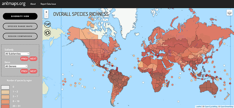
I recently started a job as a data journalist at Agence France-Presse (AFP) in Paris. Before this, the only full-time job I had was when I was living in Japan. After my Master’s, I got a position at the Biodiversity and Biocomplexity in the Okinawa Institute of Science and Technology. My original purpose was to make an interactive mapping application called antmaps. The lab had a big database of over 1.7 million ant specimen records, and they needed someone with the scientific background and the expertise in mapping and web development to work on a project. I helped visualise the database. That was my first professional project in data viz and mapping. I liked Okinawa so much that I ended up staying for four years, up till 2019.
Then I moved to Paris because of my husband’s work. France takes a long time to deal with paperwork; it took eight months before they gave me my residence card. During that time — I’m lucky because I have a US passport — I took on remote clients, and started working with organisations around the world. Paris is where my freelancing career really took off.
When you were just starting out, did you know that data visualisation and storytelling was a field and industry already?
Not really. When I was in Japan, I didn’t think data viz was that big of a field. Even though I wasn’t really looking for a job, I always kept my eyes open for positions related to data viz, but I didn’t see that many positions. It was around the time after I moved to France that I started noticing more and more jobs — in the last three, four years.
Are there specific kinds of data visualisations that you particularly enjoy?
You can do so many things when it comes to data viz including playing with data, the design, the development, coming up with a narrative, and working on a variety of topics, which I find really rewarding because you can learn a lot about different subjects and get a sense of the available data sources out there. But if I have to pick my favourite part, it’s definitely the development. I think it’s really cool that you can make something come to life just using code. I particularly enjoy working on interactions and animations.
How would you describe your brand or style of data visualisation?
I don’t know if I really have a “brand”. I suppose I often use D3. And I really like using different types of data visualisations. I like scrollytelling — especially if there’s more of a narrative. I’m open to doing all sorts of work, but a lot of topics I work on are related to biodiversity, wildlife, environmental issues, or climate change. Apart from Taiwan Data Stories.
Yes, we spoke with Daisy previously about how Taiwan Data Stories came about. What is your vision for it for the future? Do you think it’ll still be a loose collective, or will it become a bigger organisation?
At this point it’s still a pretty casual, community-based collaboration. It’s mainly Daisy and I, but we have about 10 people who have contributed to our projects. Some are in the data viz field, some are developers, we have a couple of 3D artists, and people who are good at editing and SEO. If it ends up getting bigger, Daisy and I will maybe have to think about logistics and funding. We haven’t thought too much about long-term vision. It could be really cool to eventually publish an e-book or book on all these stories. That will be a bit more further down the line though.
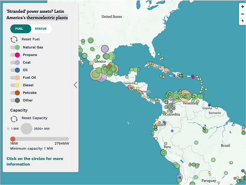
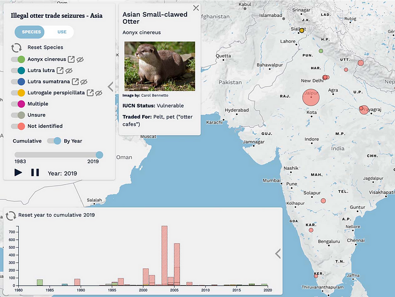
You’ve made a lot of interactive maps. You often use a kind of a bubble shape, sized by amount, like your story on otter trade (which was a collaboration with Kontinentalist), and the Latin America ones. Some of them use hue intensity to signify the value, like in the antmaps. How do you decide what form your map visualisation should take?
If I’m working with point data and there’s a lat-long, visualising them as circles on a map is the most straightforward option. And if there are attributes, then you can always scale the circles based on a specific attribute. But otherwise, if it’s more important to visualise values by areas, such as a county or a country as the unit, then a choropleth map would be a good option, which is when an enumeration unit is basically coloured based on an attribute.
Do you have any best practices or learning points for interactive maps?
Many of the interactive maps that I’ve done are more exploratory. A lot of the data points are displayed on the map right away, then you can filter by toggling specific categories on and off or by using a slider. I like adding a lot of different widgets for the user to interact with, as I think that’s important for exploring insights. Sometimes, it also helps to have separate charts on the side to serve as an overview by showing summary statistics.
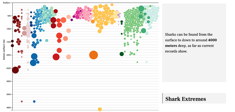
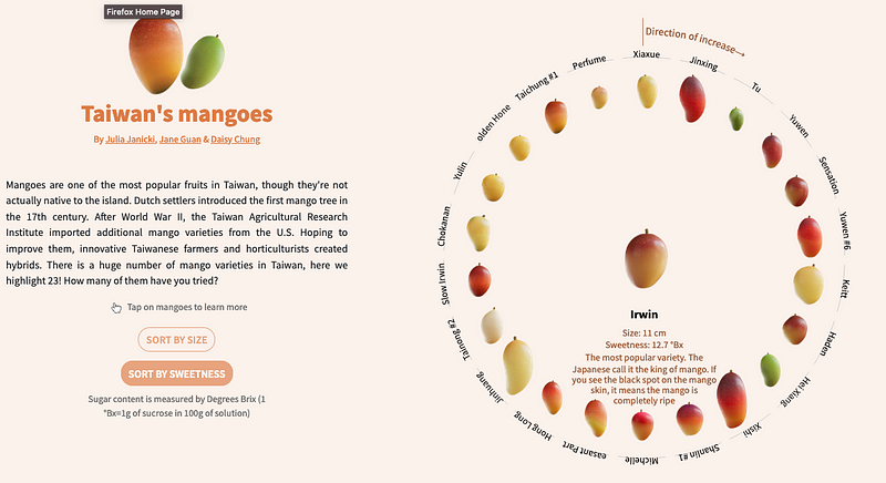
You seem to like bubble charts — like in the interactive shark visualisation — and wheel forms — like for bat facts, and the story on mangoes of Taiwan. Any particular reason?
I like using bubble charts because I can use D3 simulations to draw them. That’s really fun, because you can control a lot of different properties and change little things to make them have different effects. The bubbles can come together, or you could have them in different clusters, or arrange them into a circle, like in the bat story and the mangoes story. It’s essentially one method that allows you to do so much.
What techniques would you like to explore next?
I want to learn more about 3D and SVG (scale vector graphics) animation in general. The two libraries that I want to spend more time working on are three.js, which is essentially 3D and the web, and GreenSock or GSAP, which is really good for SVG animation, because you can set up timelines and more. I’d maybe even want to try to integrate these with data viz and D3.
In your journey of learning data viz, how do you decide how much time and energy to give to something, before you start learning something new?
I’m probably a bad person to ask because I want to learn everything at the same time. In the beginning, of course, there’s just so much to learn. For example, if you don’t know programming, and you want to build a site, you have to learn HTML, CSS and JavaScript. Then there is D3. Even though it’s JavaScript, it’s like an entirely different way of programming. So that part was really overwhelming in the beginning.
With data viz, I like having an understanding of the different aspects and how they come together, so I end up spending a lot of time on learning the different things — such as map making, data cleaning, and data science. Web development gets really complicated too, because when you get a bit more advanced, there are all these frameworks you have to know. It can be pretty overwhelming, but I just kept on learning. There are definitely times where I get burnt out, but then I see something cool on the internet and get motivated again.
And you just keep going.
Yeah. I’ve been working with D3 for a long time. I thought I was really bad for many years, but I just kept on going anyway, because it was really fun and I just wanted to get better. I really enjoyed seeing all the things that I was able to create using it. Maybe if it wasn’t something that I enjoyed doing so much, I would have just been like, “yeah, maybe it isn’t worth it”. It took a while before I was like, “actually, I’m getting good at this”.
What is your kind of creative process like, and what’s your way of creating data visualisations?
If it’s a client project with a deadline, then I come up with a timeline to work with. But for other projects that are more open, or my personal projects, my process starts with identifying the topic that I want to work with. Once I get an idea of the topic, I do some background research — reading reports or scientific papers, and getting more familiarised with the topic. Then I look for potential data sources, go over different data sets and start exploring them. I often do that using R, or Observable notebook. Observable notebook is nice because you can mix text with data viz, and you can also do exploratory analyses there directly.
Once I have explored the data set, I identify which ones may be important for my topic. As I do that, I explore the narrative. Next, I look into different chart/map types, and I come up with a prototype. At the end, I start the development. Sometimes I skip the lo-fi prototyping if I already have a clear vision for it. For example, since I’ve done a lot of interactive maps, I would directly do the exploration in JavaScript. But if it’s a new concept, I would sketch it out first, then use Figma, Adobe XD or Illustrator to put it together on a page, then use code to make it come to life.
In your many years of doing client work, do you have any tips to share?
The main lesson is to never undersell yourself. Even if you’re just starting, you should be priced correctly. If it’s something you’re passionate about and you have other motivations, I think it’s okay to accept a lower rate or volunteer, such as doing advocacy for something you really believe in. But otherwise, make sure you’re paid what you deserve. Sometimes prestigious organisations will underpay you because you get the title of working with them; don’t let them do that because they are usually well-funded.
Set the scope and have clear expectations from the beginning, so you don’t end up overworking. Always ask for a contract or things in writing. And communication is really important. Don’t hesitate to tell your clients when something is out of scope. If there is anything that you’re hesitant about, it’s always better to ask.
You can also be picky about your clients. (laughs) You don’t have to work with everyone. That was a thing I did in the beginning. But people in our field have a lot of experience and skills that are in demand. You should not accept any project just because people come to you.
For your client projects, did you also have to do the data collecting, cleaning and processing?
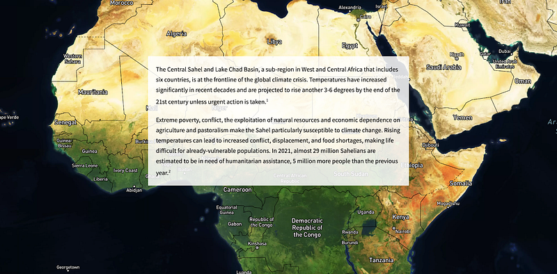
For the most part, clients come to me with their datasets. But there are cases where I have had to look for datasets, like two of my projects for the United Nations. One of them was a data journalism fellowship. I did work for The Center for Humanitarian Data, and my topic was to focus on how climate change affects the Sahel [region in Africa]. For that one, I found and explored a lot of different datasets based on reports, then came up with a narrative.
For the other one, for UN-OCHA (Office for the Coordination of Humanitarian Affairs), I was working on a climate change report. They wanted a lot of data-driven and quantitative insights to back up their report, which was very qualitative. For that, I also looked for and explored datasets to back up their text.
Having seen how data storytelling is practised around the world, could you share insights on what you’ve observed about the value of data viz?
I definitely noticed that data viz is bigger in some places than others. Data journalism is really big in the US, UK, and parts of Europe, like Germany. A lot of places, like France, are still more traditional, a bit resistant to change. For newer things like this, it’s taking a bit of time for different organisations to take it up.
Do you feel that there’s less interest in Asia?
In Asia, I’ve seen most interest in Singapore, because there’s Reuters Graphics and Kontinentalist. I haven’t seen a whole lot in Japan. In Taiwan, there are a couple of news organisations that are starting to have data journalists.
How did you get your AFP data journalism role? We’re very excited for you.
I was recruited. It’s funny because I haven’t seen a lot of data journalism positions in France. As a freelancer, I’m always keeping my eyes open for different positions, but I never thought about applying for a full-time job because I’m pretty happy with my situation — even though I do get frustrated sometimes from working alone so much. But then this happened.
I’m curious how it’s gonna be like as a data journalist in France, because it’s not really a big thing here. It will be a really interesting transition for me, because I’ve been working from home for the last 3+ years. With this role, I’ll be able to work with people and experience what it’s like to work in a newsroom. I will get exposed to a lot of different topics, which I’m really happy about. I also really like reading the news (to a certain extent), so it would be nice to get updated about what’s going on in the world on a daily basis.
More tips from Julia
Tips on finding jobs as freelancers (All of the below are how I’ve gotten work):
- Check the Data Visualization Society (DVS) job board
- Join the DVS Slack and D3 Slack
- Set up a Twitter account (though let’s see how Twitter evolves). Many people post job opportunities there. It’s also good to be known in the community.
- Don’t forget the power of word-of-mouth. More people/ organisations need people with data viz skills, including your friends or their companies/ organisations.
- Have good SEO for your website. Some clients have found me by typing “map”.
- Submit your work to awards and attend ceremonies. I met Simon Scarr (Deputy Head of Graphics from ThompsonReuters) at the Information is Beautiful Awards, and we ended up collaborating.
- Reach out to specific organisations/companies if you think your skills could be useful to them.
- Attend conferences, give talks, and network: I’ve been approached by future clients after giving talks.
- Have an online portfolio to demonstrate your work. I started out doing side projects to practise my skills and build up my portfolio, and it worked for me.
- During interviews, you are often asked about your process and to go into detail about projects you’ve worked on, so be prepared for that. Always have questions prepared to ask your interviewer.