Meet the Community! Jack Zhao, data visualisation specialist
Jack Zhao is a data visualisation specialist, co-founder and one of the directors of Small Multiples, Australia’s leading data…
Jack Zhao is a data visualisation specialist, co-founder and one of the directors of Small Multiples, Australia’s leading data visualisation studio. After graduating from the University of Sydney, he did various stints as a designer and developer before starting Small Multiples with Andrea. He works across database and digital design to effectively communicate stories told with data, and enjoys coming up with creative ways of representing data.

How did you get into data visualization, and what about it appealed to you?
I grew up in a Chinese family, where there was the expectation to study a STEM or commerce degree due to its stable career prospects. My mark was good enough to get into Bioinformatics where I learnt programming — how computers work, code, and the way of thinking given a problem, how do you automate or optimise it. And then after graduation I thought: I do not want to do medical research or work in the lab. (Laughs)
I did an internship at a Head and Neck Cancer institute, where they needed a programmer to translate data or numbers into something the researchers can see. So that’s how I transitioned from a science engineering degree into visual design and interactive development.
I then did a postgraduate degree at University of Sydney called Masters of Interaction Design and Electronic Art. That exposed me to many things in Arduino, physical computing, UX/UI design — and data visualization.
I’m more interested in the dataviz because it has a relatively short turnaround time, instant gratification. You run the code and immediately see something in front of you: a picture, an artwork. I enjoy that. Most importantly, dataviz makes the invisible understandable, and it gives me a great sense of achievement when I can reveal a secret to the world.
What inspired you to start a data visualization-specialised studio yourself?
I would attribute it to the sense of restlessness. Working at a nine-to-five job, you just do whatever you’re asked to do. And I’ve always tried to do something on the side. Also, Andrea and I thought we were good enough. We thought we had the know-how. We’ve seen the stuff. We think we can do this kind of stuff ourselves.
In our 20s, we didn’t have any much responsibility and so we thought we can try this out and see if it works. If it doesn’t, then we can go back to work for a big bank or something. But it was fun. And I guess there’s the entrepreneurial spirit. Being a first-generation Chinese immigrant, there’s a long-running tradition “making something yourself” and being self-reliant.
What’s an example of a meaningful data visualization project you were able to do by running your own data viz studio?
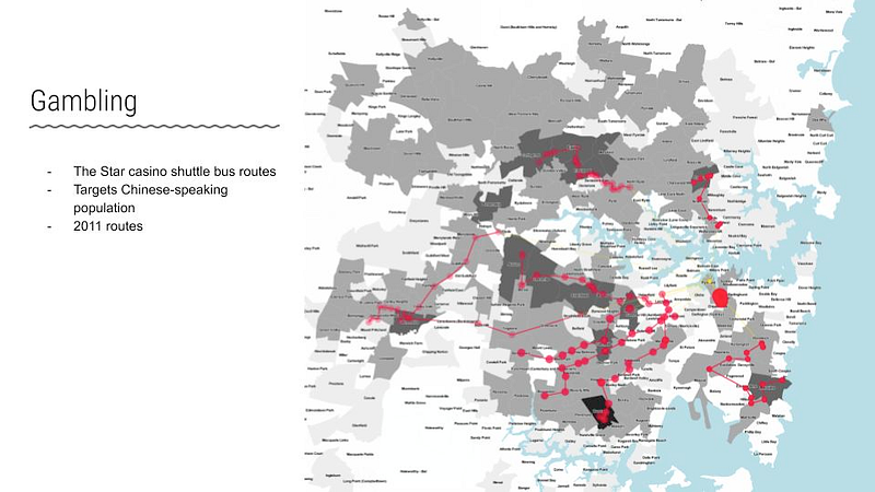
We did a dataviz looking at how casinos target vulnerable communities in Sydney. Problem gambling exists in all community groups, perhaps a little more noticeable amongst Asian and Chinese-Australians. This was exploited by the operator of the casino licence.
They send out minibuses to the suburbs, where this specific group of Australians lived, and pick up elders and transport them to the casino to gamble. The buses are free and they get incentives, like a food voucher, for example. I’ve seen these buses making these trips, and to me this is predatory behaviour.
So I went to the casino website and scraped all the bus routes. Where do they send the buses? How frequently? I then geo-coded the locations, and that immediately showed that, yes, they were definitely sending buses through the suburbs where there’s a higher Chinese population.
So partly due to social justice, partially self identity, I felt the need to speak up and show people the things that they’re not seeing, to make them more aware about these problems. I felt that it was almost my responsibility, because I had these skills — to pull out the numbers. plot them on the map, or make something to show people. I was restless, being young. At the time, I felt I was just interested in doing this kind of stuff to show hidden things.
What’s been the biggest difficulties and also the biggest joys of running this business, building it up for 10 years?
The joy is meeting different kinds of people. If I didn’t run the business, the people I meet, the topics I touch and work on, will be very limited. So say, if I worked for a bank, I’d deal with customer experience or financial data. But in running our own studio, we get to meet all those people, banks, airlines, plus NGOs, and the government, because our data skills can be applied to anything.
And it’s quite rewarding that every two months we learn something new about a topic. It exposes us, opens us up to all these different things in the world. Other things like I think you get to claim the work as your own, because this doesn’t belong to a 10,000-people operation. You’re more recognised, I think, because your name or your team’s names are directly attached to the work. Definitely more ownership of work, more freedom to do things I want.
Downside — financially we’re a pretty self-funded, independent business. Selling can be tough. Because we are basically responsible for the livelihood of our people, when the pipeline is thin, we worry, naturally. This is not unique to data visualisations. If we run a bakery, the same problem: that I always want customers to walk in, buy stuff. When you worry, you can’t dedicate your mind to the fun stuff.
What are your preferred tools for making data visualizations?
In the beginning I used more Python and JavaScript, HTML, CSS, standard web stack. Now, we have developers that especially do React and D3.js and JavaScript and web. So my tool set still uses Python, because it’s very human readable — if I want to do some data transmission work I can just write it. I use Tableau — although I don’t like it as a presentation tool because it’s a little lacking in terms of end user experience, it’s perfect as a data exploration tool, drag and drop, and you will generate a map very quickly. Help me see. First, is this idea feasible? Can I show the things I want to show from this data? What are the interesting things that sparked there? Before I dedicate more time to make a proper Mapbox, or something high fidelity. It helps me choose whether to continue with this project, which direction I should go.
Another tool is QGIS: open-source, GIS, geospatial software. It’s very useful in doing data transformation and visualisation. You drag your shapefile, and get map points and polygon points. This is my tool of choice for making custom maps. For making interactive maps I use deck.gl, Mapbox, and Carto.
Has your “data judgement”, i.e.., a sixth sense for knowing when a dataset looks promising enough to invest further time in it, evolved?
I think so. There’s a kind of intuition you get from looking at a lot of other people’s work and what generates an emotional response from the audience. For example, sometimes you spend a lot of time making colour palette visualisation for famous films, thinking, “This will be cool. People will love it” —but nope.
For people who are in this field, it’s interesting because you understand how much is involved in condensing all that into these colours. But, for the general public, they’re just—shrugs, because it can be a step too far.
How do you see your own work evolving going forward?
I want to push the work further in terms of technology. I want to integrate things like machine learning into my work. It does something that’s not humanly possible, by processing massive datasets and producing an output, whether it’s to differentiate things or classify things or generate text or new images. This opens up many possibilities, like genome data.
Perhaps more artistic work in the physical realm because right now most stuff, except for the Not a Single Origin chocolate project, is based on the screen. Especially in the past few years, short format videos became very prevalent; our visual cortex became over-saturated. I want to think about: How do we represent data? Not using pixels, but using paper format or something.
Do you have any specific interests that you’d like to do dataviz on?
I was brought up in Beijing, so the memories and experiences that stayed with me are very strong, because how you grew up with a child defines you as a person. In Australia, Chinese Australians are a minority group. In some suburbs we’re the majority. But in the overall population, we’re still not empowered, I’d say, in the media, representation-wise, and social mobility-wise. Chinese-Australians are easy targets whenever something goes wrong.
Even though I have lost most of my connection with China, I feel like I should use my understanding of the culture to benefit others, to make other people aware of it. So that’s why I sometimes like to make a map about Chinese-related topics. I identify as Australian first and then Chinese, but because of the perception others have of me as not Australian first, I feel compelled to do some topics. There’s a need.
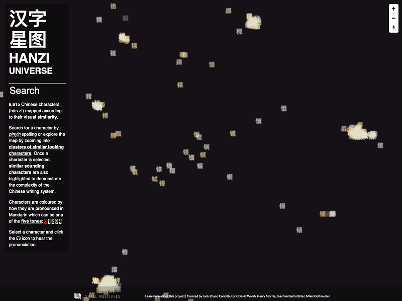
I want to show people that we’re just people — no matter where you come from and the colour of your skin — people share the same problems, life problems; how to live a fulfilling life, how much money you make, marriage, kids, the same human desires. Although there are differences, people shouldn’t be swayed by sensationalist media and political agenda, other-ing people who are different and attributing all problems to them, as it’s an easy way out — if you think all your problems are caused by a group of people, you don’t have to solve it, you can just blame them. The world is complex, but we should learn to appreciate this complexity using tools like dataviz. I think dataviz can open up conversations and show what Chinese culture is really about, not just food — I mean, food is important — but we need to show what we share as humans… I’ll show what’s interesting to me, to make parts of Chinese culture that’s hard to understand accessible to non-Chinese speaking people.
What’s the data visualization scene in Australia like?
Data journalism is still where most talent or good work gets produced nowadays, still. As journalists provide information about the world, there’s a lot of innovation there in terms of telling important stories as effectively and emotively as possible. Because that kind of novelty, I think, is not very required for the commercial context, where the dataviz solutions are more functional.
Quantity-wise — there’s more people doing data visualization in Australia; in a job search, many job ads have data visualization in the job description. But most of them are asking for Power BI, or a Tableau expert. So essentially, someone who can operate those softwares. They’re a little bit different from the stuff that we like to do.
Any changes you foresee in the next five years?
While there’s always been the tyranny of distance, and being a relatively small country with a small population, the demand isn’t as high as in the States or in Asia. But it’s less of a problem, as organisations from the States, from Europe, feel more comfortable outsourcing or commissioning work from Australia. I think that is going to happen more.
The growth of in-house dataviz capacities is a trend everywhere. Companies want to skill up their own people first. And if they really can’t find someone, then they will come to an outside expert. But dataviz is complicated. There’s just so many cross-disciplinary skills that you need to possess as a team. Different technologies, different design processes, so it’s hard for an internal team to master all these within a couple of years. And after a couple of years, people move on anyway, whereas we retain all this expertise and so our value offering is distinct and unique.
What are important traits to have in this field? What do you look for when hiring?
What I’m looking for is a willingness to learn. Even if the person isn’t too familiar with the tech stack that we use — but, if given a project brief, the person is willing to spend the time to investigate the solution, or build some quick prototypes, that’s good.
The other thing is that I wouldn’t hire someone to treat this as a nine-to-five job. That person should have a passion as well, whether it’s social justice or even sport. And they see this job as an opportunity to master some data visualization skills to investigate those personal passions. I think that’s super important to drive them, to push them. They should see the value of why this is cool, why it’s important; it’s not just to get paid.