
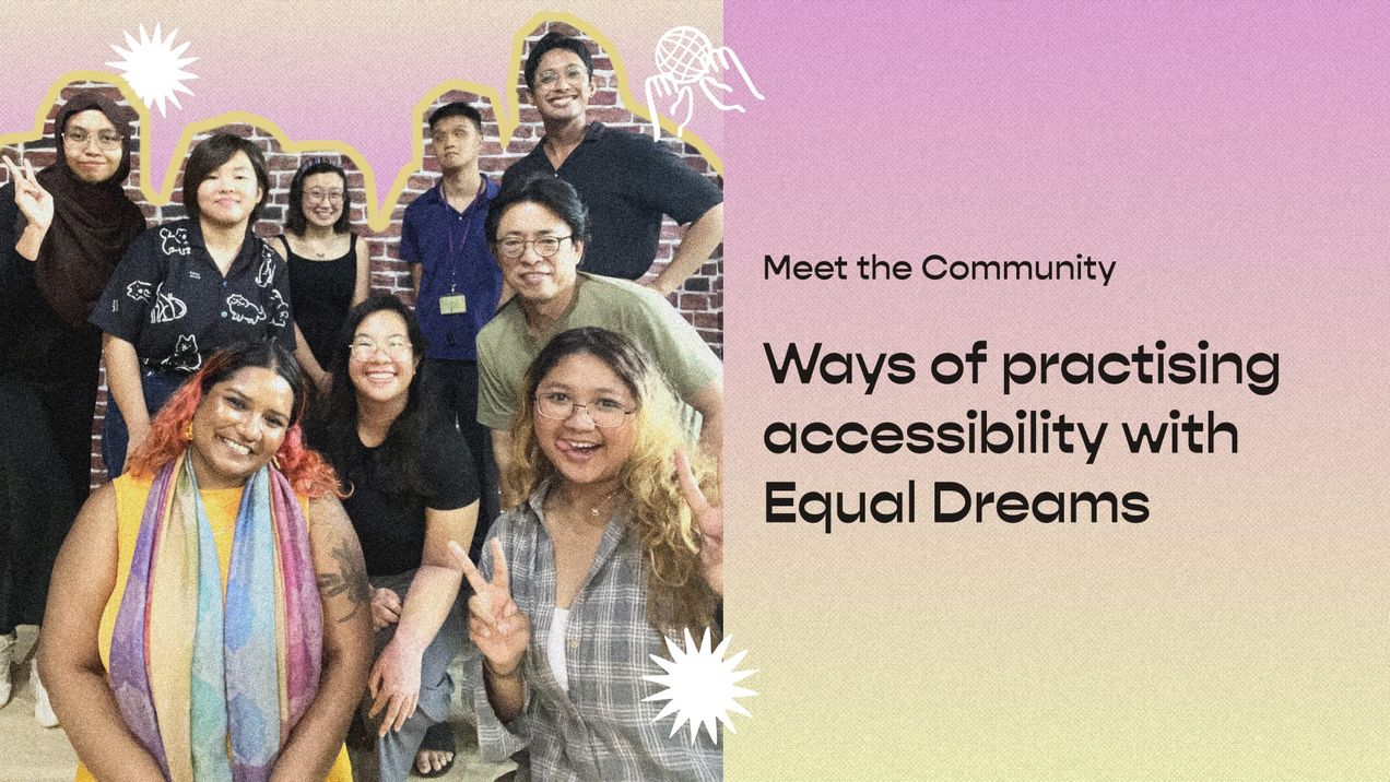
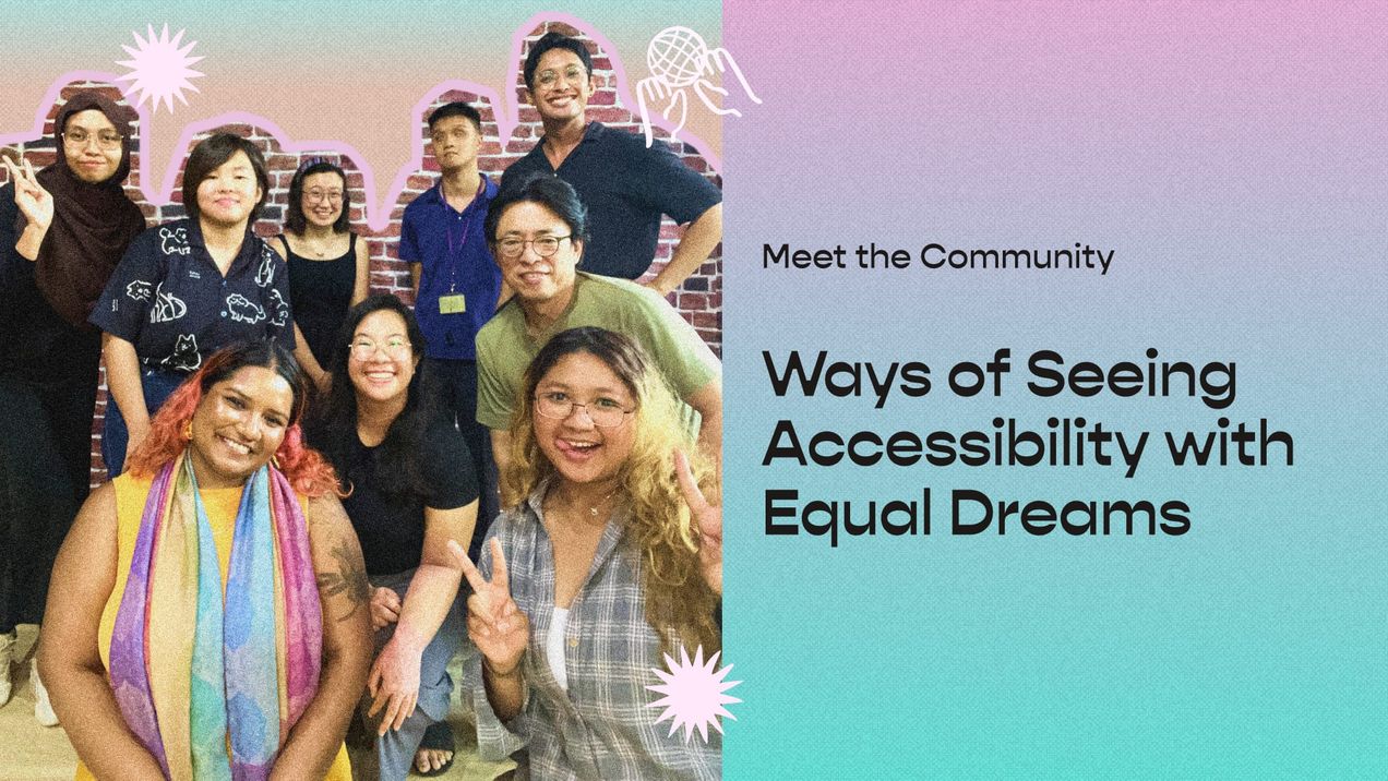
Meet the Community! Harim Jung, data viz expert and nuclear engineer
Harim is a Korean nuclear engineer by training who has worked in Abu Dhabi. She learned data visualization on her own and is an avid…
Harim is a Korean nuclear engineer by training who has worked in Abu Dhabi. She learned data visualization on her own and is an avid Tableau user. She’s most passionate about using data viz to debunk myths people have about nuclear energy, which she sees as key to low-carbon energy and solving climate change, the most important topic today. She also works with international NGOs to develop data visualizations on a range of topics concerning humanity’s progress.

How did you get started on data visualization?
This is a really important question because so many have interest [in data viz] but they don’t know where to start. In my case, I’m a nuclear energy engineer who’s exposed a lot to datasets through papers and reports. Through the time I spent on datasets, I realised data visualization is more effective [in enabling understanding and communication]. So I started with R (programming language), and it’s very powerful if you use libraries like ggplot. Every tool has pros and cons, but I wanted something more beautiful by customising colours and design, so I converted to Tableau. I wanted to make papers more responsive, and make my research more effective at persuading and informing people.
What’s unique to your data visualizations? For example, I notice there’s a very heavy focus on energy and climate change. Is it because of your professional background or because you feel it’s one of the most important issues people need to know about and act on?
Both are exactly right — I started from a nuclear background, and I see it as a form of low-carbon energy, but when people think of nuclear [energy], they often think about nuclear weapons or prohibitions. I wanted to change that misconception of nuclear power. That’s the goal of the International Atomic Energy Agency (IAEA) too. But certain international organisations like the United Nations (UN) can’t really say everything they want to say; so I thought, let me change people’s minds through my own visualizations — by communicating to laypeople. Like how Kontinentalist spreads the right messages, I feel like it’s my personal mission with my unique position as a nuclear engineer and my ability to simplify these issues through data visualizations.
I notice going through your portfolio that you have a preference for official datasets like from the UN and other big international bodies. I’m curious what you look for when you choose a dataset? What makes a dataset worthwhile and interesting enough for you to spend time and energy to look deeper and to use?
I love reading reports and papers by agencies. If I get an interesting topic, I will go deep into official datasets. Normally, I prefer to use official datasets from governmental and public organisations [because I want to share] right and trustworthy messages to folks. That official dataset is a tool for me […] if I just visualise the whole thing it’s not fun for me or good data viz. From the dataset and report, I need to ask myself: within this dataset what kind of message can I convey? [In] collaboration pieces on my Tableau webpage […] I have to conform to certain messages, but my personal things are quite complicated and more fun.
Your data visualizations tend to be about pretty serious issues, energy or child-feeding patterns — all important to human progress, and not always the most light-hearted. I was wondering if you have a preference for more serious topics?
To be honest, I want to do some light topics because I’ve already done so many heavy ones!
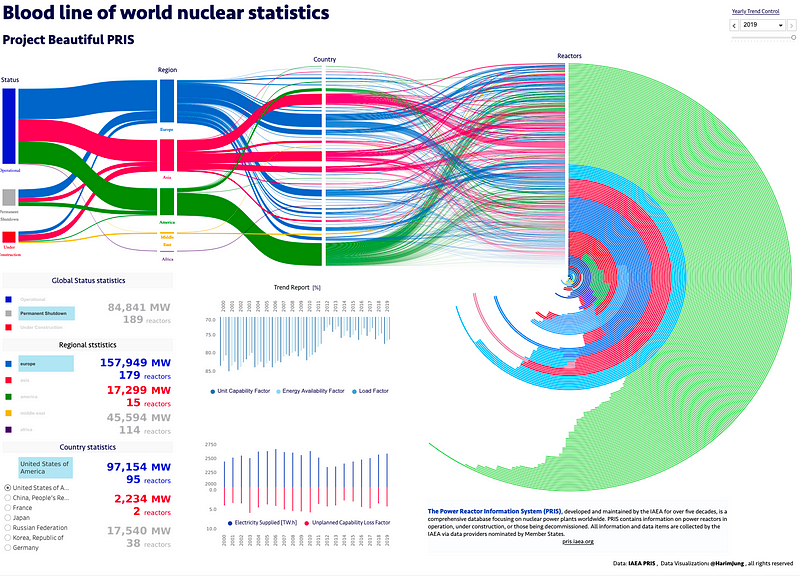
Aside from the content covered by your data viz, I was wondering about your style — it’s very clean with minimal annotations or animations, for example. Could you talk a bit about that? This is something the agency asks for — it’s more like written report-style. Official reports have to be very clear and not use much colour, and there are lots of rules. But for my personal projects I like to adopt a more fun and colorful style [check out Harim’s data visualization based on the Power Reactor Information System (PRIS) database, run by the IAEA, for an example!].
For you personally if you didn’t have these limitations (of collaboration), what other styles and formats are you interested in trying out? For example, you’ve seen Kontinentalist’s work where it’s much longer, there’s a whole narrative, illustrations and data viz, and even sound embedded — are these forms something you’re keen on, or are you interested in data viz only and playing around within that form?
This is a really great question! I really like the Kontinentalist’s style. I guess this is a matter of the tools, like Flourish is web-based Javascript… What I really want to make is a really interactive one that allows you to click and change, etc. So if I have a chance to work with the Kontinentalist, my visualization will be based on Tableau, but it’ll be dynamic and interactive.
So, I know you started with R then moved to Tableau to customise your designs a bit more — what other tools do you use?
So far my visualization work has only been on Tableau, because it’s very intuitive. You can drag and drop based on x and y [axes]. I really love maths, so I love Tableau! And, actually, I think visualization itself isn’t a big deal actually, if you have the right data. But if you have trash data, it can be a real headache, so data cleansing and processing matters a lot. I normally use Alteryx and Tableau Prep to process the data — they’re tools that allow you to manage your data better than if you had to code everything.
As for design, I want to learn and get better at UI/UX for data visualization, so I think I’ll go learn Figma with my friends.
Thanks for sharing about your data viz work, purpose, topics, and tools. Now, I’m curious about your learning process: how did you begin learning data viz? I notice you took many online courses about data science in 2015 to 2016 — was that the start of it?
I’ve always been interested in data science, but there wasn’t really any material. I remember at that time data science was booming, it was very popular in Udemy and Coursera. In that year I went to the United Arab Emirates (UAE) for my internship and my very first job in the engineering industry. I had a lot of time and I wanted to change up something from the nuclear datasets. So many great materials are on MOOCs, and I urge people who are interested to please go and learn from there, it’s really good!
Before 2015, data viz wasn’t that popular or familiar in Korea, so there was no access to relevant resources. And I was a bit younger and I couldn’t find any mentor or friends who had started on this stuff. That’s why I went to Coursera to take the classes, learning stuff like R and Python. Normal engineering classes teach you tools like MatLab, but they’re usually working with numerical data and not really a data visualization tool. So I had to find my own way.
And then I saw you began an organisation called Deep Nuke — was this to further your data viz work?
Yes, it was my own data-based startup — it was a business working for nuclear research-based collaboration. I already had lots of research and data on nuclear stuff, and I love making lots of projects. I met some really good friends from Hungary and Austria who have relevant knowledge but no tools. So we came together and collaborated. This is kind of the start of my data visualization journey from 2016!
I see. In all, since leaving university, what surprises and setbacks have you experienced?
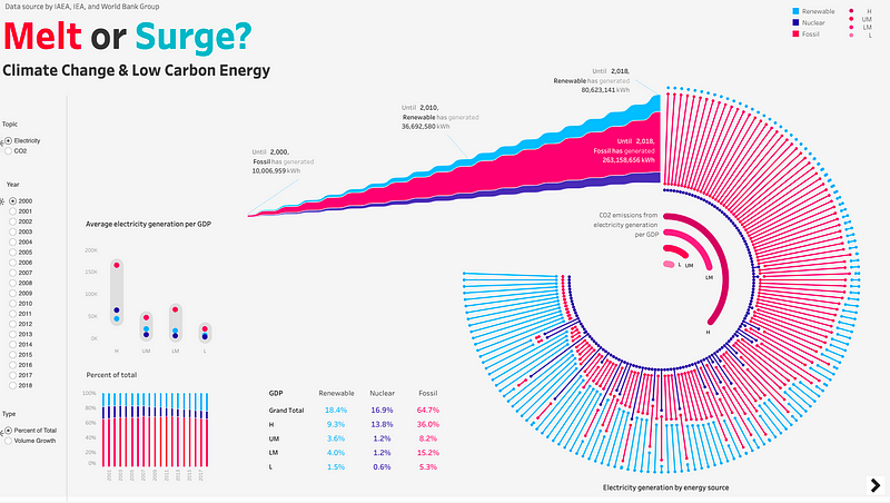
The IAEA visualization challenge was in 2019, and that was around the time of my graduation of my Master’s degree. My Hungarian friend encouraged me to apply for it, because I knew data visualization and am familiar with nuclear data. So I just applied and ended up winning the first prize. That was my first debut, an instance which proved that I could do data visualization, as before that I’d not been considered a data visualization expert. Being a nuclear engineer in the past, I’d felt it was too strict and dry, whereas data viz feels softer and flexible and so happy to me. I realised through the competition that everyone really liked my visualization [which was] about climate change and low-carbon energy, which made me feel like “wow this is working” and that this is the path I have to go through. That was one of the best moments for me — I really got happy.
The challenges and frustrations are in the daily issues — whenever you work in data viz [with others], it’s about approval. Whatever you do or don’t do, it’s about approval, because I’m not working alone, so whatever I want to say I have to think many times if the right message is [being] put out to the people. No matter how beautifully or clearly you analyse the data, the most important thing is the data viz’s purpose. Whatever you do, if you bring out a message that everyone already knows very clearly, this is not a good way [to do data viz]. So [clarifying] the purpose of and what you want to convey with the dataset — that’s the challenge for me and for all of data visualization.
Just curious, what has been the most important or surprising thing that you’ve seen or learnt about climate change through data visualization?
To be honest, as a nuclear engineer I am really sure that the role of nuclear energy is the most central for climate change and CO2. Everyone has a view of it, that it’s not necessary or good, but after I worked on datasets related to energy, you can see nuclear energy is really essential for the supply of low-carbon energy. I wouldn’t say it’s the only objective way, but I do think it’s very important to form a backbone of low-carbon energies. There’re so many regulations, [and] it’s really safe and clean and effective. This is a real issue that we need to convey to people, and some people don’t want to know how close nuclear energy is to us, but it’s really essential.
You mentioned data visualization in Korea isn’t very active, and that there’s not many people interested in it or doing this kind of work. Is that correct?
Yes, Korea is a very competitive society and people are workaholics. People want to make money through coding and developing, not make data stories, for example. We don’t spend much energy on the message or visualization. Most visualization in Korea is focused on KPI; Koreans like to say “don’t care about other things, just do your work”, and we don’t like to come up with our own voice and own action, as we’re kind of shy as a people. That’s why data visualization is kind of secondary to the stuff that makes money, like research, etc.
I’m curious because I just interviewed someone from China which in many ways also has a very competitive society — but the person was saying that the data viz scene is quite active. How come it’s not happening in Korea? What about major news organisations?
Of course they do data visualization, but I meant for normal people data visualization isn’t common or known. If you have a chance to choose something, most people will choose the money-making path; most data visualization people are working in fields like analytics and business intelligence. Generally, I think data viz will grow… [data viz of the] business intelligence kind of are in demand — IT companies like Naver and Kakao, they are working on some… but it’s very limited to development and IT people, not outside of that.
You mentioned that Koreans are generally ‘shy’. How do you think the culture of being shy affects data visualization?
For my generation, we are socialised from young to be very humble and that you shouldn’t shout out your own voice for things. That’s the atmosphere here. And that affects lots of things. Data visualization is about conveying your message from the data, but many people find it difficult to voice out.
So as the first member of 1MVL, my main purpose is to break down the wall, and I want people, especially young Asian people, to express their voice and share it together through this medium.
What is 1MVL?
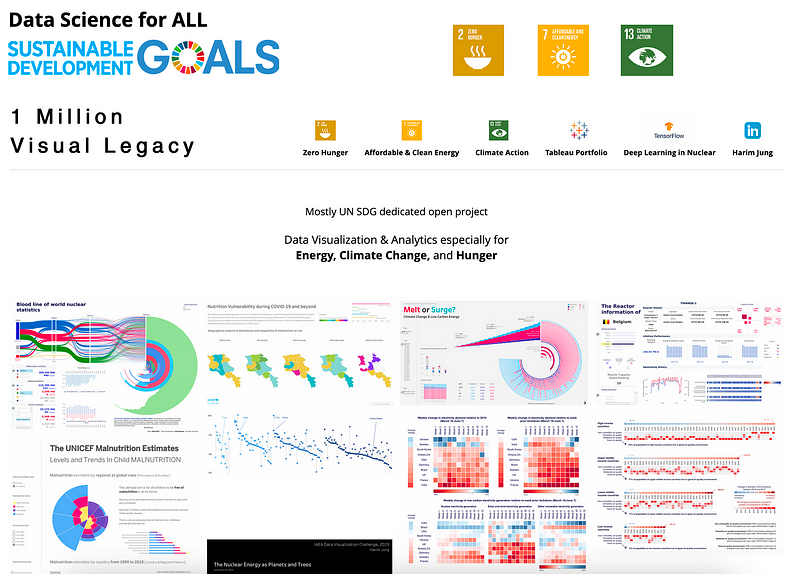
It stands for 1 Million Visual Legacy — it’s an organisation that I created to spread ideas and messages through visualization; I want to bring all the data on a topic, visualise the dataset, then make it an educational resource. How many reports and research come out a day? It’s like hundreds, but no one cares. So much money and effort has already poured into these inputs, so I thought to myself: why not embed them on the web or portfolio or Instagram, for example, and let people share it for free? I will divide the website into specific topics and get people to work together on their topics. Imagine if you want to know about CO2 and climate change and you Google for hours, but [instead], you click here, and you can see the data source and data visualizations directly and get the message — that’s my goal.