
Meet the Community! Diana Yukari, information designer
Diana Yukari is a Brazilian-Japanese information designer. She graduated with a BFA from the School of the Art Institute of Chicago and…
Diana Yukari is a Brazilian-Japanese information designer. She graduated with a BFA from the School of the Art Institute of Chicago and worked at Rede Globo before joining Folha’s data journalism unit (DeltaFolha), one of Brazil’s largest newspapers. As the team’s only designer, she produces voluminous amounts of beautiful infographics — driven by an intense conviction about telling the stories that are important to society, as well as communicating facts and truth to the public. Check out her Behance portfolio — but know that it contains only a fraction of the incredible work she does! You can also reach out to her Twitter, Instagram, and LinkedIn.
How did you get into data visualisation?
Growing up, I didn’t have any art classes. I went to university in Brazil for Advertising because I felt like it might be something that would interest me. I didn’t like it, but I met a professor who was a graphic designer, who introduced me to the world of art. I transferred to the Art Institute of Chicago in my second year because they had a really interesting programme on editorial design, which was something that I enjoyed. There, I did a lot of things, because it’s a very experimental school — 3D stuff, some creative coding, object design — but I knew from the beginning that graphic design was what I wanted to do professionally.
However, I still really didn’t know anything about information design or data viz. It was during my last semester, when I took that class, it felt like all my classes and different interests connected, because I was always a newspaper reader. It made sense, although at the time, it didn’t.
What about information design in journalism that felt different for you, as opposed to graphic design in advertising?
The one thing that I love is to tell a story. That’s one of the main things in information design: the goal is not just to present numbers — it is to actually tell a story that people can make sense of and give a perspective that is sometimes not obvious. One of the reasons why I love working in journalism is that I get to work with different topics that I consider important to society in general.
I’ve been a news nerd since I was a child, and my mom had a subscription to Folha way before I worked there. It makes me proud to work with so many talented journalists that are looking for stories that are important, and this interests me not only as a designer but as a citizen as well.
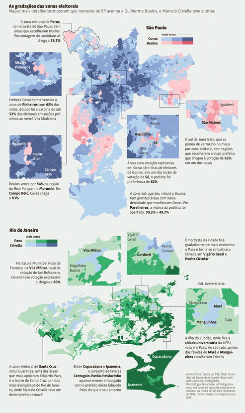
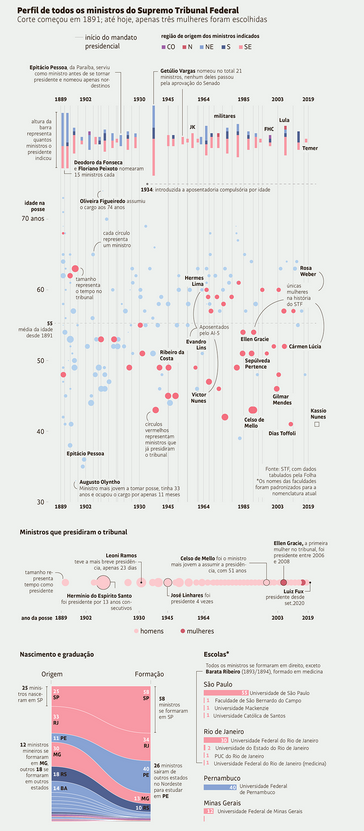
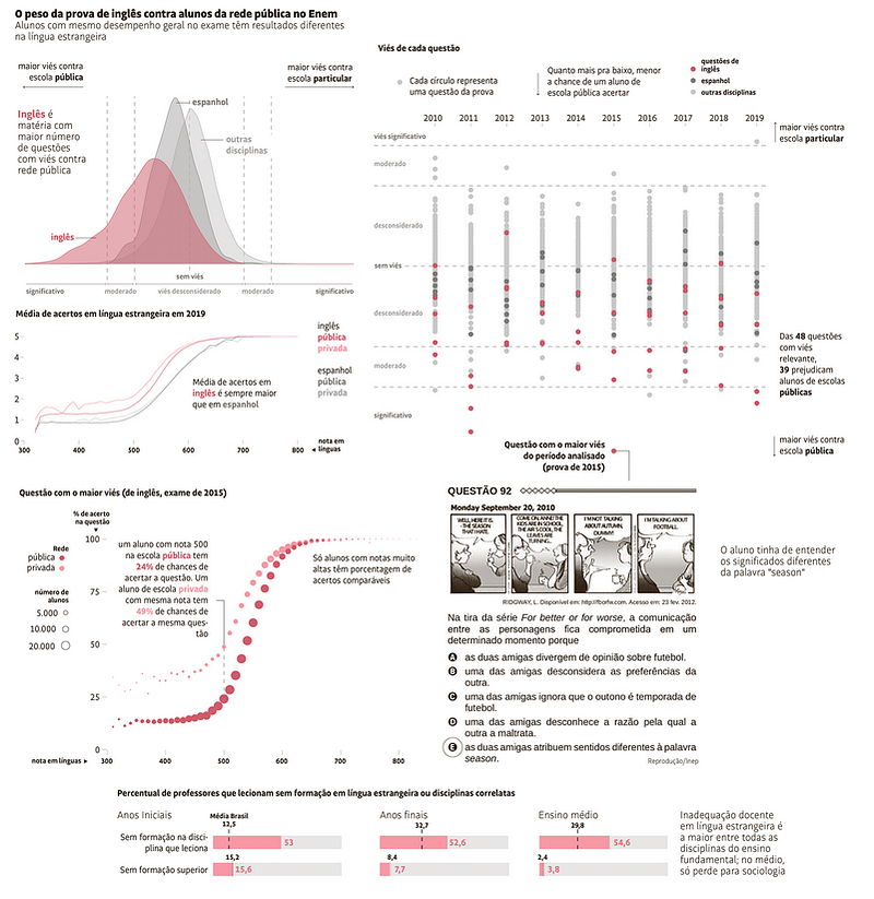
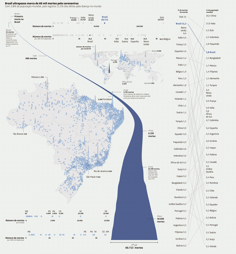
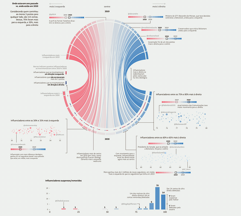
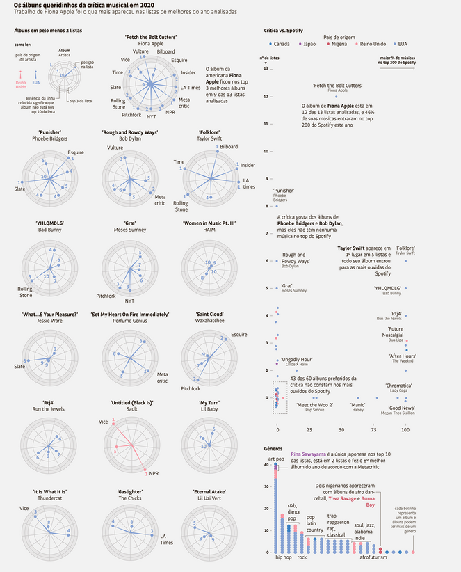
Here’s a selection of Diana’s incredible work in telling stories that are important to society!
Could you describe your experience learning and growing in data viz?
After I graduated, I moved to New York and got a job at Business Insider, which was the first place I learnt to make charts. When I came back to Brazil, it was a bit of a hard transition — I felt like I needed to prove something because I didn’t know anyone from the community, I was looking for work, and I didn’t have experience. So I started doing some tutorials and personal projects, which I think has been most helpful. Since I had a goal, I wanted to try to make it work.
Then I got a job at Globo, the largest media company in Brazil. My boss really liked what I was doing, and he gave me the time to think about the things that I wanted to learn and create something different for the website. I was lucky to have met someone who really believed in what I was doing and was willing to take someone out of the daily news churn to be dedicated to something that they didn’t have.
After a year, I went to Folha, where I currently work, and that’s when I realised the skill level was much higher, and I needed to learn to keep up with my colleagues because they’re so talented. When COVID-19 came, the amount of things that we were doing doubled or tripled. Journalism became this craziness overnight.
I see. So you did your learning in a mix of ways — sometimes during your personal time and sometimes during work. What is important is always having a boss who believes in the importance of your work, helping you learn what you need to learn, and being open to letting you try different ways of doing your work — and thus over the years you’ve become familiar with R. Is that an accurate summary?
Yeah. I got really lucky with my bosses — they trust what I’m doing. It’s amazing, the creative freedom that they give me. That just makes me want to be better. It makes the difference between you being lazy and doing the minimum, and really being pumped about what you’re doing. When you’re working with people who are extremely confident and talented, it makes you want to do more, because you know that it’s possible. It helps that my colleagues are really supportive of my craziest ideas too. Sometimes I think about the things that I’ve done, and find it hard to believe my work has been published in the largest newspaper in Brazil. Sometimes even when the idea’s silly, my boss just throws it at me and says, “Oh, she’s the data viz wizard, she can make it work” (laughs).
[After the interview, Diana sent me more names she’d like to shout out, as all these people have helped her: Fabio Takahash (ex-Folha editor), Flavia Faria (current editor), Daniel Mariani (data analyst/scientist), Leonardo Diegues (data analyst and web developer), Guilherme Garcia (data analyst/scientist), Cristiano Martins (data journalist), Raphael Hernandez (tech/data journalist). In her words, “I would never be able to do anything without them!”]
I notice a lot of really talented data journalists, infographics makers, come from Latin America — is it just me?
Oh, yes, graphic design, advertising, and architecture are huge in Brazil! For instance, Oscar Niemeyer is one of the big names of international architecture. I feel like maybe lots of people here are just very creative. There are so many award-winning designers who have been in the field for 20, 30 years. I think it was different from the work we’re doing now, which is more data heavy than it used to be, whereas a decade back infographics were more pictorial. It’s fun to be a Brazilian and see someone from your home country credited for information design on an article in the New York Times, CNN, South China Morning Post! (Laughs).
[Diana sent more examples of Brazilian excellence in graphic and information design my way after the interview: Simon Ducroquet at the Washington Post and Gabriel Gianordoli is the visual editor at the NYT. “They are both awesome!” And the Washington Post did a cool version of a Brazilian COVID project.]
What is the data viz landscape like in Brazil?
I would say that the largest concentration of data viz practitioners are in journalism. The community in Rio are making stuff too — I think there’s one called Lab Vis in Rio — and they do a lot of data viz work with major organisations like the United Nations and NGOs. I know some people who left academia and opened a studio, as well as Cafe.art, which does a lot of socially conscious work. There’s also Volt Data Lab in Brazil (that produces a data journalism outfit called Nucleo) and Data Sketches in Colombia. Volt’s made of journalists and statisticians. Those are all the companies that do data viz in Latin America that I know of, but I would love to know more!
One of the work that I found really cool last year was a Brazilian project in the Washington Post that was supported by Google. You could type in your address, and it would show what it would look like if your neighbours were affected with COVID-19. It was an important project and one of the coolest things I saw last year, and I’m really proud that it was a Brazilian project which was also published in a major international newspaper.
What are the unique challenges of data viz and journalism work in Brazil?
Right now, I’d say accessing data is very difficult. Pre-COVID-19, we didn’t have a good track record of recording stuff, but it’s becoming worse. One of the things that we had to do here is that we, collectively, as media organisations, started to collect COVID-19 data by ourselves, because it was not provided by the government. They even tried to change the data collection method in the middle of the pandemic. We found out that they had the intention of hiding some numbers because the data we received didn’t make sense. So the media organisations grouped together to collect the data, and we published the numbers every day for the public to have a trusted source, since there’s a lack of transparency from the government.
At Folha, we sometimes write about how data provided by the government doesn’t make sense. The numbers don’t add up or are incomplete, as there’s no habit of recording things or doing so correctly. For example, we don’t have records of how many COVID-19 tests are being done, and it’s incredibly hard to sort through data from hospitals. When we’re looking at journalistic references to brainstorm how we can tell our stories,we realise publications such as the New York Times or Washington Post are able to do incredibly detailed stories because of the data readily available to the public — and that blows our minds, because we don’t have such well-recorded, publicly available datasets.
Do you think this model of news organisations collectively collecting and analysing data for the public will continue after COVID-19?
Apart from COVID-19, Folha has similar data-focused projects on environmental politics, mobility, politics, and public health. We’ve also made efforts to pair up with NGOs to make data easily accessible. However, we’re facing a lot of rejection — Folha has been critical of Bolsonaro for years, so many people are really angry at us. Similar to the U.S., a lot of people don’t trust the media — there are many lies, and as information spreads fast on the internet, people choose not to believe in us. It’s frustrating, as we’re trying to do a job that was not our responsibility in the first place. But we do these projects because it’s important and it’s got to be done. If the government doesn’t communicate with the public, then it’s up to us.
Do newspapers tend to have a methodology section where you can explain how you did the data analysis, so that it helps in some way to create or repair that trust that’s been impacted? Or do you feel the issue is way bigger than that?
Our problem here in Brazil is that people don’t like to read the news — they’d rather read and believe information that’s spread through text messages. So no matter how much methodology we put in our text, most people don’t read it.
So is the solution to create very cool, sexy infographics shown through WhatsApp?
If I knew the answer to that problem, I wouldn’t be so enraged right now! (Laughs).
But I think it’s deeper than just receiving a text message and not questioning it — oftentimes, people already believe something, and the text messages only reinforce what they believe. That’s why they don’t read the newspapers, because the papers don’t say what they want to hear.
Do you feel like the work you’re doing, such as good infographic design, is part of that fight against that or do you feel like it’s a lost cause?
I hope it’s not a lost cause, and I don’t think my work alone is enough contribution, but my work with the people I collaborate with could potentially make a difference. We create stories that tell you how hard it is to obtain data, and we say, “Take a look at this chart and see how it makes zero sense, so don’t believe in it!” We do make the effort to reach out to people who may spread or believe in misinformation, but I’m sad to say that it’s not a war that my six co-workers and I are going to win just by making good data viz.
I’m just curious, what is your relationship with your Asian heritage and does it have any influence on your work?
For me, I’ve always been close to the Japanese side of my family — I grew up familiar and accustomed to Japanese tradition and practices, which is great because, when people migrate, they never change anything; it stops in time. So I feel very strongly that it’s an essential part of my identity. Here in São Paulo, we have a really large community of Brazilian-Japanese people, but in Brasilia, it’s not as big, so I was often the only Asian person in my class. Also, I think a lot of content we consume in Brazil is American, such as movies, music, and general pop culture; there’s therefore an under-representation of Asians, which reaffirms the feeling of us not being “normal”. But when I lived in New York, I didn’t look Japanese to most people; I looked Latin to them instead. So it was so strange to come back to Brazil and feel different compared to an average Brazilian again, which in turn influences so much of the way I think and behave.
I think my heritage’s influence on my work isn’t obvious. But when I think of my childhood, remembering my grandmother going to Japan and bringing me back stuff, the things I like, the toys that I had — I feel they ended up being a reference for aesthetics to me. So I think my heritage influenced me very subtly — like a subconscious understanding that I find things that remind me of my heritage beautiful.
My data vizes are styled with very clean, simple lines. When I cover heavier subjects, I make sure the viz does not appear as sombre aesthetically. There’s a lot of white space and dedicated lighting as well.
In terms of your personal interests, do you sometimes want to do data viz on food, art, or maybe other less-newspaper-type topics?
Yeah, I love to work on personal projects. My boyfriend is a data analyst — before the COVID-19 crisis, we were working on Animal Crossing, Pokémon, and other light-hearted subjects. I’ve always wanted to do a story about museums in Brazil, or how formal education shapes how we look at art (as I’ve always looked at art very differently from my Brazilian artist friends). But since we’re not living in a light-hearted moment right now in Brazil, I don’t think it makes sense for me to work on these kinds of projects at the moment.
Could you describe your work process and the tools you use in your work?
Everything I work on is static, so Adobe Illustrator is my main tool. But nowadays, I think 95 percent of my work goes through R and ggplot before it’s touched up on Illustrator.
I work directly with the data journalism department, with the analysts and data scientists. So usually I input the data that they’ve collected and analysed into Illustrator. It’s a very collaborative process — I participate in all of the discussions on how the story is going to be told. Sometimes I find something in the data they give me — such as some parts that don’t make sense or something interesting — and I may send it back for reanalysis.