
Meet the Community! Ashris Choudhury, India in Pixels creator
Ashris is a software engineer who studied architecture at university, before going to MIT Media Lab and Hindustan Times, and is currently…
Ashris is a software engineer who studied architecture at university, before going to MIT Media Lab and Hindustan Times, and is currently working at HeadsUp (a sales tool for product-led companies). A classic case of someone who resists easy categorising, Ashris is simultaneously poet and mathematician, exploring the human condition and emotions through art while also building empathy-centered robust tech products. India in Pixels, one of his many side projects, visualises data about India across different fields and has garnered 13 million views. Check out his portfolio here.
How did you get into data visualization?
I think the label “data visualization” was given to me. When India in Pixels (IIP) started, it was about making interesting stuff about India — for example, how Ganesha is represented in different Southeast Asian countries. But I eventually realized I was being perceived as a data visualization maker, so I stuck to it.
Only after attending MIT Media Lab did I realise I was properly studying and documenting India. I then formally started doing data visualization projects and realised there’s a whole community of people who do this.
What makes your current approach to data visualization unique or different?
I think it’s the intersection of these two things. One, in India there’s so little work done in terms of condensing information and presenting it, so it’s easier to stand out. Two, I’ve been able to scale this up by being just a single person because I use a lot of tech that can take in data and churn out graphics. I use the algorithms in three parts: the data collection, the data manipulation, and finally, making the data into a visual format.
When collecting data, you often find tables in PDFs. I have blocks of code that allow me to convert it into a JSON structure, and I have code (Python request library) that lets me fetch data from a URL. I also automate converting data into a map. I can reuse these bits of code again and again.
Why the career path so far — MIT Media Lab, Hindustan journalism fellowship, then software engineering?
I stumbled upon MIT Media Lab when one of their projects went viral, and I thought it was really interesting. So I got curious: Who are these people? And I thought, wow, these people are trying to mix different disciplines, and I thought: this is the place I belong.
But after I got to MIT Media Lab, where I’d always wanted to be, there was no TADAH, you made it! — or any similar feeling. It was more like, “Okay, this is it”. That changed the way I make goals in my life, because after that, I knew there is no TADAH after every goal. It’s the journey which matters, not the final goal.
So when my supervisor recommended applying to master’s programmes, I was like, Why should I be solving first-world problems when I have problems back home? It didn’t make sense to me to buy a $3,000 augmented reality solution for an educational program. I don’t know if it was the cultural clash or whatever, but it just seemed like my roots are back in India — so let me go there.
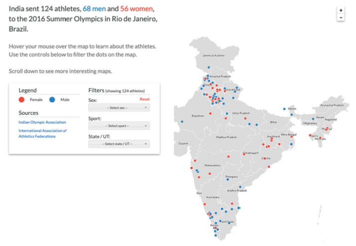
After returning to India, I went to do a journalism fellowship at the Hindustan Times, because it’s a very unique program. There were also great data visualization people like Harry Stevens and Gurman Bhatia, who have done cool projects like songs sung by Lata Mangeshkar or how Indians performed in the Olympics. I was really excited to get to work with people like that, who get the effort that fact verification, writing, and reporting take. Now, with IIP, I can always ask my journalism friends, “Hey, can you give me some links to the story that I’m planning to do data viz about?”
I then pursued software development and engineering, for two reasons]. One, to pay the bills. Two, to learn and advance my programming skills, as I sometimes got stuck when I wanted to do some project. Now it’s been three years in the industry, and I think it was a good move; my day job and IIP work have symbiotically helped each other.
What originally motivated your work with IIP? Was it a way to process your feelings about a place you called home, and how have your feelings changed since you’ve started?
Growing up, I moved around India a lot. I felt alone all the time, and all I had was this random bunch of memories and experiences that I didn’t know what to do with. I had one experience from this city, one experience from that village, something from here, something there — and there wasn’t a single person who knew all of it.
I knew I was queer; even as a kid, I was very feminine in some ways and very masculine in other ways. I was living in urban areas and in rural areas. I had to be very aware of which accent I used to avoid coming off in one place as a “big city guy” or, in another place, “not polished enough”.
All these experiences made me realise that you need to have an integrated story about yourself. Because if you don’t, then people will choose the story for you — and just place you as a character in that.
All this complexity, in my identity, got reduced to one as an immigrant, as my luggage was being searched in the Boston Airport. All that made me realize, I have to own my identity; I need to shape who I am.
So I empathize with India on some weird level. I feel like it’s a country that is struggling with its past: it was a big empire, then it got colonized by several European powers. And now it’s sort of like a democracy which is just trying to make things work. And I’m not so sure if it’s like this peaceful nation, or this macho nation.
Now with IIP, every post tells me something about this whole country; it tells me something I can then tie up with something else. It’s sort of what I’ve tried to do in my life — in every endeavour that I do, I look at how it’s connected with the rest of what I have done. It’s about integration and trying to form a story of your own. So, IIP has helped me feel like I’m not alone.
How did the overseas stint at MIT Media Lab change that? Data viz as a way to explore and open the beauty of India?
In India, people often have like, sigh, a “This is India, this is how it is” attitude, and you sort of internalise a sense that we have these problems because we are not good enough, but the West is in perfect order. Yet when you go there, you see they have their own problems, and even some problems which we don’t have — like gun violence — and that makes me feel like we are all different cultures, more of a network than a hierarchy. There’s no hierarchy, even if like these numbers — like per capita income — give us this feeling that there’s a hierarchy, and we belong somewhere. You cannot compare things so directly; everyone has their own culture, history.
What I did appreciate about the USA was they’re very articulate about expressing their culture — like there are tools available, which make it easier for an outsider to grasp something about American culture, like movies. But if someone wants to know about India, they have to go through Wikipedia; it’s not as accessible. So now I know if I am to tell the story of India or learn it for myself, it has to be presented in a way that is not boring — those are the things that I got from the West, the way you present stuff.
I’m just curious, like, how do you make the judgment call on which methodology to use, or which specific aspect of the data to highlight? Do you mind unpacking the tension between that and the idea that the data is just truth, and we’re all immediately going to come to the same understanding?
There’s a paradox I feel about data visualization. Because there’s certain things that will be easily quantifiable, like your wealth, and certain things which won’t. And so we naturally place more emphasis on things that are quantifiable. But numbers can be misleading that way — because numbers are just proxies to certain things. They cannot capture everything, and they create a false sense of hierarchy.
The way I see data visualization, data is the realm of order, whereas visualization is the realm of chaos. One is the realm of numbers, ordered, factual, verifiable. And then the second is how you see these numbers, the qualitative aspects, experiences, emotions — and, as long as I feel these things can coexist, and there’s a space for both of that. I’m happy with whatever it is, even if it’s not truth. I think when we deal with sociological things, personal stories are important, because everyone is entitled to their way of looking at life. The approach we bring to physics or chemistry shouldn’t be the same approach when we’re talking about how should people live with each other.
So that is where I think data visualization shines — it’s a great introduction, or, like, a great conversation starter. The field forces you to be empathetic. Because you have to think about how this data is going to be perceived by someone, you have to give it a shape — without empathy, you just cannot design good data visualizations. I think those are the powers of data visualization, not necessarily like it’s the Bible of information. So I see it in that perspective — it’s a great tool for cultures to come together, look at something they both can relate to, like numbers. And even if they have different experiences, they can talk about it: Why is this lower? Why is that high?
How has the process of India in Pixels’s work changed, and how do you see that work evolving, going forward?
Initially, it was very much like, IIP was more like my portfolio, something I’ll show as my work — but now it’s more like it’s this big organism of India, which I don’t know, which none of the people know. But when everyone sort of come together then we know more of it.
I definitely want to be more experimental with my work, not play so safe. And sort of keep on my toes. I want to constantly keep surprising them. I think that is how I’ll enjoy it.
In terms of form, I do think I have a lot of issues, because I wouldn’t say my creativity is very high. The only aspect in which I’m creative is in choosing the topic, something that grabs people’s attention. But once I have the topic, the way I present it is very conventional — either it’s a map, or it’s like two very simple things that are there. Because I have realized that sometimes presenting something very creative is not needed. Sometimes audiences are happier seeing something more conventional. Not everyone in my audience is from a design background, or have data viz knowledge. I’m also not a fan of interactive things like web interactives, clickable stuff. I think they’re just more confusing. So for me, I have kept these constraints — they should be extremely simple, low text, simple images, but still retain some element of unconventionality. Expressing the data is not difficult. I think taking a data set that will be helpful for someone — that’s the difficult part.
How do you see data viz changing in the next five years?
There is literally no innovation in collecting data and I think there will be more tools on this front. Unless you have your own database setup, which you can only do with a big company, there are not enough tools for people to collect data in an ethical way, which does not require a lot of hacking. Secondly, there will be a lot of automation happening. For example, we have a lot of data streams available. Let’s say Twitter, or some action is happening all the time, or the stock markets are going up and down — let’s have automated streams of data readily available, and I can just compare them. So if you want to know what’s happening in the realm of football, in terms of our data visualization, there shouldn’t be someone who has to sit, collect the data, plot it — to do this today and tomorrow. Ideally you just do it once and automate it. I think there will be a lot of automated visualizations — you can use some predefined templates, change a few variables, then adapt it for your own project. I think this is how open source and data visualization will go.
In the future maybe everyone knows code or there are tools that don’t need you to code, for everything. So if you want to get data from a website you can just copy and paste its URL and you’ll get a beautiful .csv file.
Are there topics untapped in data viz?
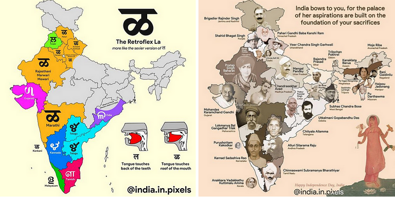
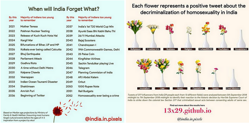
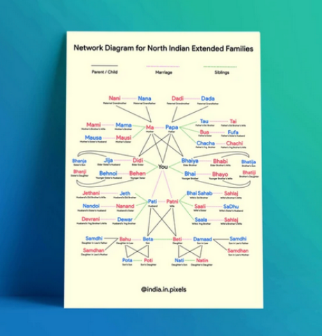
I feel there are still many structures out there, which are non-quantitative in nature, that don’t get focussed on as much in data viz. Let me give you an example: in English, we have very few words to refer to relatives. What do you call the wife of your father’s brother? What about that aunt’s something? In India, we have lots of different words to identify this specific hierarchy. But you don’t have that in English. You just end up with “uncles” and “aunts”. And that’s really interesting. These aren’t numbers, but they can be explained in a very nice tree structure.
Good resources and advice? As someone who self-taught programming, what are your tips for self-learning ?
I go to certain places on the internet for inspiration. For podcasts, I listen to Data Viz Today by Alli Torban. Before I knew about Outlier or even the Data Visualization Society, this was my go to podcast and how I learned what people are doing. And Kantar has this “Information is Beautiful Award” every year and they have some amazing work. So I visit that website to check out really cool work. I also get inspired by works of Gabrielle Merite who has a flair for bringing high art to her dataviz works. And Reddit — I keep scrolling through specific map communities or India-centric things. I also go to are.na — it’s Pinterest but for, like, hipsters. It’s very minimal so you don’t get addicted, and they have amazing resources and interesting artists, particularly from the US.
My advice to someone just starting data visualization would be to have one foot on something that you are comfortable in, and another foot on a domain that you’re not comfortable in. Having these two, known and unknown combinations, is when you will learn the most. Because if you have never coded and suddenly you do d3.js straightaway, I think it will be very uncomfortable.
Use the tools you’re familiar with. Don’t think that there’s one right approach. Don’t get into the false illusion that if I don’t know d3.js, I’ll never be a data visualization expert. Because honestly, like, I am not that good. I just stick to my own tools like Photoshop, I come up with my own approaches. And that’s perfectly fine. The field is so wide right now that there’s space for everyone.
That would be my advice to someone just getting started, there’s no right or wrong, just do it. Like, don’t worry if, I’m doing it the right thing or not, just have fun. If you’re starting, if you’re interested in data viz, ask yourself, why are you interested? What excites you? And stick to that, you don’t have to delve into uncomfortable territories just because that is what you think a data visualization person does. Just keep having fun, and make good work.