Meet the Community! Andrea Lau, data visualization specialist
Andrea Lau is a data visualization specialist; she is the co-founder and one of the directors of Small Multiples, Australia’s leading data…
Andrea Lau is a data visualization specialist; she is the co-founder and one of the directors of Small Multiples, Australia’s leading data visualization studio. After graduating from the University of Sydney, she worked as a UI/UX designer at various organisations, including the Australian Broadcasting Corporation (ABC), before starting Small Multiples with Jack, who we interviewed here.She cares strongly about data transparency and technology as well as bringing data to life for the people whom it is most relevant to. Aside from visualizing data for clients, Andrea loves teaching people and sharing about this work through talks.
How did you get into dataviz? I saw you chose to do a Bachelor of Design Computing, Information visualization, Interaction Design at University of Sydney — did you know you liked dataviz from that early on?
My mum kind of guided me to that! In the lead up to uni, all of my subjects were in science, but I also did software design and development. I’ve always liked technology, and, our family was lucky enough that we had a computer around, so there was technology around me, and I liked making things. So, at the university’s information day when we were walking around, my mom saw Design Computing and she said “You should do this!” Unlike “typical Asian parents”, my parents did say you should do something that you really like.
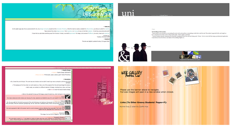
In second year, an academic, Andrew Vande Moere, showed me all this infoviz stuff that was happening. And I thought (gasp) that’s cool! It’s like this marriage of development and design. Afterwards, Andrew managed to convince both Jack and me that we should start research degrees. And that’s how we met. Four years later, we started Small Multiples.
What inspired you to start a studio by yourself with Jack as opposed to finding a role in some other organisation?
Because we couldn’t. There were no data visualization roles. I mean, even now, it’s hard to find proper data visualization design roles. You could find maybe managers or data analysts or business analysts, but not specifically what we’re doing. Doing it back then was even harder. So we just did 2.5–3 years of normal UI/UX and interaction design jobs before we decided to take the plunge and do our own thing.
How did you decide to be business partners with your life partner (Jack)?
Jack and I have a common understanding and value system. For example, we value design in general. We’ve been commuting a lot by car recently to avoid public transport in COVID times, and we always inevitably end up talking about car design, saying, oh my goodness, that’s such an ugly car, or why does that exist? There’s an inherent curiosity about how things are designed and made, and we want to make things, critically think about them, and improve them.
In working with Jack, I think one of the key things is recognising each other’s strengths and weaknesses over time. I’m not going to ask him to make wireframes, and he’s not going to ask me to come up with ideas when the other is available to do it, because he’s the ideas person and I’m the details person. Just over time, you recognise that, and because you’re partners, you can tell each other, and give constructive criticism without too much backlash.
And how do you two choose who else to work with?
You hire people whom you want to actually see and be next to every day. The nice part about being the owner of a company is that you get to have a say. We tend to hire people who are creative — open to ideas, open to exploring new things that they haven’t learnt about before. This is key, because we’re an “agency”, so we can get a client coming through the door who is in a domain you’ve never heard of before, and we need to quickly get up to speed with that. So you have to be curious and creative. We also like creative optimisers — not perfectionists, because we don’t want 100 percent all the time. We want 90 percent or 95 percent, or whatever it happens to be most of the time; because of the nature of running a business, we can’t have everyone working perfectly all the time.
Lastly, we want people who are authentic and pragmatic. That means not overly salesy people who are realistic with what they say about a project, who aren’t afraid to necessarily tell someone, I can’t do this, this is impossible. You’re out of your mind. We don’t want someone who’s going to say, “Oh, yeah, everything’s perfect. And everything’s great.”
Additionally, a lot of us are multidisciplinary. Our general manager, she’s a journalism graduate who then moved into production and is now the operations side of things, and she is inherently curious and loves science. One of our developers has three degrees — one in fine arts, one as a bachelor of arts, and a computer science degree.
What experiences did you guys have before starting Small Multiples?
I was an interaction designer at a company called the Interaction Consortium — we learnt UI, UX, running a small business, Python, Django development work; as a small company, we ended up getting our hands dirty with lots of different types of things.
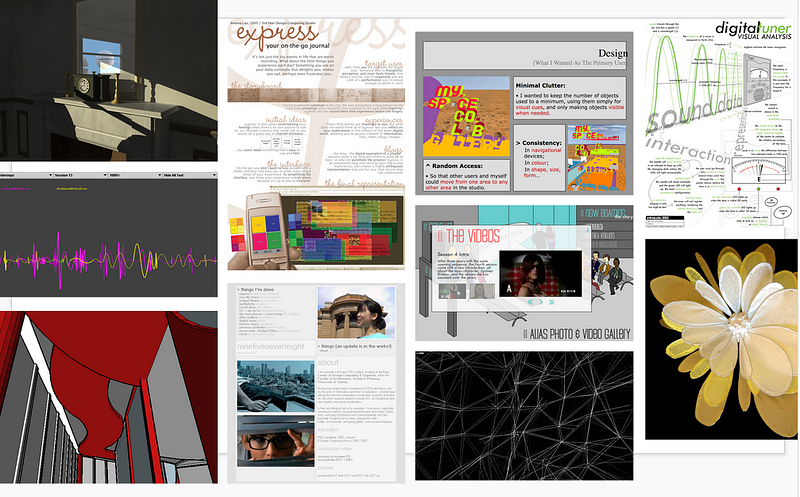
Then we went to ABC, the national broadcaster. And we were there at the right time, because right after we started Small Multiples, the very first project we did was as the designer and developer on ABC’s first data journalism project.
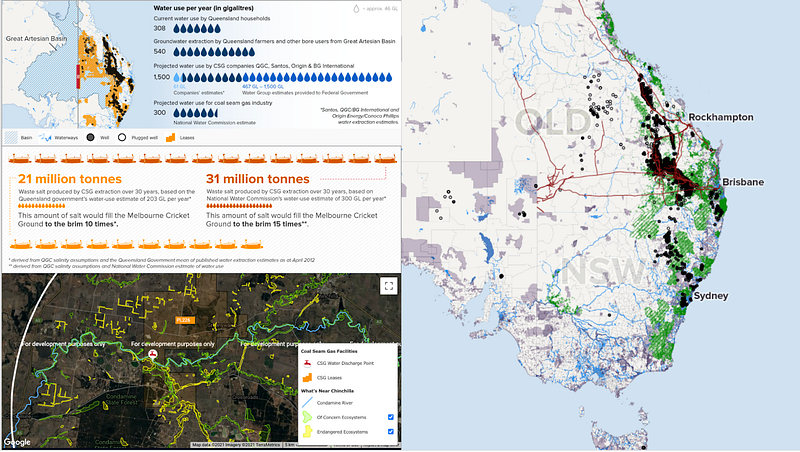
Small Multiples’s first project, made in 2011 — it showed the issue of fracking in Australia and its environmental implications.
I mean, looking back and knowing how we ran the project, we wouldn’t run it again like that. For example, this map on the right hand side was made in Tilemill, which was the predecessor to Mapbox. This one down the border was just Google. Then we did the other things in Illustrator and hacky code. But this was pre-everything. Google didn’t have any charts. No one had any frameworks, so it was kind of tough back then. In light of that, I’m fairly proud of what we’ve done.
How has your and society’s understanding of data visualization changed in these 10 years?
Because we came out of a more-or-less academic slant to dataviz, we made things that for the general audience were too complex. So it’s been a process of simplifying. At the beginning, it was like, we’re gonna do cool complex dataviz, and it’s going to be amazing and everyone’s gonna love it. And then we realised that no one understands that kind of thing in the “real world”.
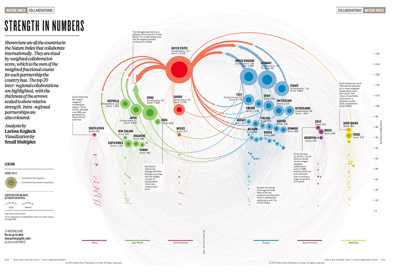
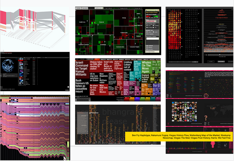
But some things are done for a wow factor. For example, the one for the Nature Index, Strength in Numbers — we were briefed that it should have a wow factor, so that’s why we did that one. But everything else we do now is much more stripped down and gets to what people really need at the end of the day.
Back then, also, people weren’t as dataviz or chart or data literate at all. Around 2015 would have been the low point of simplification. Slowly, we’ve been able to make things more complex now, because people have been on that journey. Back in the day, it was long infographic posts on Facebook; it was following what the New York Times did with election results; people are becoming more attuned to what data visualization is now, so we can be a bit more complex. But we have a different problem these days, which is that if I talk to someone about data visualization, it’s not about what we view as dataviz, but they might talk about data analytics, data science, and dashboards, and Tableau.
Now it’s a different challenge — differentiating what we do as a very user-centric, design-centric thing, with the good development-based support of more-or-less bespoke data visualization, versus an off-the-shelf-product. Data visualization is a way to make data more useful to people through the lens of understanding the people who you’re making it for, through user-centered design and bespoke development.
How have your tools changed?
Back then, it was just Excel that we could get our hands on. Now, we still use Excel a lot. But a lot of us will go into Tableau just to analyse it really quickly. Mapping technologies haven’t changed as much; we used to use Tilemill heaps, and now we use Mapbox. For prototyping back then it was a lot of just coding. Now, there are obviously more frameworks, things like D3. And Observable. I know Jack will tell you that he uses a lot of Python, using Jupyter Notebooks and things like that.
For prototyping, Datawrapper has a great storytelling element. For UX and UI design, Photoshop and Illustrator were the standards at the time, but now it’s very much Figma and things like Miro. Really now, we’re lucky, because there are lots of different tools and frameworks and open-source libraries that help with the prototyping and opening up with ideas and in the actual production of work.
How has Small Multiples’s work changed and what opportunities do you see for it?
I think at the beginning, dataviz was still for marketing — something flashy and cool. But over time, we have virtually stopped doing that kind of work and moved towards tools.
Increasingly, we’re working on tools and applications, like dashboards. It might be building a scenario-builder product, or a government client who wants help digitising an otherwise very manual process involving lots of data and maps.
It feels like a lot of the organisations that we’ve talked to have assembled big teams of data scientists and data analysts to do work. But, at least some (anecdotally) seem to be missing that humanistic design, user element to things. So I would hope that in the next five years, we marry the idea of data analysis and data analytics and data science with the visualization side, for the sake of the user, and for the sake of usefulness. So that you see data visualization designer roles everywhere — not just ABC or The Guardian, on those in-house places at a bank, but anywhere that has a data scientist should also have a dataviz designer. An opportunity for us is that, hopefully, we can teach some of the people we train or consult to help people along that journey, so they’re not starting from scratch.
How would you articulate your studio’s unique offering given that, for example, organisations are increasingly developing their own in-house capabilities?
The value is that we’ve been doing this for a while; we can strategically lead the use of data visualization in organisations and on projects in a way that you don’t get from just deploying a tool or a suite of tools.
An in-house team will know very in-depth insights for the organisation that they’re in, but they might be bogged down with the typical ways of doing things and not have much diversity in thinking. Whereas we’ve had the ability to learn over so many projects over such a long period and are outside of that. And because we do things at the highest level, we can apply a whole bunch of other learnings from different projects and different clients and people that we’ve talked to.
What difficulties or opportunities do you see for dataviz in Australia?
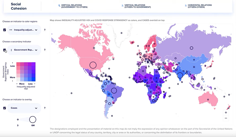
In general, Australia is damn far from everywhere else. And it’s hard to be in that mix of practitioners who are talking even on Twitter, for example, because we’re in the wrong time zone. Post-COVID, everything’s just online, it’s just going to open up more international work opportunities. For example, we have worked with UNDP, and that was all during COVID. We haven’t met them at all; it was just a lot of night calls and early morning calls for them.
On the other hand, because we are Australia-based — specifically, Sydney-based — we have a shorthand to understanding the area and the people around us. So we should stay local in the sense that that’s where most of the value comes from.
Any last tips for people interested in this field?
Everyone will tell you to do projects and get practical experience: make, do, code. Work on a topic you’re passionate about that’s completely self-initiated. But also, do work for someone else: volunteer at a charity, make something for your dad — this is so you have a client. Also, learn the theory — I don’t think anyone thinks there’s dataviz theory out there, but there is. Look up Ben Shneiderman and the information-seeking mantra, Christopher Healey and pre-attentive processing, Fernanda Viegas and History Flow (and all the other research over the past 15 years that I have missed!).
Are there any cool people, projects, organisations that you think I should check out?
- Michael Honey from Ice Lab: https://www.icelab.com.au/work/australian-prime-ministers
- Greg More from Oom Creative (Melbourne): https://cusp-design.com/designer/greg-more/
- Dumpark: https://dumpark.com/
- Mitchell Whitelaw: https://mtchl.net/