Meet the Community! Alexandra Khoo – data analytics strategist
Alexandra Khoo is at her best when she blends strategy, data analysis, creative design, and coding. Starting her career in international…
Alexandra Khoo is at her best when she blends strategy, data analysis, creative design, and coding. Starting her career in international relations and policy-making, she made the switch into data science and analytics. Her latest adventure is at Delivery Hero (foodpanda), where she helps to unblock, speed up, and empower product analytics teams to do their best work. As a mentor for Google’s Women Developers Academy and former editor for the nonprofit She Loves Data, she is also an advocate for diversity in tech.
How did you enter the data viz field?
Like many, my route into the data viz community was quite circuitous. My background is in international relations and policy-making, and as part of the role I chanced upon FiveThirtyEight. I was blown away by how they combined design and data. Discovering Nathan Yau’s work was a pivotal moment, as it pulled me deeper into the field. It tapped into my innate desire to create something, and I thought, “Oh my gosh, his work is so cool. I want to be able to create that too.”
Could you share more about that path of exploring and self-learning? I know you relied on She Loves Data, Hack/Hackers Meetup, DVS, and enrolled in the Metis Data Science bootcamp to optimise your learning. How did you navigate all that?
For an interdisciplinary field like data viz, it’s hard to have a structured syllabus. For instance, following this data journalism-related syllabus compiled by Professor Dan Nguyen is really difficult. Myy learning style is very curiosity-led and it’s very rare to find courses that can engage me fully from start to end. So what I do instead is look at projects from publications such as The Economist or The Pudding, and if I think it’s interesting, then I’ll learn how to create it.
In school, we got so used to the idea that learning requires a super-structured path. But what I realised when studying data viz on my own is that learning can be flexible — for instance, there are a number of times when I return to the same topic, because I gained some experience and I’m able to ask deeper questions.
To sum up my learning style, I look at the result that I want to achieve, whether it’s something more technical, and deconstruct it to hone in on the specific element I have to learn, then keep practising it. I think it’s very important to know your own learning style. It’s about finding what works for you, and the only way to do that is to keep trying different methods until you find something that sticks.
Often in self-learning, learners face the dilemma of knowing the right thing to learn and knowing when to stop and move on. What was your experience?
What got me into this field was the thought of, “Oh my gosh, that’s so cool, I want to make it too”. But when you’re learning how to create it, you realise, “Oh my gosh, that is so much hassle and I can’t even create anything that’s close to it”. If you get hung up on the techniques, it’s too easy to feel discouraged because they’re often laborious or repetitive. For example, while using D3.js, you might think, “I’m writing so many lines of code, and I can’t even see any resulton the screen yet!” So instead, it’ll be better to focus on what makes a good visualisation, as it helps to give you a vision of what to strive towards.
In hindsight, I would recommend having a good grasp of the fundamentals first when you’re learning something. After that, you’ll have more flexibility in deciding what you want to learn. For instance, if you want to create data viz for the web, there is no running away from JavaScript. If you want to create something using D3, it is helpful to have basic knowledge about how web development works in general.
Also, if I were to talk to my younger self who’s starting to learn data viz, I would tell her to learn what makes a data viz good. After that, it’s about building the vocabulary so that later on, she would be better prepared to know what she’d need to search for to learn a specific skill. For example, say you come across a streamgraph, it might appear as one big blobby thing. But when you learn about what actually makes up the data viz and break it down into its elements, you realise there are certain visual channels and marks. So, at the beginning, even if you don’t understand how to create things, just knowing the rough lay of the land really helps, rather than rushing straight into techniques.
How did you figure out what makes a good visualisation? What materials did you use or did you wish existed?
I think a lot of it comes through consumption — whether it’s books or people’s works and projects. Through exposure, you realise there are certain things that appear over and over again, such as the principle of contrast. You also see how different people have different styles, and learn what’s possible to do. I read this article — by Nadieh Bremer, I believe — where she shared that when you’re first starting out, before you can create something that’s really original, you’re gonna be incorporating a lot of other people’s ideas into your work. It’s through the process of creating over and over again that you eventually discover your own style.
I find that a lot of materials out there are about the technical side of data viz, like coding. But what I find harder to find advice on is the “softer” side, such as the storytelling and design considerations. For example, there’s a lot on how to use colours, but less about the final things that make the difference between what makes you go woah and what makes you think, “Okay, this tells me information, but doesn’t quite capture my imagination.” (Laughs).
What were some of the psycho-emotional challenges you’ve faced?
I realised while there’s a lot on YouTube about how you can pivot from non-tech to tech fields, there aren’t as many resources about what to do after you’ve gotten in — for example, how can you thrive? In the tech field, a lot of things are changing, and it’s too easy to feel like you’ll never know enough. I’m sharing this because I hope that we can have more conversations about how we can not only bring more people into this field, but how they can flourish and not feel like they are alone and have to battle against imposter syndrome. I mean, having years of experience probably helps, but until then, we need to help them stick with this field long enough to know that it gets better.
Personally, I think it’s about asking yourself whether you are subconsciously holding yourself to a much higher standard than you would for other people. Once you recognise that what you’re asking of yourself is unreasonable, it helps you find peace. In the data viz scene in Asia — and I don’t know if this is just an Asian trait — I sometimes get the sense that people feel the need to be super impressive before they can share their work or experiences. So they don’t speak up, which is a pity, because I feel there’d be a more vibrant culture if there were more sharing among us, even if we’re not experts yet.
How would you describe your current data viz projects, style, and interest?
I’ve been told I have a gift for finding ways to eliminate complexity in a concise manner, and I think this skill is a result of my hybrid background. I’m often coming in with an outsider’s perspective, which helps me know how to communicate topics to people who are not familiar with it.
As for style, I think my style is kind of blended. I like to add quirky designs, such as little illustrations and flashes of geometrical styles in my data viz, but I’m still exploring and evolving. I also do data sketches — these are illustrations with data viz incorporated into them, such as data comics. But I don’t have a fixed preference for types of data visualisations, I simply go with what helps to tell the story.
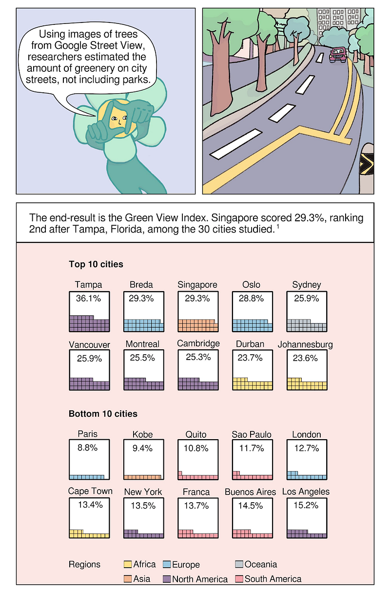
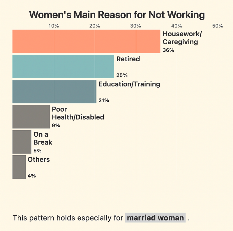
For subject matters, the ones that pique my curiosity are always the ones that shed a bit more light about what it means to be human. I like visualisations where the reader is invited to go through a journey, so that at the end of that visualisation, it helps them to think of what more there is to it. For instance, for the 2020 census, I wanted to avoid making sweeping claims about a charged topic like gender roles, and instead hone in on what the data was showing us about people’s experiences today. I was also hoping to make my reader ask, behind these numbers that we often take for granted, what else they are also saying about how we are as people. That’s the kind of reflection I’m hoping to prompt through my data viz.
Referring to the DVS article you helped to produce — about why people find joy and value in data viz — I’m curious: What are the main joys and value of data viz for you?
I feel like the act of creating data visualisations is transformative, not only in the sense that you are mapping data into something that can be experienced by someone else who may not have that first-hand experience, but you — the practitioner, the creator — are also changed in the process in terms of how you reason with the data. When you have to work with it in such an intimate way, it makes you think more critically about how this phenomenon gets captured, like what actually gets counted in as relevant, or how something is measured.
Are there certain people or projects that you’re currently very excited about and following?
One of them would be Kontinentalist, as it covers subject matters such as heritage and culture, like spicy food, and things that you don’t normally see visualised as much, so it’s really refreshing. That’s the good thing about data viz in Asia: we have a wealth of distinct source material we can create data viz about!
Other stuff I’m really excited about includes the DataWrapper blog and any piece of work from Lisa Charlotte Muth, who sharesvery useful tidbits about the practice itself and what’s notable. I love how Lisa is such an enthusiast — she actually created a crossword puzzle for data viz, and that prompted me to create a mini crossword puzzle on my own. (Laughs). Another person or practitioner that I often find myself inspired by is Moritz Stefaner, who’s one half of the pair behind the Data Stories podcasts. Of course, there’s DVS Slack, The Pudding Slack and there’s this Data Science by Design Conference, as well as the Meetup groups in Singapore.
I know you’ve already shared three career tips with She Loves Data in an interview. Is there anything else you’d like to add?
[For anyone curious, the brilliant tips are: (1) Don’t worry, if you don’t have a passion; just stay curious. Focus on mastering the skills. (2) Things that aren’t obviously connected to work, like your social habits and lifestyle choices, may still shape your career. (3) Remember, your job isn’t your career. Jobs are owned by the company, and you own your career.]
What I noticed about myself was that I rarely eyed something from the start. My career choices came through a series of saying “yes,” to, like, a tap on the shoulder, putting my hand up for opportunities, and being really open to what comes next. For data viz, no matter if you want to be a full-time professional or a hobbyist, it’s important to immerse yourself in a community, share, and give back, and it’s through these actions that you’ll find where the opportunities really lie.