Making a map of land reclamation in Singapore
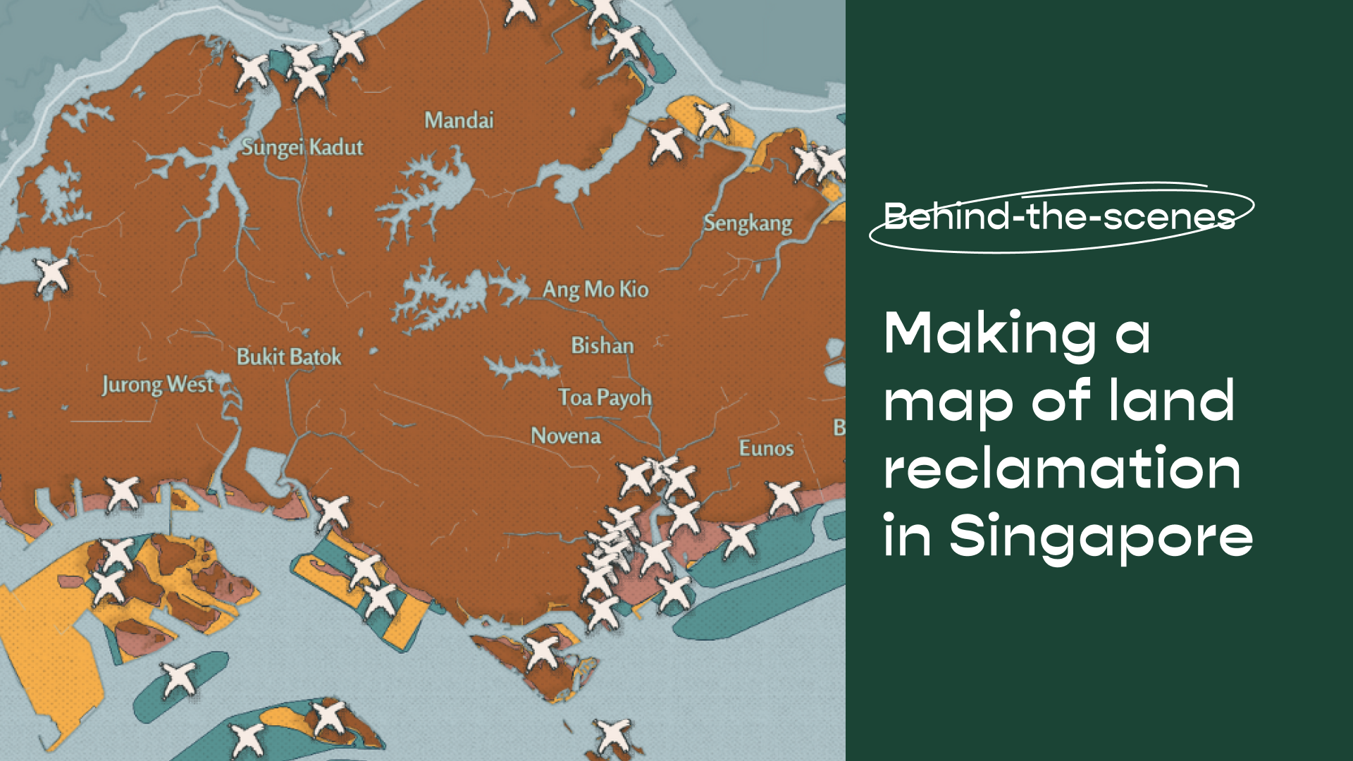
How familiar are you with the shape of the land(s) you call home? On the map, most of us identify Singapore as a little red dot, or a diamond at closer view. In our recent story on sand mining and land reclamation, we created a map to examine the complex shapes that make up Singapore land.
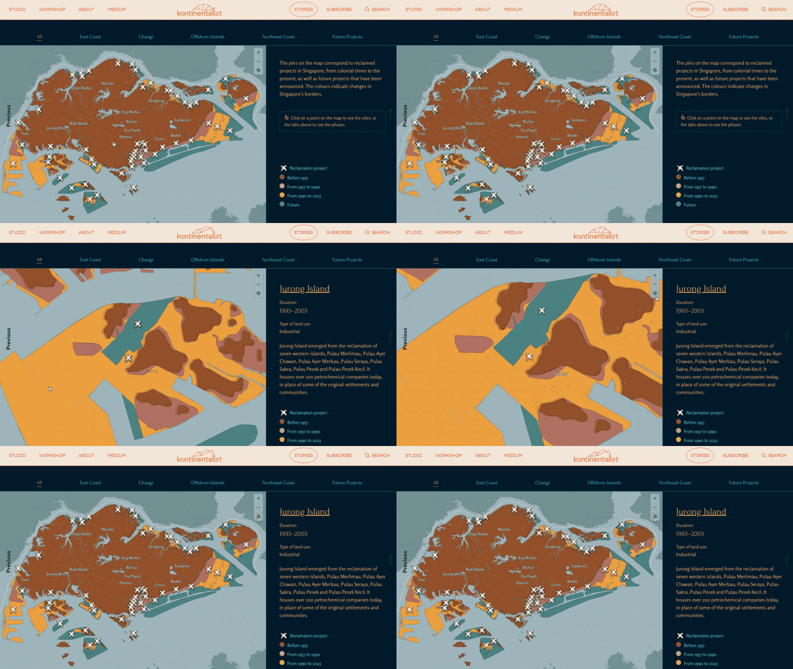
Our map presents two levels of information. Clicking on x-shaped pins provides greater detail on individual reclamation projects. This article focuses on how we created the first level of our basemap and its colour legend, showing changes to Singapore’s borders over time. With limited data on reclamation, how did we navigate the challenge of tracing Singapore’s borders—by conjoining a few maps, whose authority we started to question?
PHASE 1: DATA COLLECTION
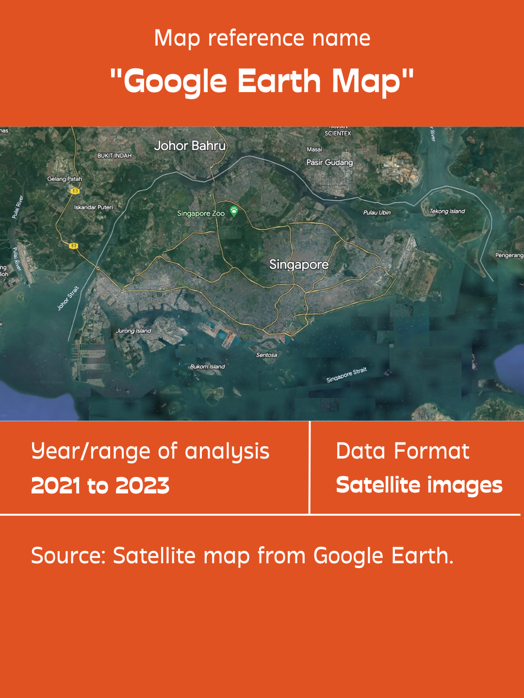
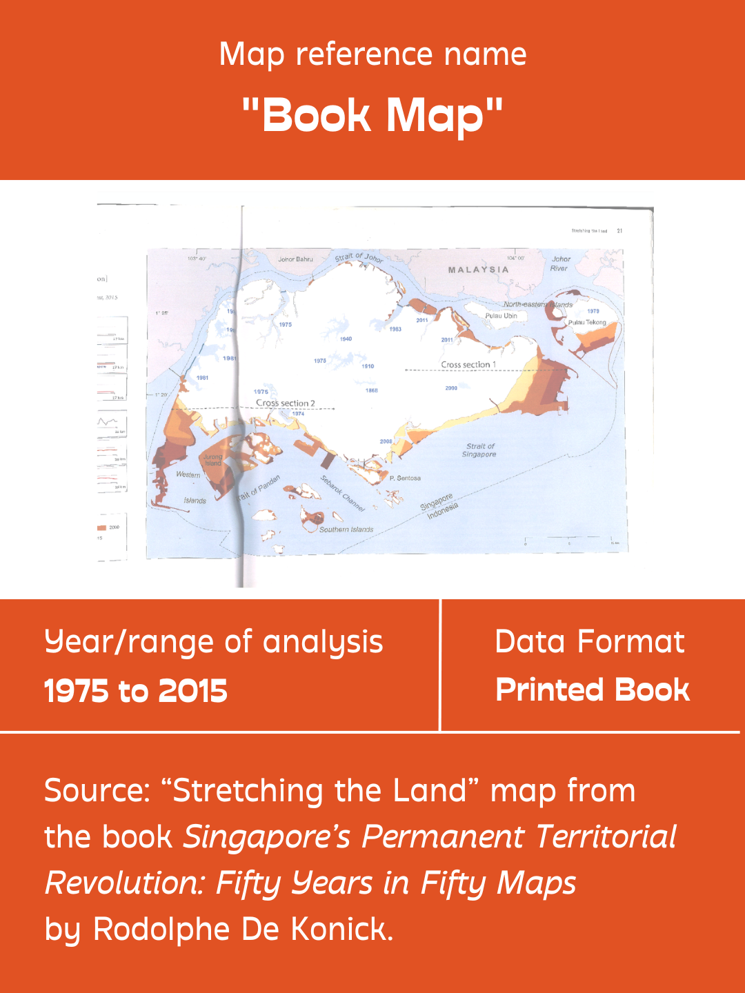
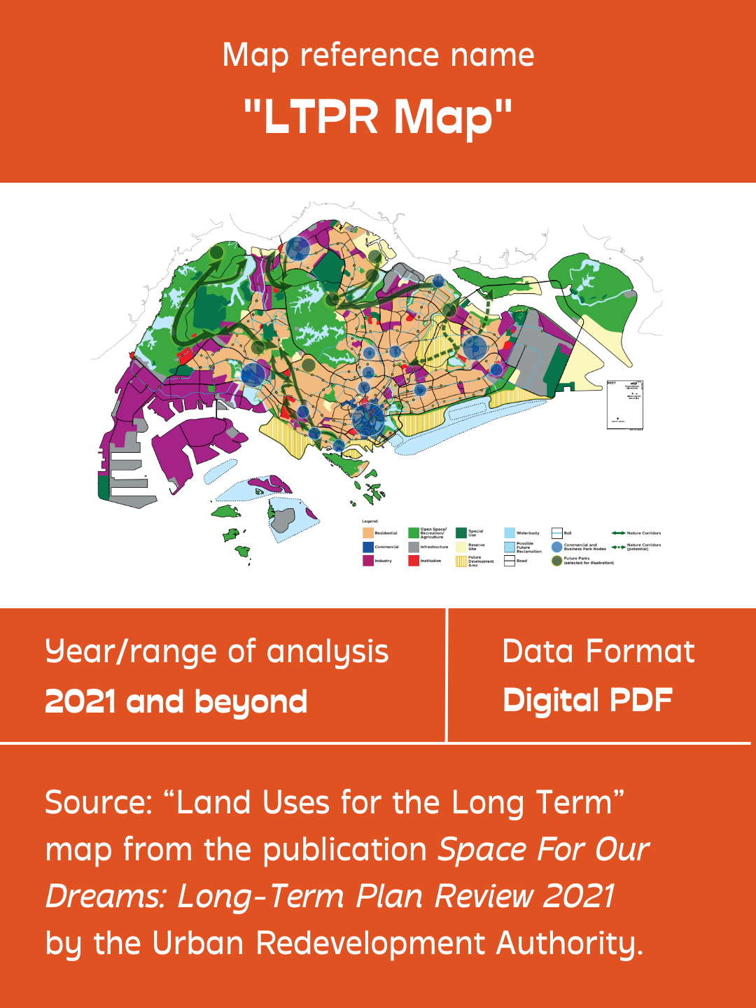
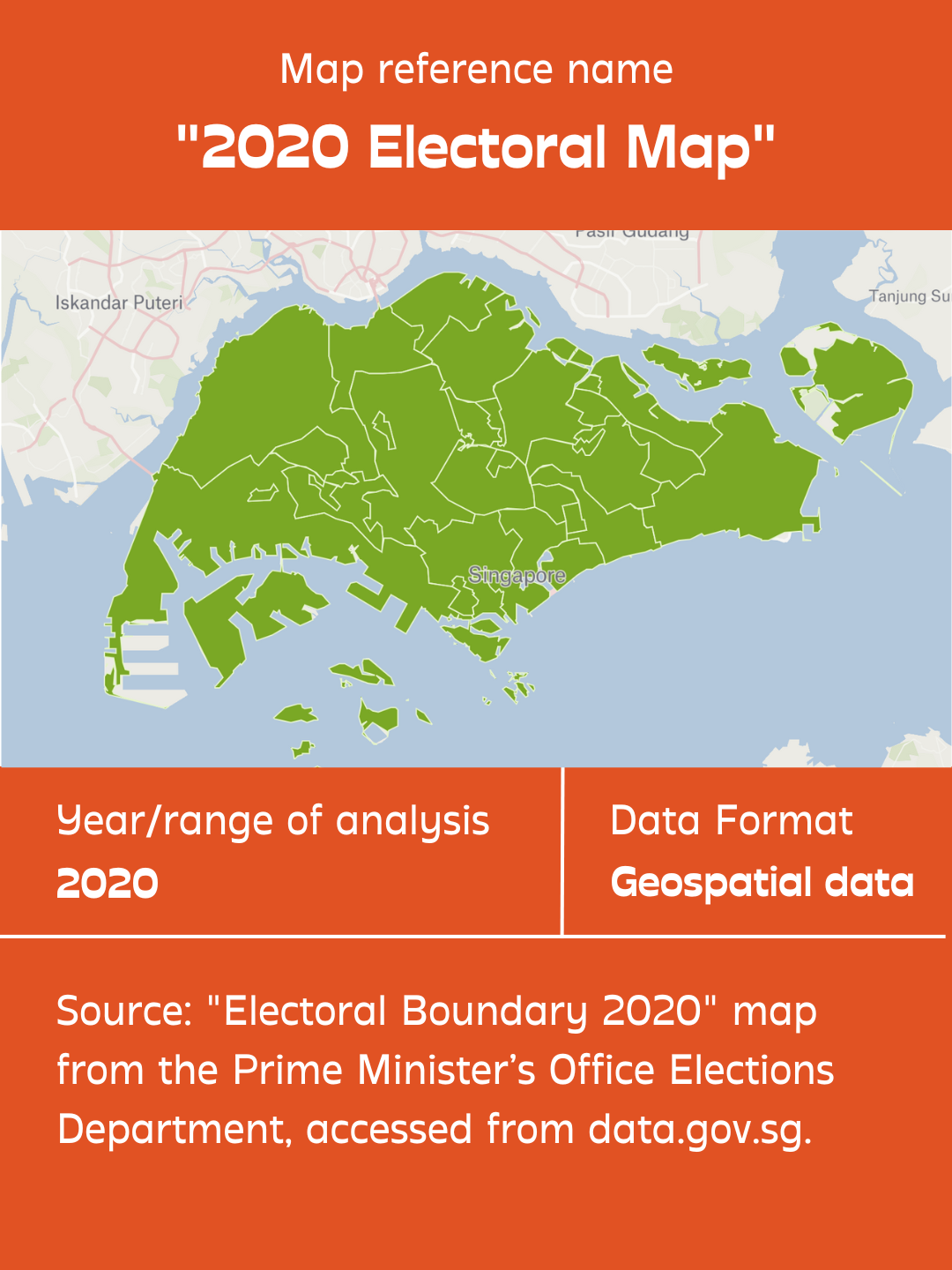
Our goal was to visualise a comprehensive timeline of land reclamation in Singapore that was as complete as possible—spanning from the earliest documented project before independence, to the most updated plans for the future. However, we quickly realised that there was no existing map that covered the full extent of our desired timeline, and so we stitched together data from four different maps, each analysing different periods in Singapore’s past, present, and future. This was however more challenging than expected, due to the discrepancies we found across the datasets. Even amongst verified government sources, reclamation projects were identified by different location names, years and land areas. It was just as difficult to ascertain the reliability of data on several projects, for which we could only find one source.
Working with maps that had been produced for different contexts, we were attentive to how each of them plugged gaps for certain data points, but presented unique constraints in others. We elaborate more on how their different data formats and resolutions affect choices made in the next section on data analysis.
PHASE 2: DATA ANALYSIS
Georeferencing
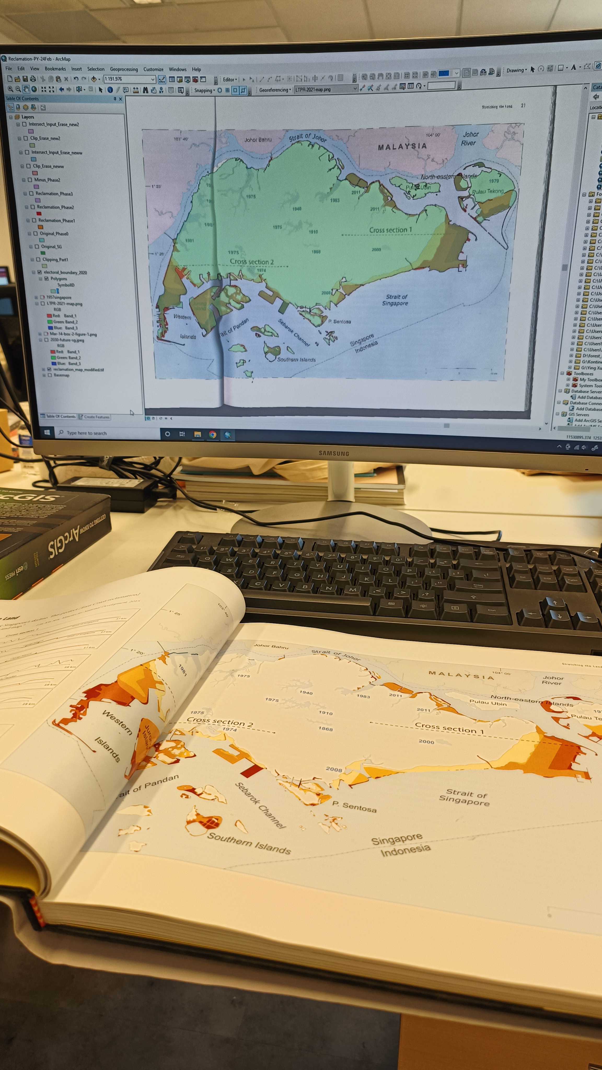
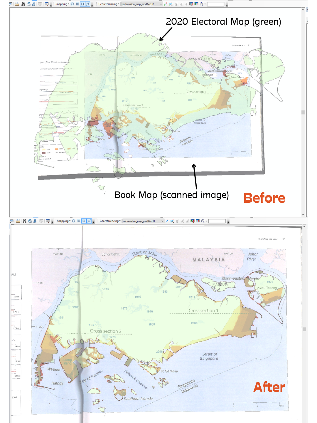
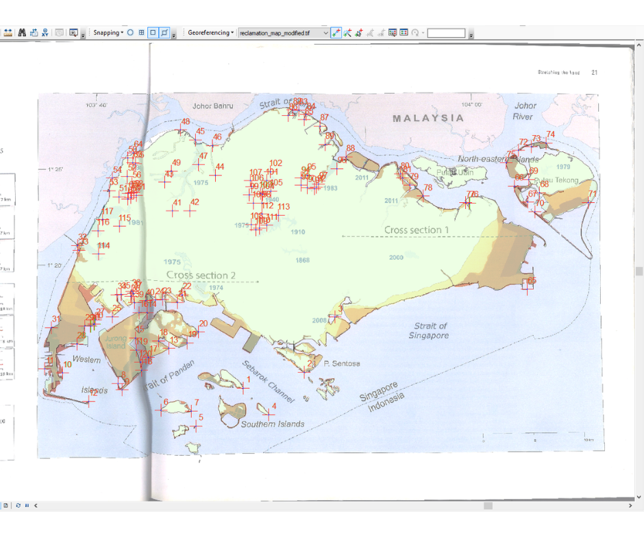
As we only had access to the Book and LTPR Maps in print or image form, we had to bring them into ArcGIS, a map-making tool, to georeference and trace the shapes we needed. Georeferencing involves matching a map’s digital image (raster dataset) to actual geographic coordinates of a reference map. Using a mouse, we manually “snapped” the edges of the Book and LTPR Maps to those of the 2020 Electoral Map. We decided to use the Singapore government’s 2020 Electoral Map as our reference map, as it was the most recent verified dataset of Singapore’s borders.
Tracing
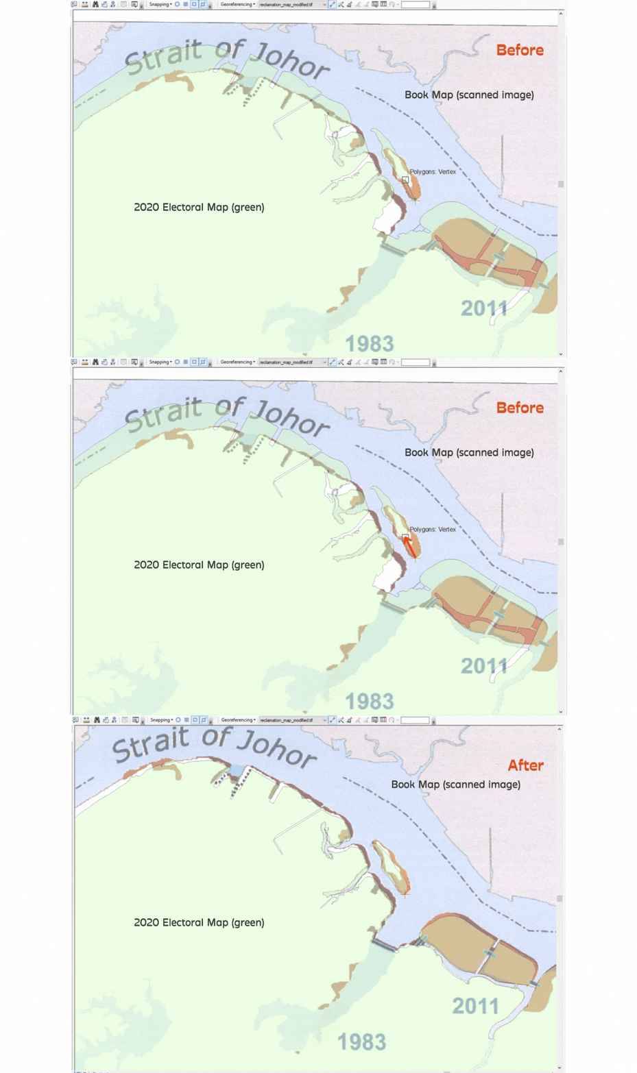
The next step was to trace the shapes that we wanted from the different maps. Visibly, in the scanned image of the Book Map above, accuracy in georeferencing the scanned image was affected by some warping, caused by the page fold and the limited resolution.
For both raster maps (Book and LTPR Maps), a smaller file size and resolution resulted in lower levels of detail and “fidelity”, compared to the digital 2020 Electoral Map. Besides having smoother (less detailed) edges along its landforms, we also discovered some simplified or omitted details in the maps, such as rivers. This was an issue, as representations of not only land but also water bodies were crucial in analysing the maps for reclamation changes. Thus, where the 2020 Electoral Map had the same data points as the raster maps, we referenced the dataset of the 2020 Electoral Map instead.
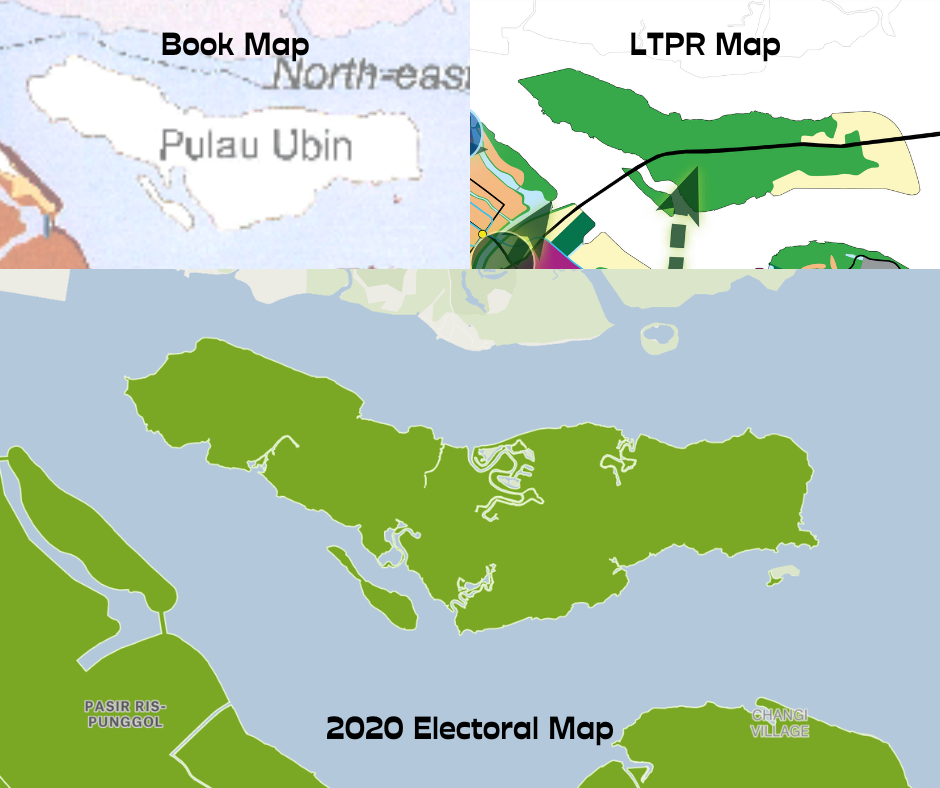
In tracing data from the 2020 Electoral Map however, some discretion was still exercised. After all, the priority for the 2020 Electoral Map was to represent electoral boundaries, and thus it did not represent all geographic data accurately—some water bodies had also been omitted. Across these four maps, the discrepancies in land data complicated the process of what we initially thought to be a simple (though tedious) task of tracing a few maps as “accurately” as possible.
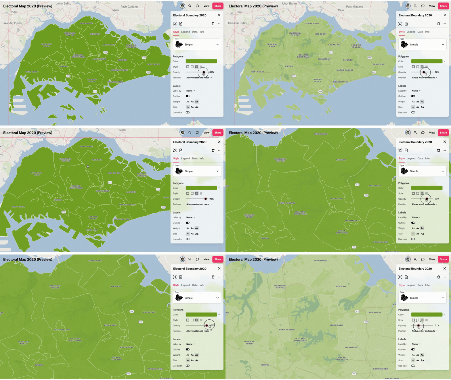
Nevertheless, we gave our best attempt at working with the available data, making several critical decisions that are elaborated on below.
Assigning colours
From the maps we referenced, we decided to define four key phases of reclamation in our story. Using different colours, we created separate shape files (.shp) for each of them. Shape files are vector data files that store the location, shape, and attributes of geographic features.
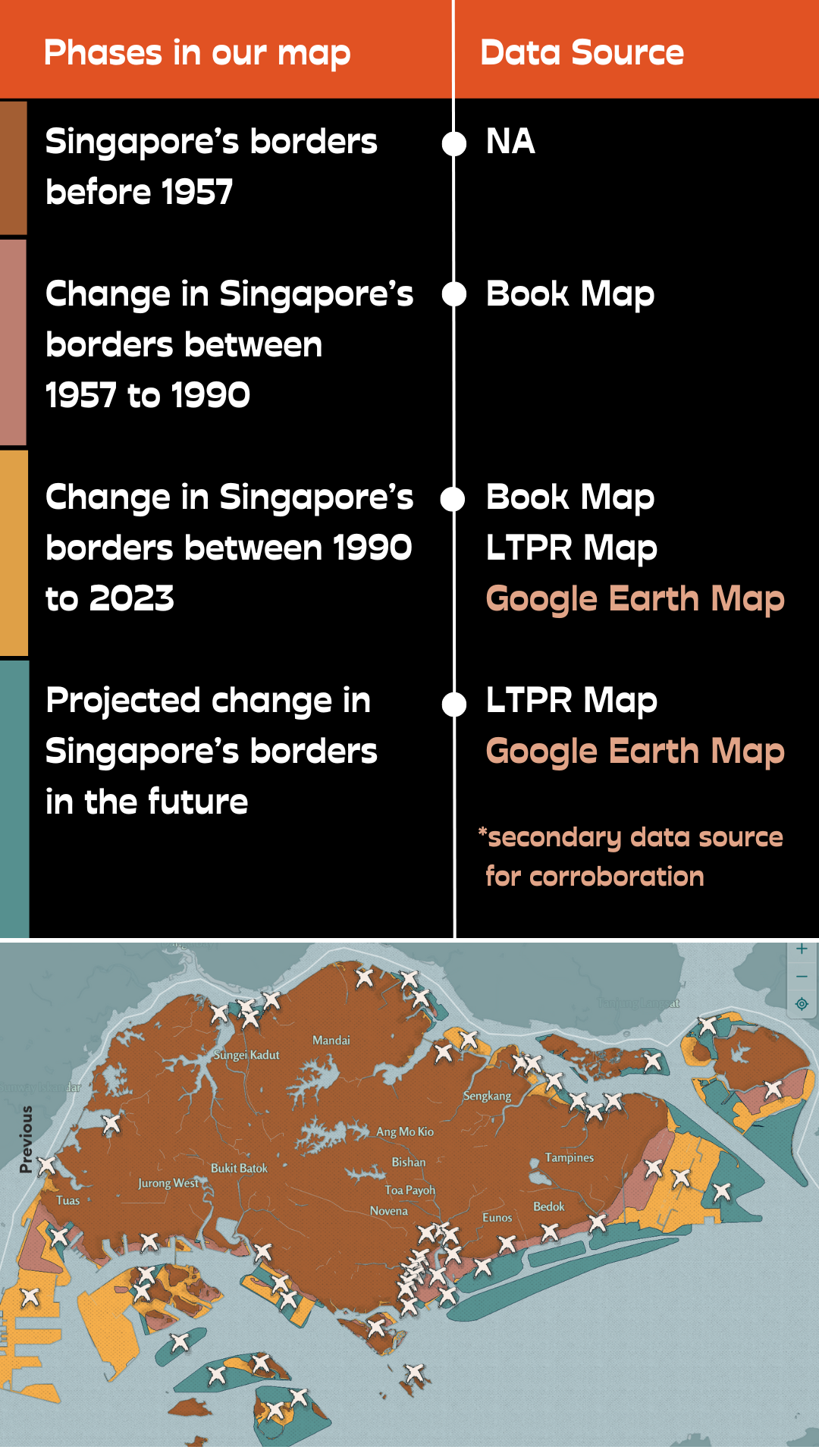
Past
(Before 1957)
Singapore’s earliest recorded reclamation project dates back to 1814, but we found limited geospatial data to map out these areas. This prevented us from creating a map layer for areas reclaimed between 1814 to 1957. Among the maps we referenced, the Book Map, with the earliest range of analysis, begins its documentation from 1957.
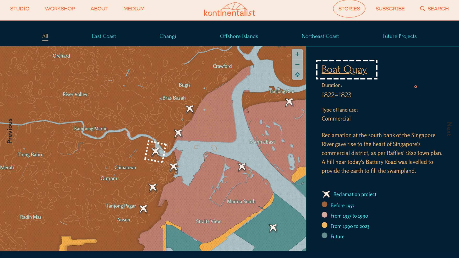
Earlier projects occurred at a smaller scale, compared to post-independence projects. However, they were still key events in Singapore’s history of reclamation. Based on available data, we decided to represent their estimated locations using geolocation pins, within the largest area of Singapore rendered in dark brown, that consists mostly of Singapore’s natural land.
Past to present
(1957 to 1990 and 1990 to 2023)
For projects from 1957 to 2015, the book map was our main reference.
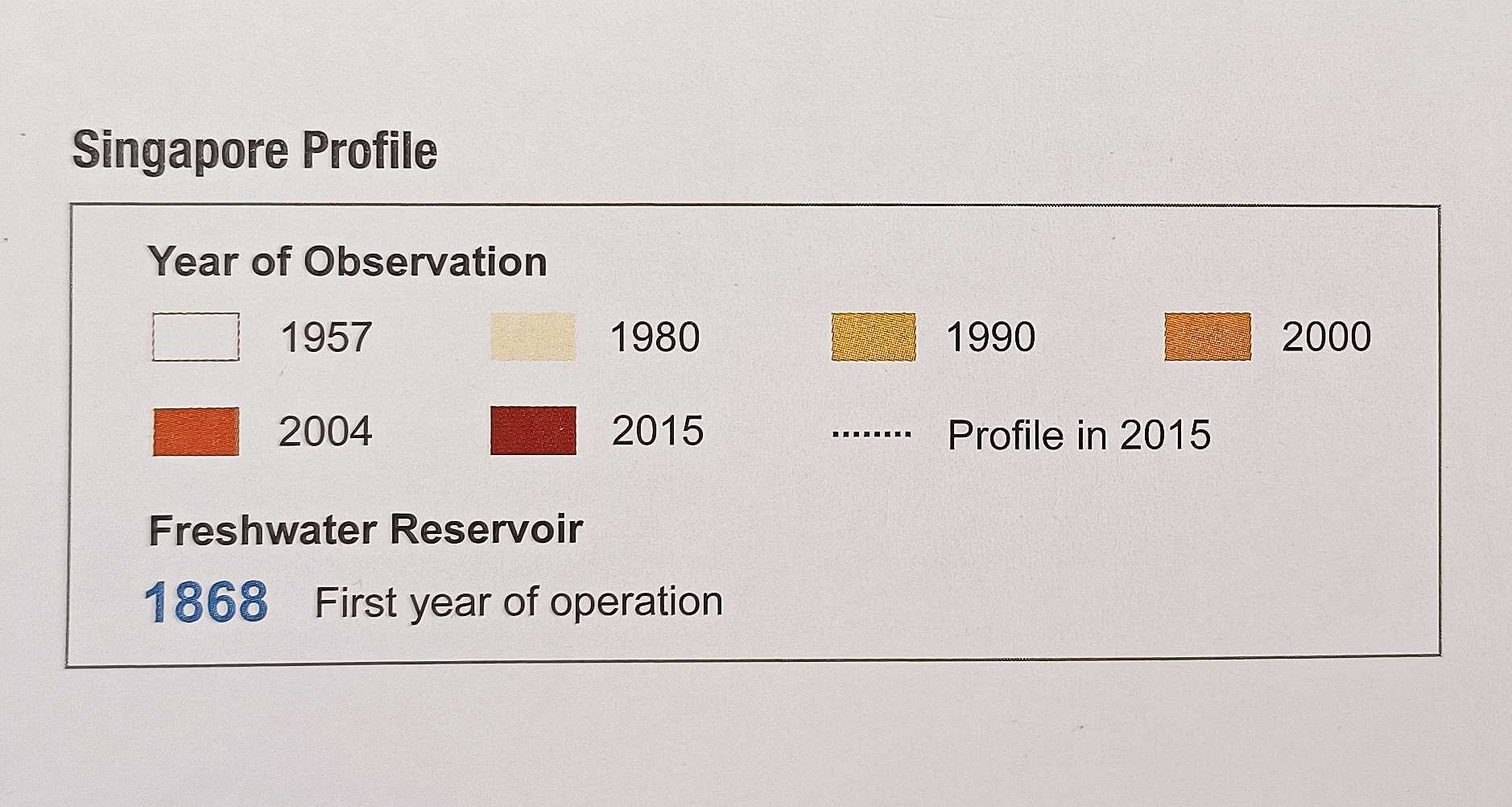
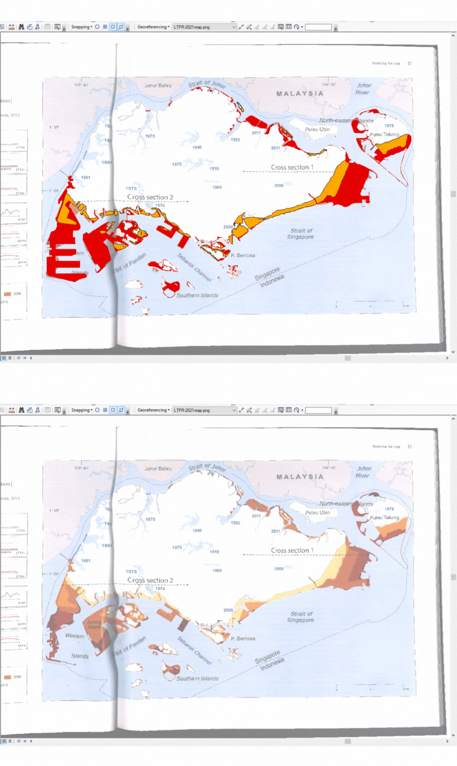
Beyond the Book Map’s range of analysis (1957 to 2015), we referenced data from the LTPR Map. On ArcGIS, we overlaid the two maps and traced the areas of difference at the borders, before using the Google Earth Map to verify that derived areas had been reclaimed between 2015 to present day.
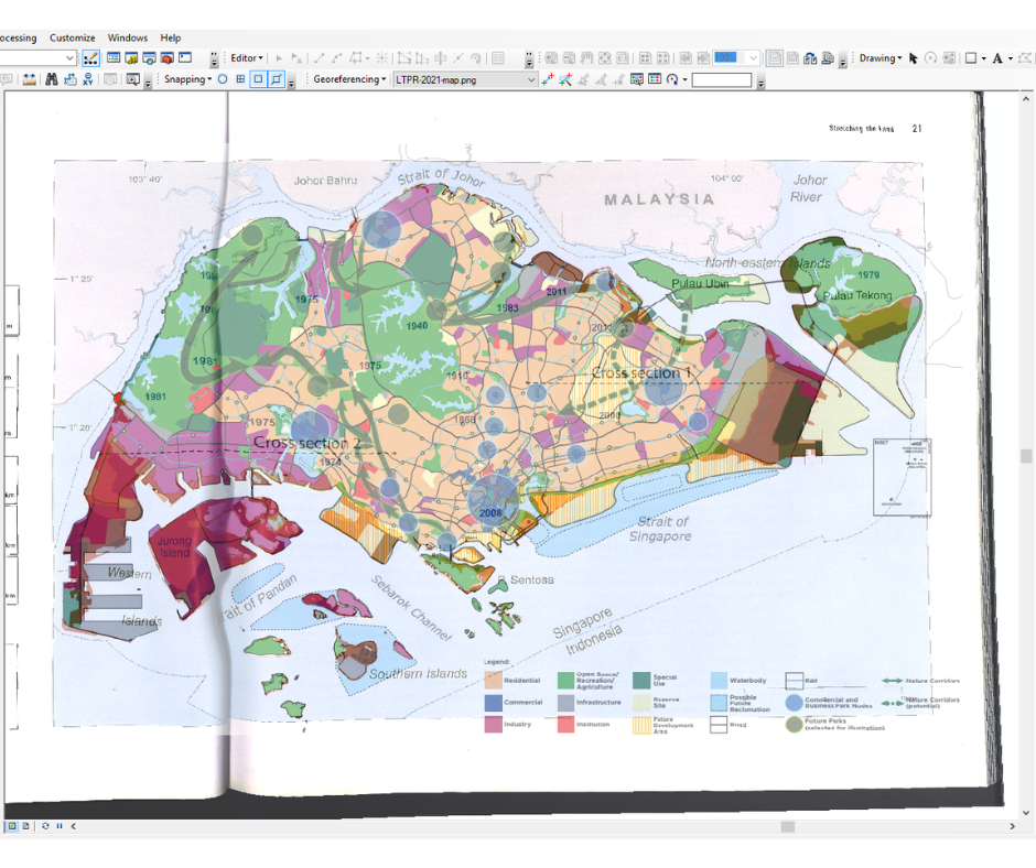
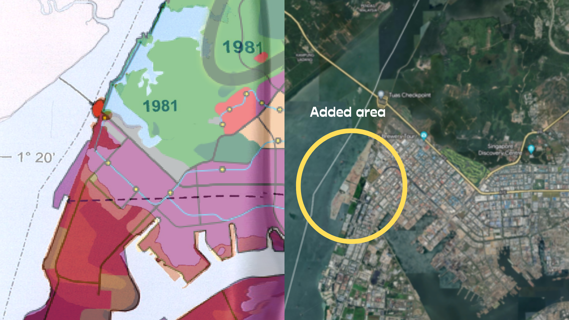
This final step of corroboration with the Google Earth Map was crucial, as we discovered several discrepancies between the satellite images and several parcels of land derived from the analysis. Some areas did not appear to have been reclaimed fully or at all in satellite images. This especially pertained to those assigned to ambiguous land use categories in the LTPR Map, which were given names such as “future development areas”, “reserve sites”, and “special use”—all of which describe unspecified plans with distinctions that are unclear, at least to the public.
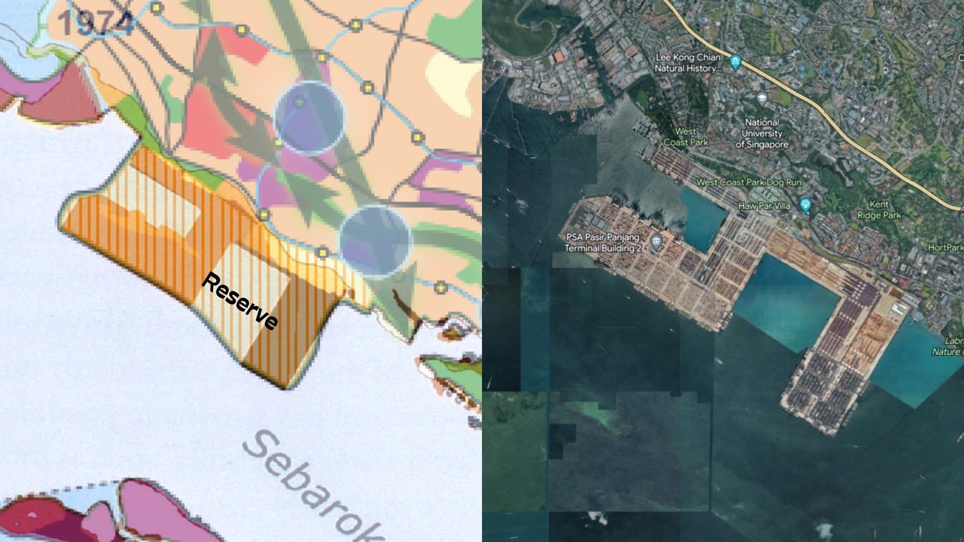
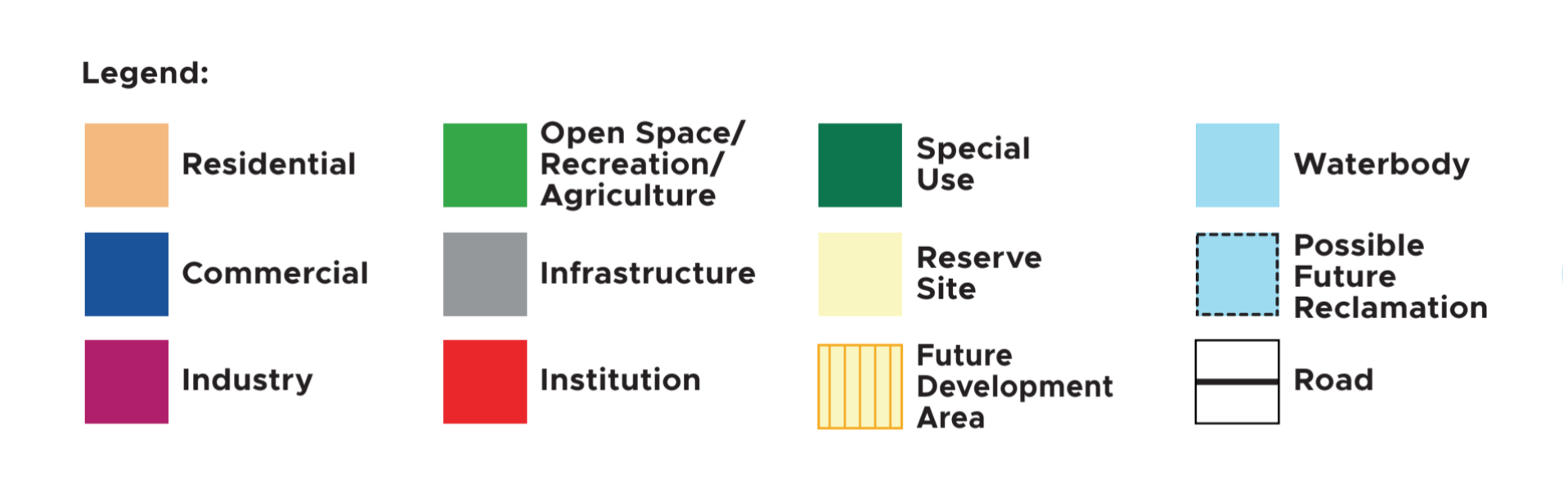
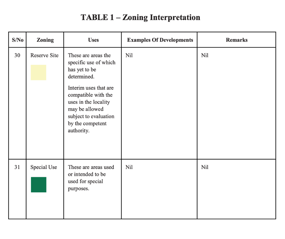
This map illustrates the likely profile of Singapore and possible land use allocations beyond 2030. It shows the scope for additional land reclamation, if needed. These reclaimed land parcels, including the land currently zoned as “reserve”, could be used for housing, industry, and other uses. (Source: Land Use Beyond 2030 map description by MND)
Future
For our map’s “Future” phase, we mainly referenced data from the LTPR Map.
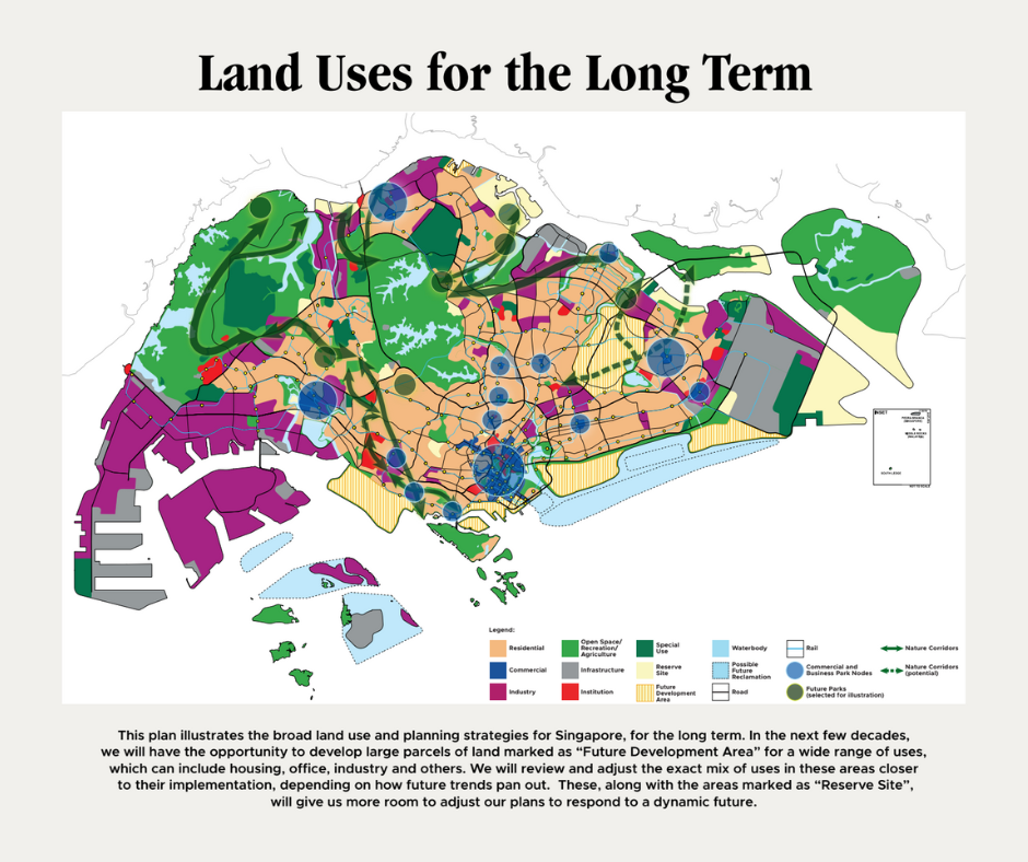
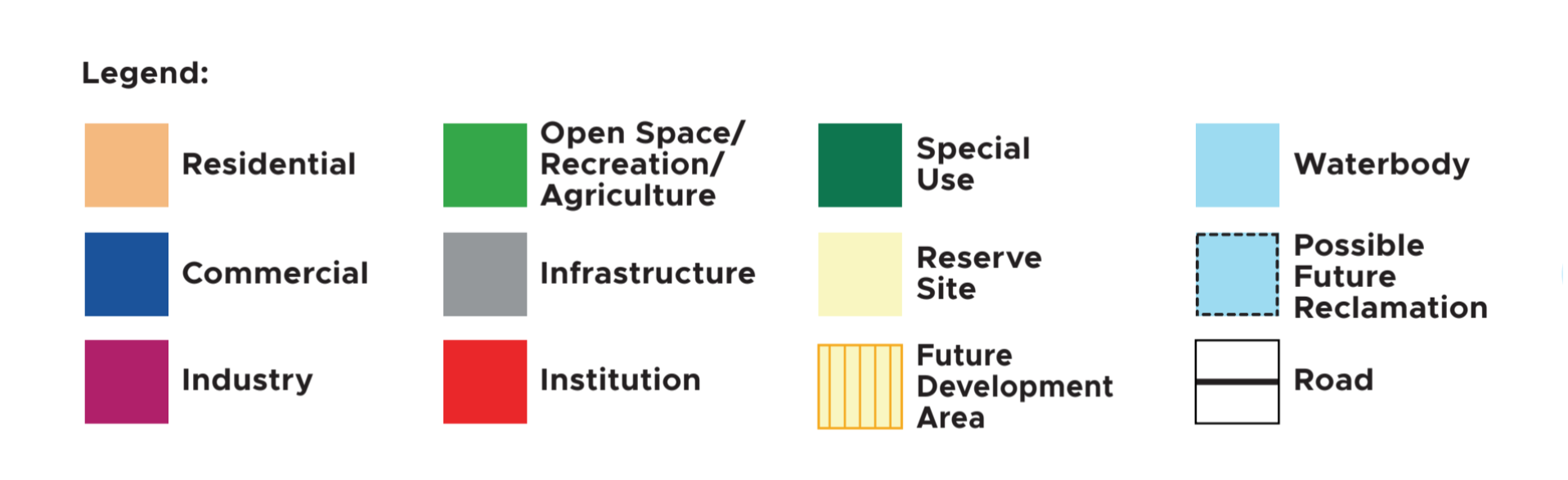
While the map has a “possible future reclamation” category, we did not draw data from this category only. As it was published in 2022, we still needed to check for any updates since. From corroboration with the Google Earth Map and the latest news reports, we decided to include all parcels of land on the LTPR Map that had not yet been reclaimed or were undergoing reclamation in the present day.
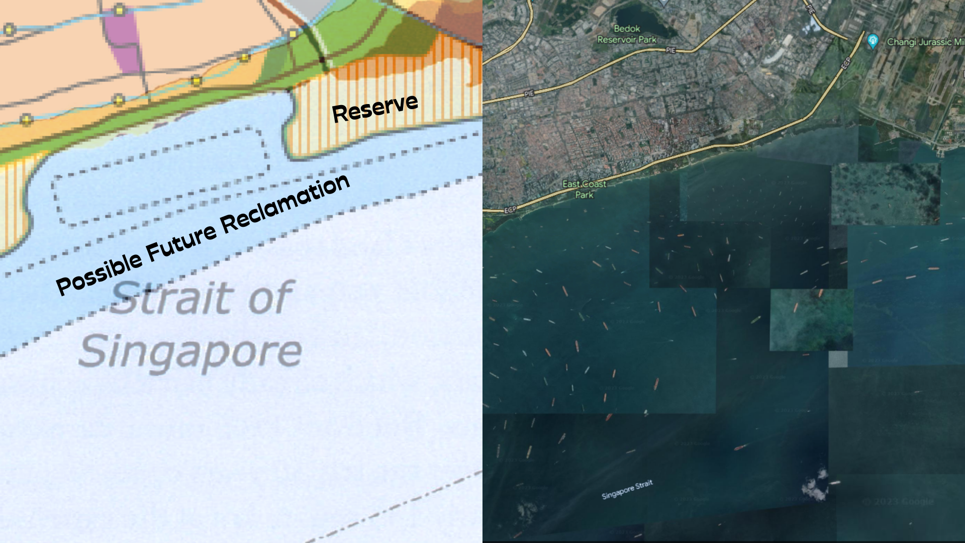
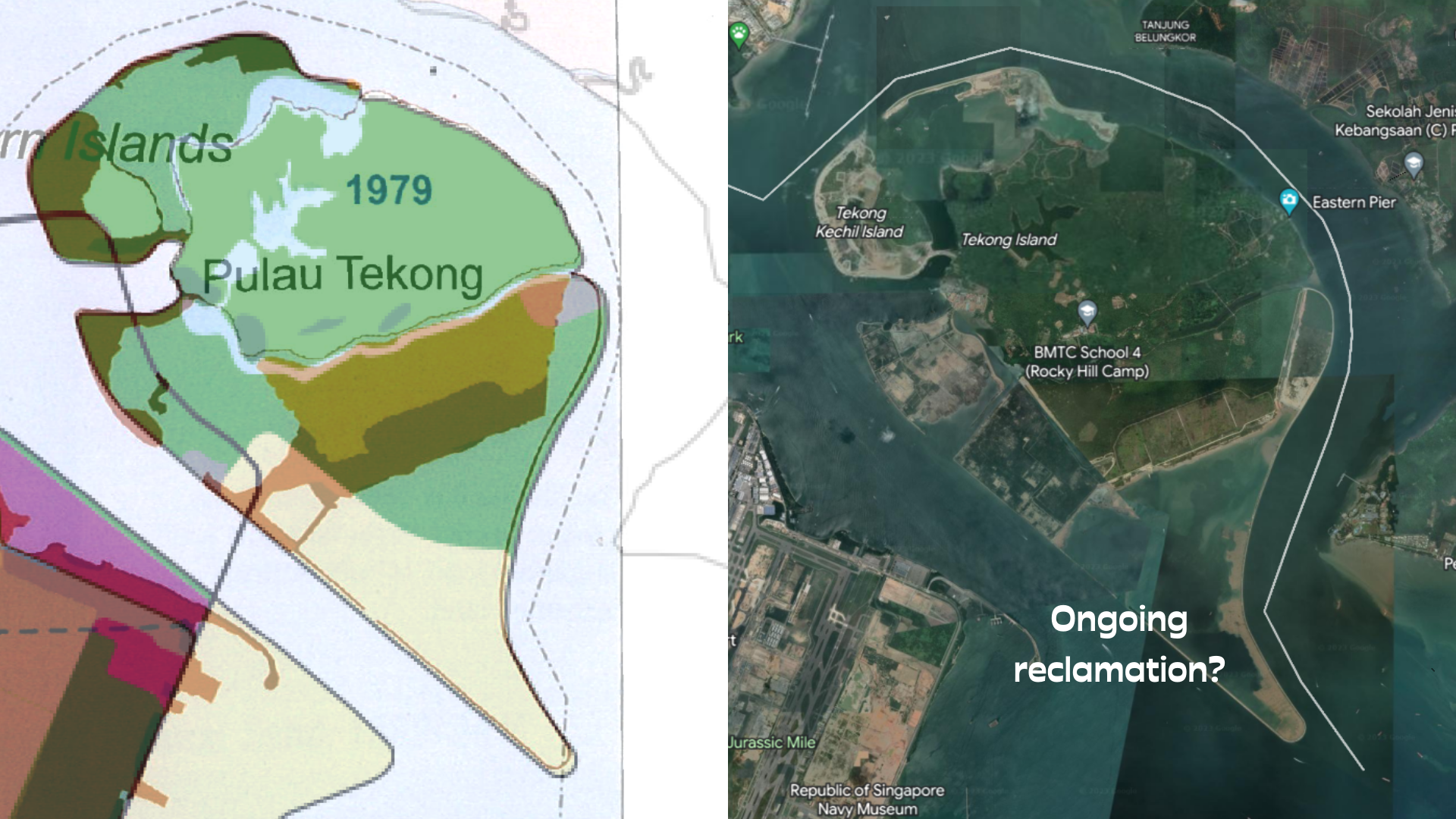
This meant that our map’s “Future” phase consists of several areas in the bucket of ambiguous land use categories like “reserve” and “possible future reclamation”. In the geolocation pins for these sites, we tried to include more qualitative details on respective land use plans published by the government. While we appreciate that the categories used in the LTPR Map may reflect the need for the government to be cautious and allow for a degree of flexibility in its development plans, it is certainly challenging to work with when it comes to analysing the data on future reclamation.
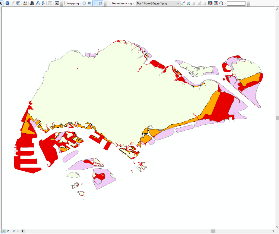
At all phases of the map-making process, it is good practice to pause and save your work, especially when using ArcGIS on a desktop running with low disk space. I can’t recall the number of times I hit save during this entire project!
This map was my first project as an intern at Kontinentalist, and it might be the most memorable one too. Not because of the time that I spent on it (possibly the longest, including the time I took to write this article too), but because of the level of ownership that I felt, entrusted to me by the team. Internally, Nabilah referred to the map as “Man Wei’s map”, although we had navigated decisions together in the team, and Pei Ying had been a tremendous help in getting me started with ArcGIS. The experience of making this map was deeply personal in ways that I had not expected, as I reflect on my takeaways below:
While making this map, I had foreseen the challenges we would face in collecting data, but not the extensive discrepancies encountered between the sources, and much less among official government publications. I often paused to ask myself: Who makes maps? What do we sometimes assume about maps and the people who make them?
These questions remind me to view and question maps with a critical eye, but also consider maps as accessible tools to us for discovery and world-building. With a mouse and a humming computer, I had a hand in creating a map detailing all (verifiable) reclamation projects in Singapore, past, present and future. It is hardly a laser scanned image of Singapore’s land across time—as I had somehow expected at least one of our referenced maps to be. Perhaps it was the specific topic of land reclamation in Singapore that made me strive for a standard of “accuracy” in our own map, but that I found challenging to define with the data we had.
If the map wasn’t on the topic of land reclamation in Singapore, I wonder if I would have been so thorough about cross-referencing sources for so many data points. I wonder if I would have questioned the reliability of data from government sources, as much as I did in the process of making this map. I wonder if I would have felt my hand to be so tangible in shaping Singapore’s land—even just a view of it from a screen, pieced together from amalgamated maps.
Though not quite in the same context in which indigenous land defenders elsewhere describe land as political, the topic of land reclamation in Singapore spurs these feelings in me. Before this project, maps had also never felt so political, or personal to me.
To the best of our ability, we’ve created a story on land reclamation in Singapore, where this map now lives. When sharing the story with others, I am attentive to the views and assumptions they might have about maps, and eager to have a conversation around my personal experience at making my first map. We don’t talk quite enough about how maps come to be.
From the experience of making this map, these are other takeaways I’ve had:
- A new sensitivity to scrutinising maps for the borders of their lands; I enjoy tracing their organic contours (with my eyes, less so with a mouse) and questioning lands that look unnatural—with edges that are too smooth, too sharp, and sometimes areas with perfectly spherical or rectangular protrusions.
- Attention to the existence and forms of water bodies that flow(ed) through Singapore.
- A strange feeling when walking the ground, piecing my views from the ArcGIS monitor against what I experience in real life.
- An occupational hazard where I call out simplified maps of Singapore in random publicity material.
What is your relationship with maps? If there is a map that invites you to scrutinise and question how maps are made and who made them, what might it be about? We’re curious to know :)
REFERENCES
De Koninck, Rodolphe. Singapore’s Permanent Territorial Revolution: Fifty Years in Fifty Maps. Singapore: NUS Press, 2017.
Lim, Tin Seng. ‘Land From Sand: Singapore’s Reclamation Story’. Biblioasia, April 4, 2017, https://biblioasia.nlb.gov.sg/vol-13/issue-1/apr-jun-2017/land-from-sand.
Ministry of National Development. ‘A High Quality Living Environment for All Singaporeans: Land Use Plan to Support Singapore’s Future Population’. Accessed March 30, 2023. https://www.mnd.gov.sg/docs/default-source/mnd-documents/publications-documents/land-use-plan.pdf.
Prime Minister’s Office - Elections Department. ‘Electoral Boundary 2020’. Data.gov.sg. Last modified March 13, 2020. https://data.gov.sg/dataset/electoral-boundary_2020.
Singapore Government. ‘The Planning Act Master Plan Written Statement 2019’. Accessed March 29, 2023. https://www.ura.gov.sg/-/media/Corporate/Planning/Master-Plan/MP19writtenstatement.pdf?la=en#page=11.
Urban Redevelopment Authority. ‘Space For Our Dreams: Long-Term Plan Review 2021’. Accessed March 30, 2023. https://www.ura.gov.sg/-/media/Corporate/Planning/LTPR21/LTPR_publication.pdf.