Make It Matter: Spider-Verse (Animator’s perspective)
Being the seventh Spider-Man film, added only a year after Spider-Man: Homecoming and a PS4 game, Spider-Man: Into the Spider-Verse could…
Being the seventh Spider-Man film, added only a year after Spider-Man: Homecoming and a PS4 game, Spider-Man: Into the Spider-Verse could have been easily overlooked, especially as an animated film. However, it caught people’s attention with a teaser trailer which showcased its unique hybrid of 3D animation and 2D comic-inspired visual style. It lived up to the hype, if the recent Oscars nomination, Golden Globes, and Annie Awards wins are anything to go by.
As a multimedia designer at Kontinentalist in charge of various stories’ teaser videos and some illustrations, I’m passionate about animation in general and had been looking forward to the movie since the first teaser. I went in fully expecting to learn its visual style and art direction, which I did, but was impressed by something more basic: the way the story was structured.
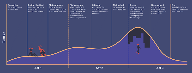
Spider-Verse had a lot to cover. In two hours, it had to pack in five alternate universes, the various villains behind it, and most importantly, Miles’ development in character and relationships — all while making sure it remains fun and focused. Yet it succeeded. The work I do may be drastically different in style and length, but engaging the audience and keeping a story focused is a universal problem for anyone involved in film and multimedia. With social media reducing everyone’s attention spans these days, it’s becoming increasingly important to be able to pack a lot of information within a short time.


