How to tell data-driven stories
We conducted a workshop for our writers recently, and below are some of the highlights.
We conducted a workshop for our writers recently, and below are some of the highlights.
One of our main editorial goals this year is to tell more data-driven stories. We did this for our story on Asian representation in movies, where the story was based on observations from one dataset.
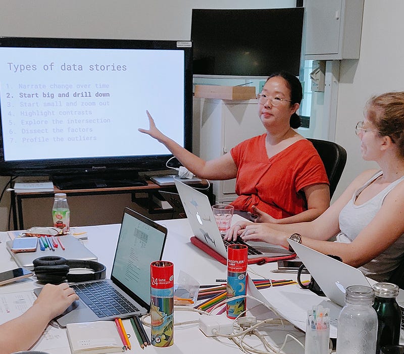
But other than being driven by data, what other storytelling and visualisation considerations are there? To answer these questions, our chief editor Peiying, and design lead Joceline, prepared a workshop for the writers.
Choosing the right data visualisation
It may seem like a duh point, but the visualisation should serve the data. We may be tempted by fancier visualisations, but sometimes a straightforward and simple bar graph is sufficient. We were then tasked to pick a data visualisation type which we are unfamiliar with, and explain it to our partners.