How to make: The workshop-survey data story
(or how to amp up a data story with Flourish viz + some code)
(or how to amp up a data story with Flourish viz + some code)
Kontinentalist hosted our inaugural data storytelling workshop a week ago! I was honestly blown away by the amount of support we got 🙂
We spoke about creating narrative arcs, storyboarding, and designing good data visualisations. For my section, I gave a crash course on using Flourish Studio, a nifty low-code tool that is used to create data viz.
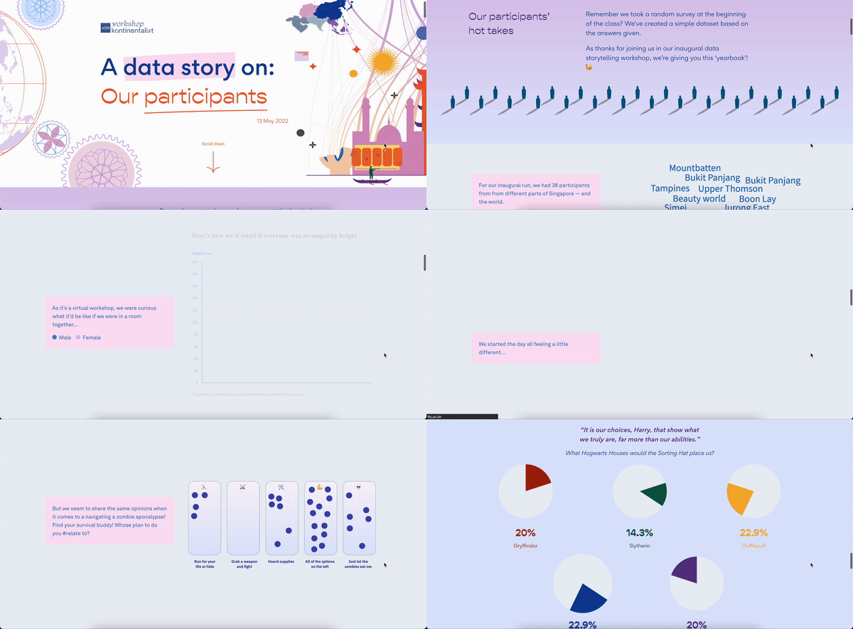
At the end of the workshop, the Konti workshop team presented a surprise data story of the participants, to the participants 🎁 The data for the data visualisations were aggregated results of the survey that the participants filled up at the beginning of the workshop.

I’m tooting my own horn here, but I thought the data story was a fantastic showcase of Flourish-made data visualisations, which blended into the website seamlessly. So I wanted to share some tips on how you can also zhng (read: upgrade) your data story website if you’re planning to integrate Flourish viz into it.
For the rest of this walkthrough, I will be referencing the data story website that I coded for the workshop participants. There will be screenshots and gists provided, if you wish to follow along with this article.
Note: You’ll need to have a basic understanding of how HTML and CSS work on a webpage for this walkthrough.


