Conducting a virtual data storytelling and visualisation workshop
With a bonus peek into our writers’ dietary habits.
We ran an online workshop with our writers on the basics of both data visualisation and storytelling. Here are the key takeaways.
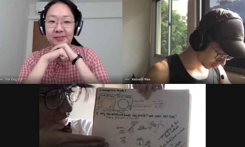
Our chief, Peiying, ran two workshops for the team’s newbies to bring everyone on the same page about data visualisation basics and how Konti’s does its data-driven stories. I’m here to talk about the second one: a slightly different version of the Datavis 101 workshop we ran last year.
Data governs the message, and the message determines the form
The workshop kicked off with some helpful reframing. When asked, “What does data visualisation mean to you?”, most of us said that it’s the visual representation of data. But Peiying responded sagely, “Data visualisation is a process which consumes data as input and transforms it into insight and stories”.
So what?
Understanding data visualisation as a process grounds us in what truly matters: the story. Don’t force fit data visualisation in your story if it doesn’t work well. Choosing whether and how to visualise data is secondary; it’s the story that animates your project and anchors you when data sets threaten to overwhelm.
We were each tasked to take one form of visualisation from this amazing compendium on data vis and explain it to one another. Kenneth chose the boxplot, Zafirah the violin plot.